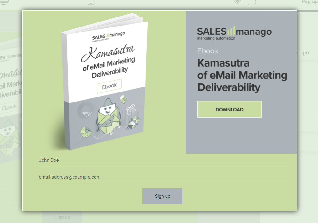
Convert and attract more new customers thanks to the extensive capabilities of Custom Modal Designer, allowing you to hyperpersonalize your website through advanced and highly customizable pop-ups. This unique designer allows selected groups of users to display pop-ups containing special offers based on their behavior on the website and CRM data. Control where, when, to whom, and what offer is to be displayed, all thanks to an easy-to-use, intuitive designer.
To create a pop-up in Custom Modal Designer go to
Web Tools → Lead Generation → Lead Generation forms → Pops-ups → Create new → Custom Modal Designer
Contents
- General information
- Devices
- Editor – basic elements of the window
- Editor – design
- Editor – widgets
- Design on the site
- Subscription – confirmation of completing the form
- Display settings
1. General information
Custom Modal Designer is an advanced creator that allows you to create not only pop-ups containing a form, but also pop-ups with only graphics. Extensive visual personalization options for each widget will make your popups catch the attention of every user.
In addition, you have the option of setting the exact location, display time and pop-up display pause time to gradually increase the conversion of your website.
2. Devices
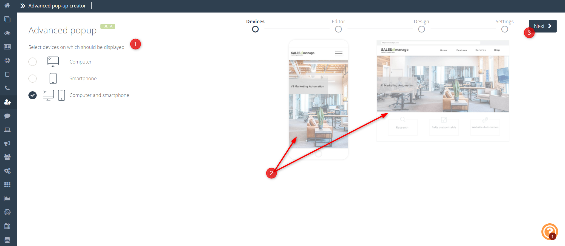
[1] Select devices on which the pop-up should be displayed – here you can choose whether you want your pop-up to be displayed on the computer, phone or both; Depending on your choice, the further configuration stage will be slightly different.
[2] Pop-up preview on devices of your choice
[3] Next – move to the next stage of creation.
3. Editor – basic elements of the window
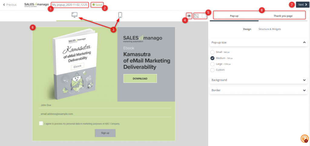
[1] Name of the pop-up – under this name the pop-up will be saved in the system.
[2] Autosave – a function that is responsible for the automatic saving of your pop-up when it is created.
[3] Device selection – available when selecting the “computer and smartphone” option in the first step (device selection) – depending on the selected icon (computer/smartphone), it will be possible to edit the display details and the appearance of the pop-up on a given device. You can create separate creations for the computer and telephone.
IMPORTANT: By default, all settings are transferred from the computer to the smartphone. After making changes to the mobile version, settings become individual for both devices. You can also define individual settings to a Thank You Page.
[4] Preview – you can go to the preview at any time to see how your pop-up is displayed to other users on the selected device.
[5] Show element borders – if the borders of your widgets are invisible, this feature will help you distinguish them from each other.
[6] Select a widget – to edit the specific widgets that the pop-up is built of, click on the chosen one. You will be automatically moved to its editing window.
[7] Next – click to go to the next step.
[8] Editable items – depending on the selected widgets, items that can be edited may differ. If you don’t add the form, it will be impossible to create a Thank you page.
Additionally, in each pop-up widget you have additional setting options such as:
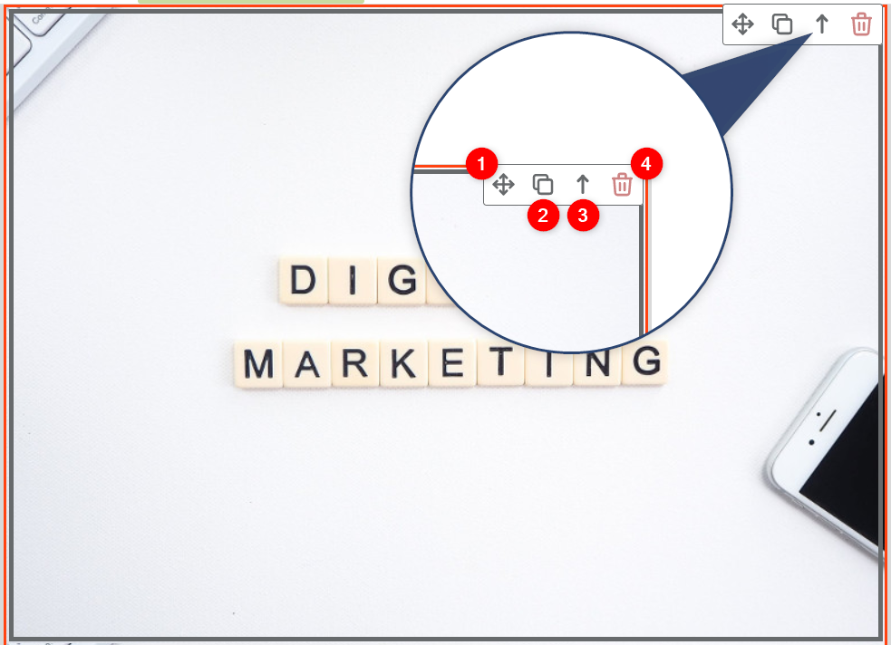
[1] Move – click and hold the icon to move widgets among them.
[2] Duplicate – click to duplicate a given widget with its settings.
[3] Up – if your pop-up consists of several elements (column, image) click the arrow icon to select the top priority item and go to its settings.
[4] Delete – if you want to get rid of a given item from your pop-up, click the trash can icon.
4. Editor – design
If you want to edit the basic appearance settings of your pop-up, on the right side of the wizard, click Pop-up and then the Design tile.
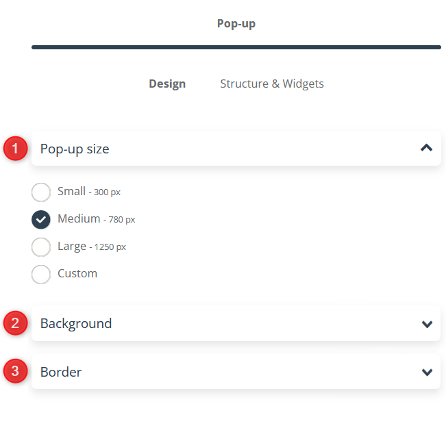
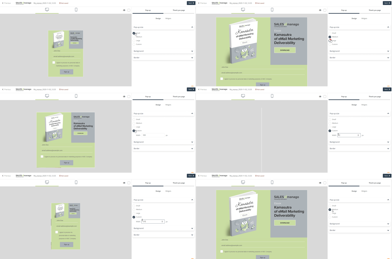
[1] Pop-up size – adjust the size of your pop-up. You can use options available in the system that will automatically adjust its size, or choose the Custom option and set its width in px:
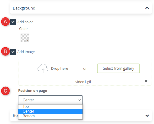
[2] Background – choose a background for your pop-up. This is a handy option if some elements of your widgets are transparent.
[A] Add color – choose a background color for your pop-up.
[B] Add image – you can also use any image from the gallery or add your own file.
[C] Position on page – this function allows you to specify the position of the image selected in point [B] in the background of your pop-up.
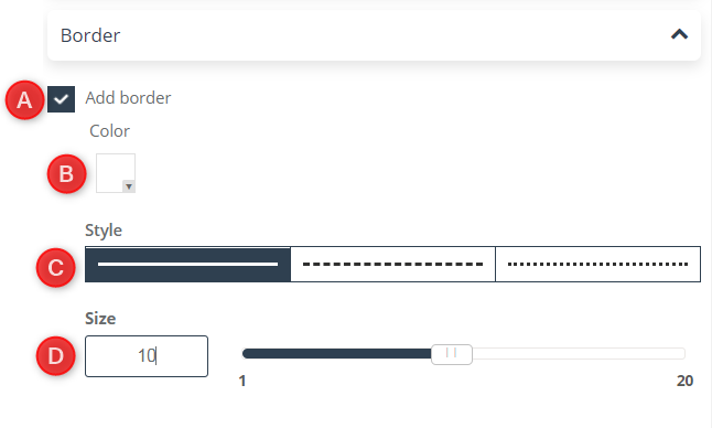
[3] Border – in the general pop-up appearance settings you can also choose whether you want it to have a border or not.
[A] Add border – decide if you want your pop-up to have a border or not.
[B] Color – choose a border color for your pop-up, you can also choose a transparent frame option.
[C] Style – choose the type of line you want your pop-up to be outlined.
[D] Size – select the width of the pop-up border on a scale from 1 to 20.
5. Editor – widgets
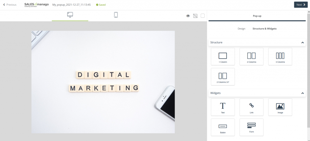
You can create pop-ups in Custom Modal Designer using 9 different widgets in any number (except the Form widget). The options are:
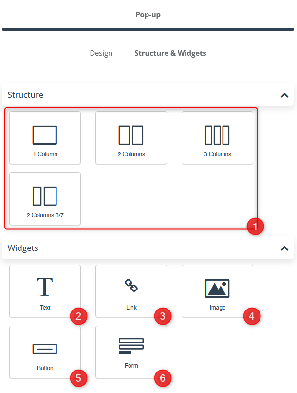
[1] Columns – use one of the available column arrangements to add an additional background and margins. Thanks to the column settings, you can add several widgets in one row by dragging them to the field of the selected column. In each of them, you can freely adjust the following settings:
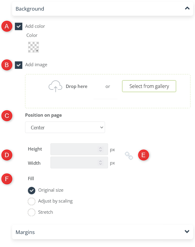
[A] Add color – hover over the selected column and select a background color for it. It will be visible, for example, when you set the transparency of a color or image of a widget placed on a column.
[B] Add image – you can also use any image from the gallery or add your own file.
[C] Position on page – this function allows you to specify the position of the image selected in point [B] in the background of the pop-up column.
[D] Height/width – by selecting Adjust by scaling or Stretch option in point [F], you can choose a specific height and width of the image (given in px).
[E] The element marked in the picture is responsible for changing the height and width values proportionally with each other and is available only with the Stretch option in point [F].
[F] Fill – you can choose the type of filling for the image.
[G] Margins – by default, elements are pressed to the edge of the box they are in. Move the slider to choose the width of the margins that will separate the widget from the sides of the pop-up. You can set them on a scale from 1 to 500.
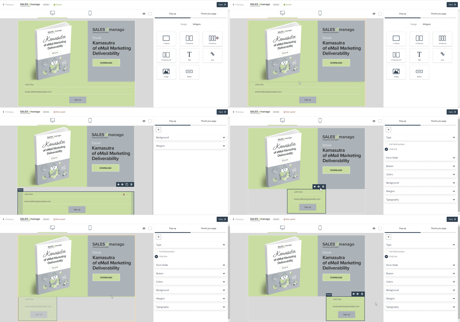
IMPORTANT: The possibility of using the column arrangement gives you the possibility to choose the length/width of the form fields, among others. Similarly, you can adjust the size and position of pictures or other elements this way:
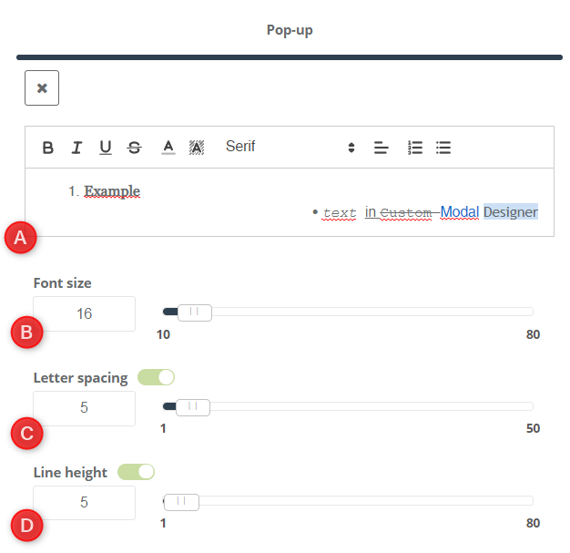
[2] Text – a widget that allows you to insert a text block into a pop-up. In it, you can customize the following:
[A] Text field – you can enter any amount of text in the text field. You can follow the changes you make on the left side of the screen in the widget preview. Specify the font type and change its colors, background color, bold, italic, underline, or strikeout. You can also change its alignment, add bullets, and change their color.
[B] Font size – set the selected font size for the text field on a scale 10–80.
[C] Letter spacing – regulate the distances between specific pairs of characters. The available scale is 1–50.
[D] Line height – define the distance between the text and the widget frames.
The rest of the background and spacing settings work similarly to the other widgets.[3]Link – place a widget to freely link a given field element.
[A] Link – enter here the address of the page to which the person who clicks on the given element will be redirected.
The rest of the background and margins settings work similarly to the other widgets.
[4] Image – a widget that allows you to add any file you drop from your computer or an image from the gallery.
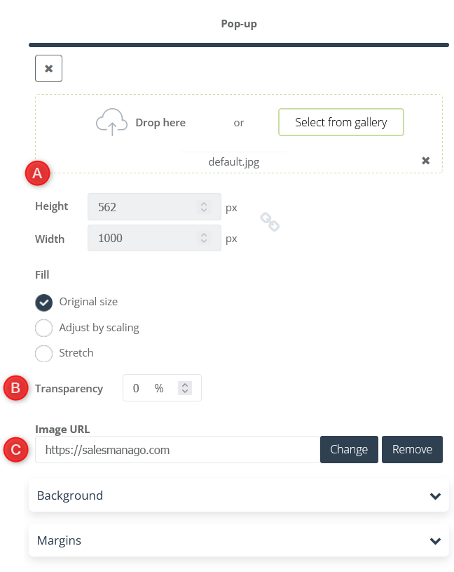
[A] Drop file here – select the image you want to add.
[B] Transparency – set the image transparency level.
[C] Image URL – you can link the image by clicking the Change button.
The rest of the background and margins settings work similarly to the other widgets.
[5] Button – a widget that allows you to add an interactive button that you can link to. Available settings in this widget:
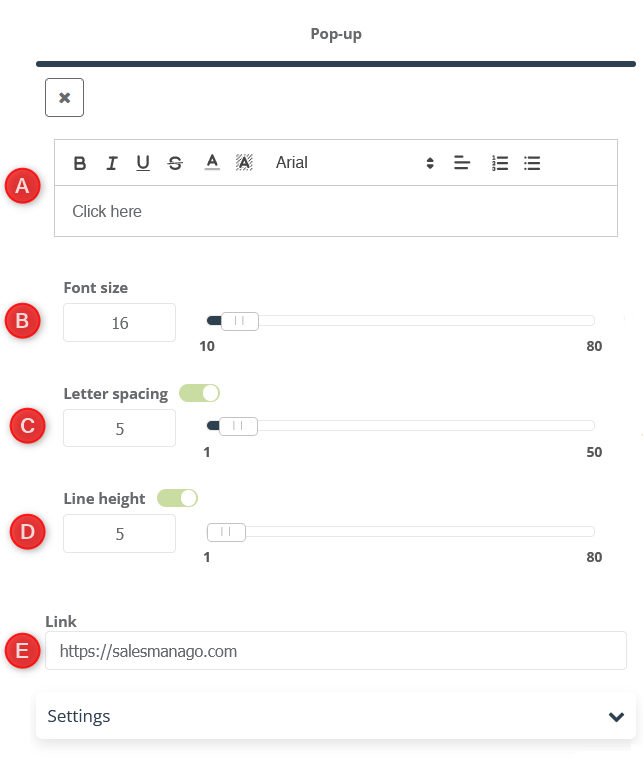
[A] Enter the text that will be displayed on the button in the text box. You can also use various options to edit the style.
[B] Font size – set the selected font size for the button on a scale from 10 to 80.
[C] Letter spacing – regulate the distances between specific pairs of characters. The available scale is 1–50.
[D] Line height – specify the distance between the headers and the frames of the form field.
[E] Link – enter the URL to which the user will be redirected after pressing the button.
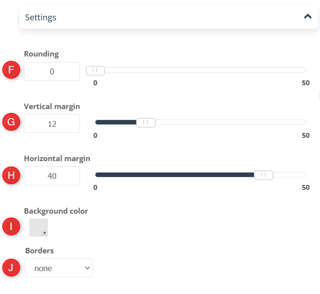
[F] Rounding – you can freely give the button a round shape, setting the rounding level on a scale from 0–50.
[G] Vertical margin – change the space width from the top and bottom border of the text on the button.
[H] Horizontal margin – change the width of the space from the side borders of the text on the button.
[I] Background color – choose a background color for your button.
[J] Borders – select the button border type.
[6] Form – widget that allows you to add a form to a pop-up. Custom Modal Designer allows you to create pop-ups without a form. Adding this widget is optional. It has the following settings:
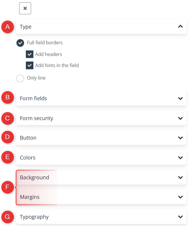
[A] Type – define the pop-up settings and specify what information you want to include in it:
- Full field borders – you can select an option to have the entire text field outlined.
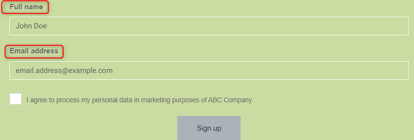
- Add headers – decide if you want the names to be displayed above the text input windows, specifying what to enter in the empty space:
- Add hints in the field – use the suggestions feature to display them in a text input field and suggest the input to users:
- Only line – Instead of a border box, you can display a text input field using only lines as follows:
IMPORTANT: The background color of the text box can also be freely edited to match your form graphically.
It is also possible to set the full field frame and the frame as the line itself with all the above settings.
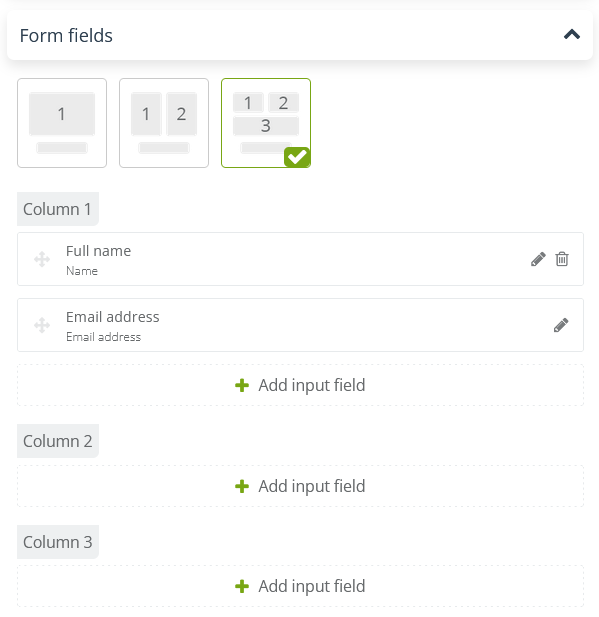
[B] Form fields – specify what data you want to collect in your form.
In this section, you can select the number of columns on the form and individual fields in each column. You can choose from:
- Email address.
- Name.
- Phone number.
- Date of birth.
- Street address.
- Region.
- City.
- Postal code.
- Country.
- Position.
- Company.
- Website.
- Custom detail.
- Agreement.
- Consent from consents list.
- Any text.
- Selection options.
- Selection list (droplist).
IMPORTANT: The Email address field is required to create a new form and contact card for the customer.
[C] Form security – allows you to add reCAPTCHA to the form, which will protect the page against spam.
[D] Button – the button settings are similar to those in the Button widget settings. You can also set Top Margin, which is the distance between the button and the last field.
[E] Colors – adjust your own color settings for your form.
[F] Background/Margins – those settings work similarly to other widgets.
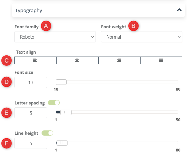
[G] Typography
[A] Font family – select the font that will be used to save the form fields.
[B] Font weight – decide if you want your names of form fields to be normal weight or bold.
[C] Text align – freely format the position of names of form fields from among the available options.
[D] Font size – set the selected font size for the form on a scale 10–80.
[E] Letter spacing – regulate the distances between specific pairs of characters. The available scale is 1–50.
[F] Line height – define the distance between the headers and the frames of the form field.
IMPORTANT:After adding the form, we have the option to create a Thank You Page from the available widgets. All their settings are analogous to the pop-up widget settings.
6. Design on the site
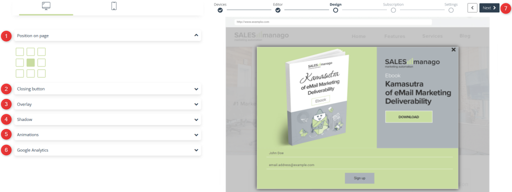
If you have already created your pop-up in Designer, you can go to its Design settings on the website.
[1] Position on page – a function that allows you to adjust the location of the pop-up on the website.
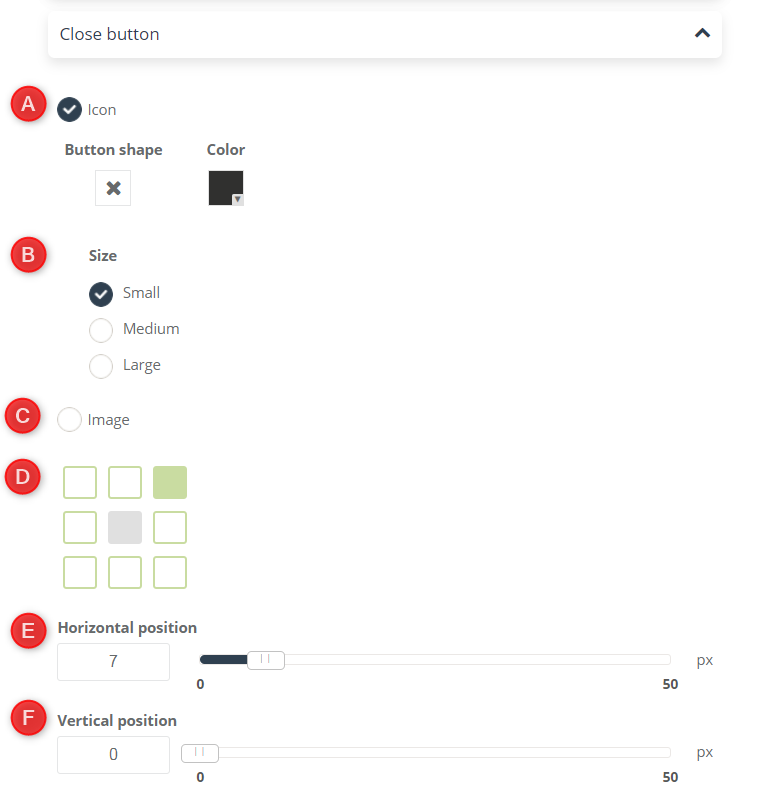
[2] Close button – change the settings of the appearance and position of the button responsible for closing the pop-up on the website.
[A] Icon – selecting this option will set the icon as a closing button on the pop-up. You can freely change its color and choose a shape from the following:
[B] Size – adjust the size of your icon choosing from the available sizes.
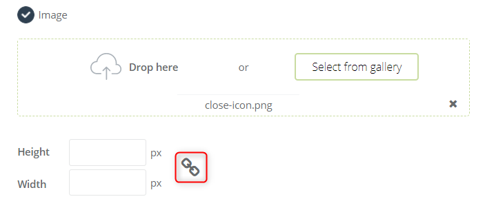
[C] Image – as a closing button you can also choose any image from the gallery or drop a picture in the given place to add it straight from your computer.
You can freely change the size of the picture by entering the sizes you are interested in. The element marked in the picture is responsible for changing the height and width values proportionally with each other.
[D] Button location – function that allows you to adjust the location of the closing button on the pop-up.
[E] Horizontal position – set the horizontal shift of the closing button in relation to the place selected in point [D].
[F] Vertical position – Set the vertical shift of the close button from the location selected in [D].
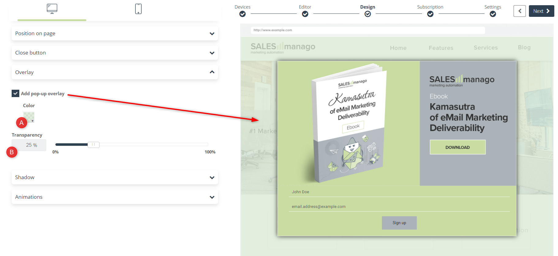
[3] Overlay – the overlay is an element of the pop-up background displayed on the website. You can add it freely and change its settings:
[A] Color – choose a color for the background behind your pop-up.
[B] Transparency – you can freely change its transparency to match the appearance of your website.
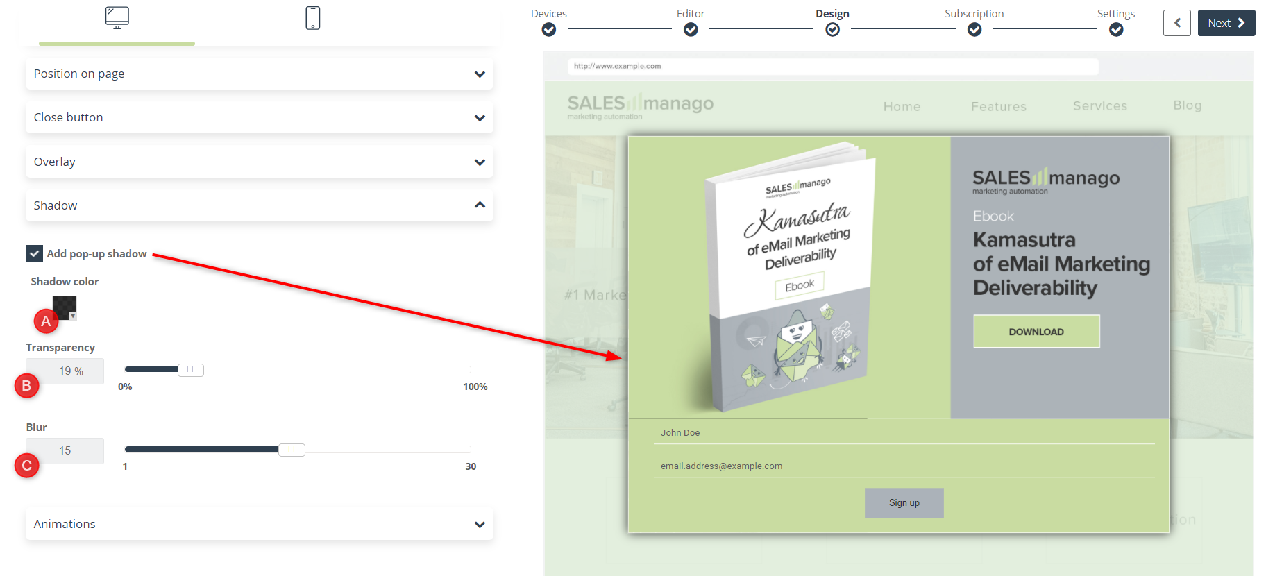
[4] Shadow – add a shadow visual effect for your pop-up, you can change [A] Shadow color to any color, choosing from the available color palette, set its [B] Transparency on a scale of 0–100%, and [C] Blur, i.e. its span.
[5] Animations – allows you to add one of the available pop-up display effects on the page.
[6] Google Analytics – optionally you can add parameters to monitor marketing effects in Google Analytics.
[A] Campaign – enter the value of the utm_campaign parameter.
[B] Medium – enter the value of the utm_medium parameter.
[7] Next – click to go to the next stage of the designer.
7. Subscription – confirmation of completing the form
If you have included a contact form in your pop-up, an additional settings window will appear. These are the subscription settings:
[1] Confirmation – in order to join your contact database, the client must confirm subscribing to the sending of messages, for this purpose:
[A] Select email – choose one of the previously created email templates confirming subscription.
[B] Preview – you can click the preview button to preview how it is displayed to recipients.
[C] Create new – click to go to Email Designer and create a new message confirming subscription.
[D] Sending account – select the account from which the email will be sent.
[2] Contact – forms in Custom Modal Designer are progressive, if you want contacts who previously agreed to receive emails not to receive a message confirming subscription, select the checkbox below:
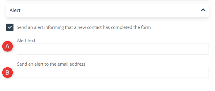
[3] Alert – this option allows you to send an alert informing about the appearance of a new contact in your contact database.
[A] Alert text – enter the content of the email message you will receive when a new contact fills in the form. The maximum number of characters is 255.
[B] Send an alert to the email address – select the email address to which you will receive the notification. You can only enter one address.
[4] Next – click to go to the last stage of the designer.
8. Display settings
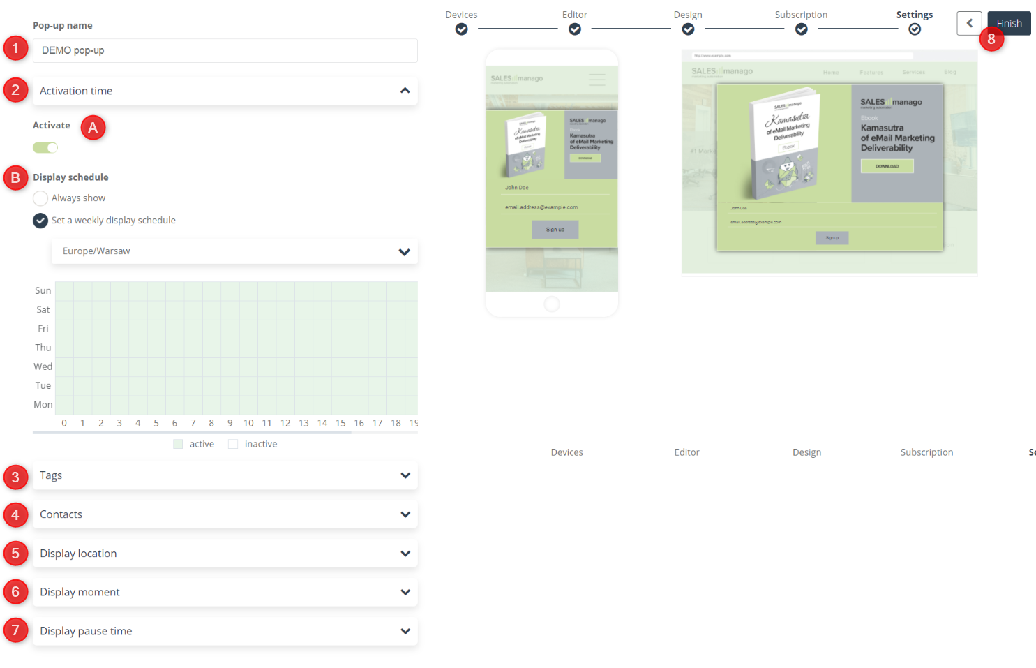
[1] Pop-up name – enter the name of the pop-up, which will later facilitate its identification on the list of your forms.
[2] Activation time – define the time when your pop-up will be displayed on the website.
[A] Activate – click to display your pop-up to users immediately after its creation. If you don’t, you can activate it later from the list of created forms.
[B] Display schedule – specify the time when the pop-up will be available on your website:
- Always show – the pop-up will be displayed to users around the clock.
- Set a weekly display schedule – you can set the availability of the pop-up depending on the given hour of the week.
IMPORTANT: From the drop-down list, select the time zone to which the selected data will apply.[3] Tags – add the selected tag to the contact:
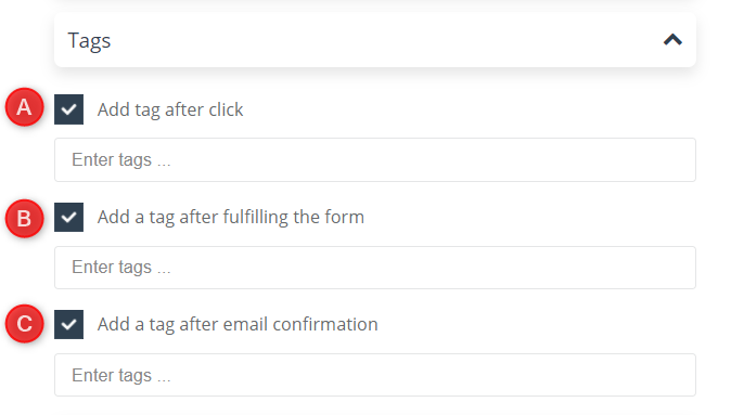
[3] Tags – add the selected tag to the contact:
[A] After click – when the contact clicks on the link or button. A recommended option, especially when setting a pop-up without a form.
[B] After fulfilling the form – when the contact fills in the form, but does not confirm the subscription for the message.
[C] After email confirmation – when the contact completes the form and confirms the subscription for the message.
[4] Contacts – define which contacts will display the pop-up:
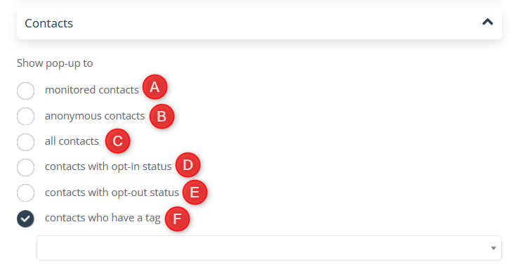
[A] Monitored contacts – that is contacts saved by a form that was created in the SALESmanago system (sidebar, form, pop-up, landing page), and to whom the smclient cookie will be automatically assigned.
[B] Anonymous contacts – contacts who have not signed up using any form created in the SALESmanago system.
[C] All contacts – every user visiting your website.
[D] Contacts with opt-in status – that is contacts signed up on sending.
[E] Contacts with opt-out status – that is contacts unsubscribe from sending.
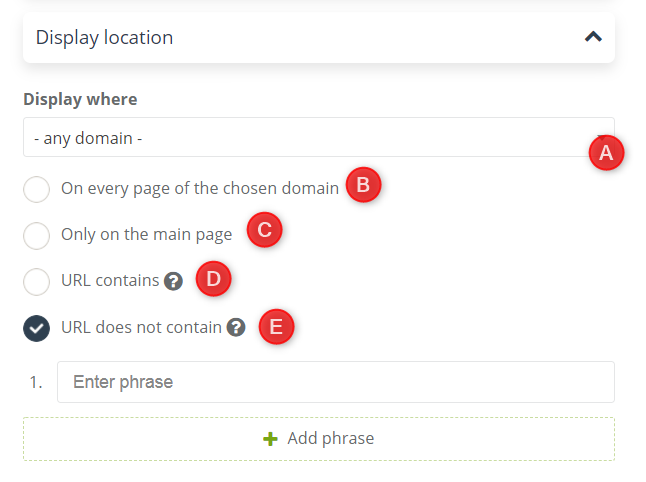
[F] Contacts who have a tag – contacts with a given tag.[5] Display location – define on which pages the created pop-up will be displayed:
[A] Location – select the domain available on the list on which the pop-up will be displayed.
[B] On every page of the chosen domain – the pop-up will be displayed on all pages for the web address selected in point [A].
[C] Only on the main page – the pop-up will not be visible on any of the subpages.
[D] URL contains – the pop-up will be displayed on all pages within the domain whose URL address contains the phrase.
[E] URL does not contain – the pop-up will be displayed only on pages whose URL address does not contain the phrase.
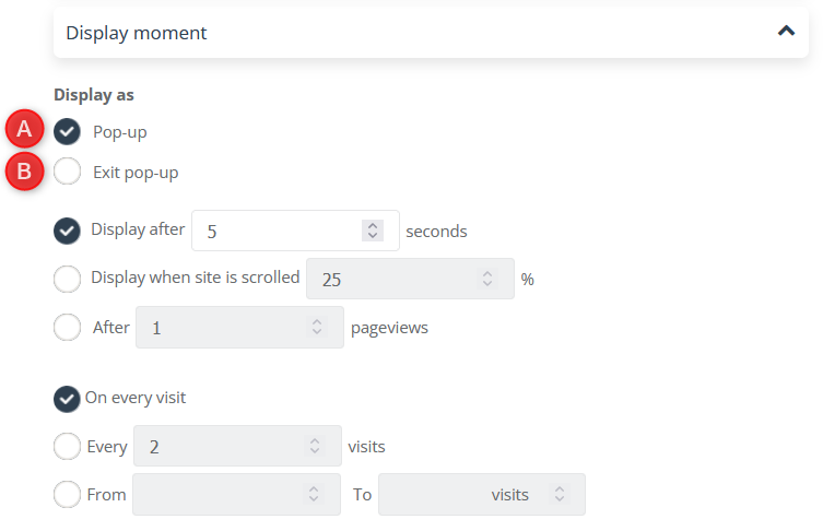
[6] Display moment – allows you to adjust the time from entering the page, after which the pop-up will be displayed:
[screen Moment wyświetlania ENG]
[A] Display as pop-up – the window will pop up after entering the website, taking into account the display conditions set, that is:
- Display after “x” seconds – the pop-up will be displayed after the selected number of seconds after the user enters the site.
- Display when site is scrolled x% – the pop-up will be displayed after the user scrolls the page by the selected percentage.
- After “x” pageviews – the pop-up will be displayed after the selected number of pages viewed (each page visited during the visit counts as a new page view).
- On every visit – display a pop-up every time the user visits the site. Remember that one visit is counted once every 3 hours.
- Every “x” visits – display a pop-up every given number of visits, e.g. for setting every two visits, the pop-up will be displayed on the first, third, fifth etc.
- From “x” to “y” visits – display a pop-up in the selected visit interval.
[B] Display as exit pop-up – the pop-up will be displayed at the moment when the user wants to leave the page.
[7] Display pause moment – allows you to block the pop-up from being displayed again when:
[A] The user clicks the close button – clicking the “x” button will block the pop-up from being displayed again.
[B] The user clicks on the overlay – the pop-up will not be displayed again if the user clicks on the area outside it.
[C] The user clicks on the linked element – option recommended for pop-ups without a form. Clicking on any link or button will block the pop-up from being displayed again.
[8] Finish – click to create a pop-up.
IMPORTANTThe pop-up created in Custom Modal Designer will be visible on the list of your pop-ups along with analytics of displayed, submitted and clicked.
