SALESmanago provides you with many features that help your business grow and what is more, it increases sales significantly. Thanks to the features, you can personalize contact with your clients and offer solutions that are tailored to their needs and expectations.
We are fully aware that so many features for first-time users of our system can cause that you do not really know what to start with. For those clients, we have prepared so-called first steps which will help to introduce and use new features almost immediately.
Advantages:
- That’s a perfect solution for first-time users of our system
- You can introduce and use new features of our system almost immediately
- You get access to the most important and basic features almost immediately, what lets you see the benefits of using SALESmanago system
When you log in to the system, you see the first steps in the upper part of the window. There you can find 13 steps with two levels of advancement. You can go one-by-one or click and select steps by clicking the dots on the axis.
Content:
First steps in the system:
- Step 1: Implementation of the monitoring code
- Step 2: Pop-up form
- Step 3: Live Chat
- Step 4: Web push agreement form
- Step 5: Import of contacts
- Step 6: Sending emails
- Step 7: Segmentation matrix
- Step 8: Automation rules
- Step 9: Live Chat
- Step 10: Business dashboards
- Step 11: Personalized banners
- Step 12: Custom Audience
- Step 13: Bot
STEP 1. IMPLEMENTATION OF THE MONITORING CODE
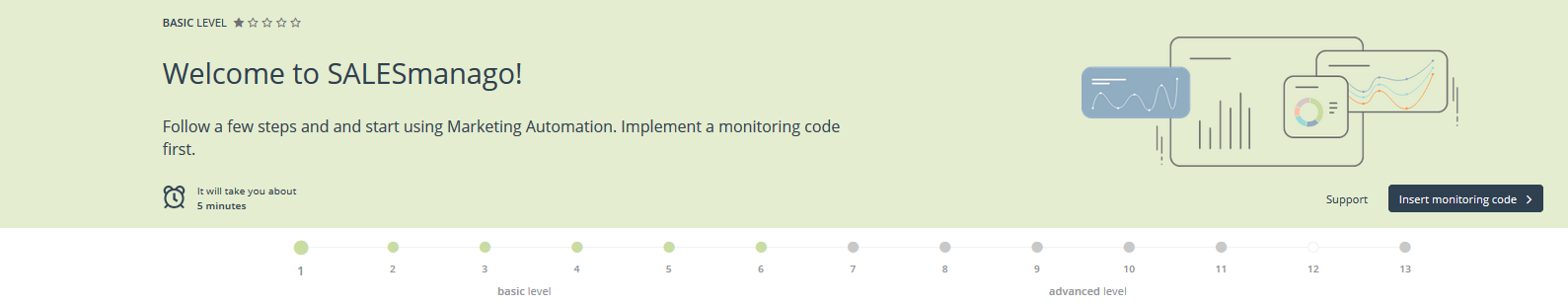
Level: basic
You need: 5 minutes
Support: Monitoring code – integration
Monitoring (or tracking code) lets the SALESmanago system gather data on a website. Thanks to the code, it is possible to track user activity on your website. Each of our clients gets a unique monitoring code when they activate their account. It’s necessary to implement the tracking code in order to take advantage of the full system potential.
Click Insert monitoring code and select one of the options:
- I have eCommerce platform if you have an e-shop on one of the platforms and you want to integrate it with SALESmanago. Thanks to such a solution the monitoring code is inserted automatically.
- I want to implement the monitoring code in the source code of my website. When you select this option, you can:
– copy the code and paste it in the source code of your website or send the monitoring code to the website Admin
– implement monitoring code using Google Tag Manager
STEP 2. POP-UP FORM
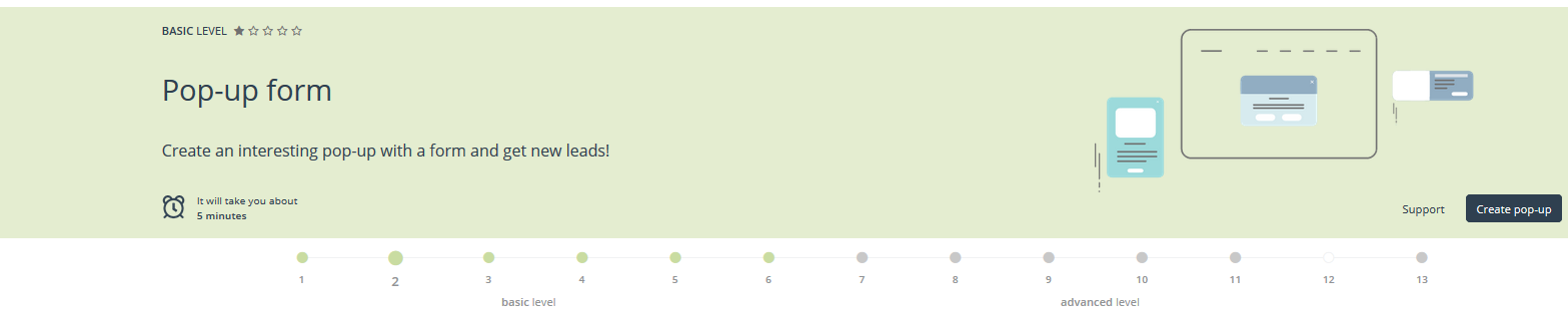
Level: basic
You need: 5 minutes
Support: Wizard: Pop-up / Exit Pop-up Express
Contact forms are one of the most effective ways of generating leads on a website. In the new Express form builder, you can design clean, eye-catching pop-up contact forms quickly and easily. Each anonymous contact who submits a contact form is saved in your CRM database as a monitored contact, letting you track their behavior – subsequent visits, interests, time spent on the website, and so on. Over time, each monitored contact’s behavior profile becomes more complete, which allows you to create more effective automation processes.
Click Create pop-up. Then you are welcomed in the Pop-up Express. Click Start and you can create your form.
STEP 3. LIVE CHAT
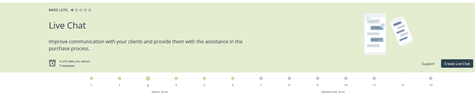
Level: basic
You need: 7 minutes
Support: Live Chat: adding a chat
Live Chat lets you communicate with your customers in a fast and efficient way. It enables you to react immediately to all queries and problems, thus, also to build a relation and the atmosphere of trust at the same time. What is more, Live Chat is an effective tool to generate new leads and manage new clients since Live Chat is fully integrated with the SALESmanago features.
Click Create Live Chat to configure the consultant, create Live Chat and add it to the website. You can also adjust its look and change settings.
STEP 4. WEB PUSH AGREEMENT FORM
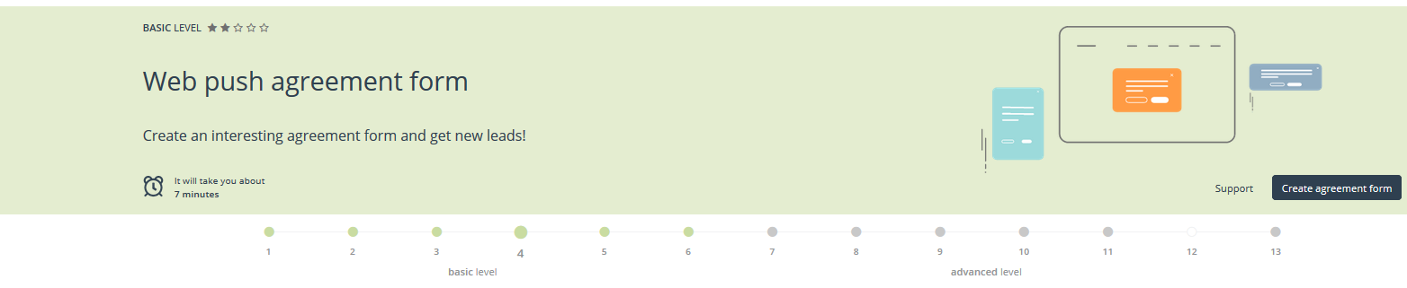
Level: basic
You need: 7 minutes
Support: Web Push – agreement form
An agreement form is the first step towards Web Push and Rich Web Push notifications. You can send Web Push notifications and Rich Web Push notifications to each person who agrees to receive them in an agreement form. While accepting the subscription, a user does not need to fill in any personal details (for example, email address), so you will multiply easily your recipient group.
Click Create agreement form in order to create an attractive form that enables getting agreements from your clients and next, communication with them via Web Push notifications is possible.
STEP 5. IMPORT OF CONTACTS
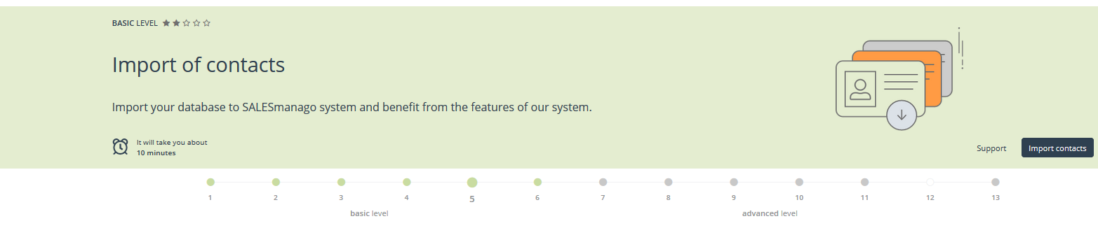
Level: basic
You need: 10 minutes
Support: Import of contacts
With SALESmanago you can easily import contacts from contact files. By means of export, you can – apart from basic information, such as email address and name of the contact – get more detailed information about the contact and save it aa a detail or tag. Additionally, imports can take place on a regular basis. Each time you want to add new contacts, update or delete data for some particular contacts, you can import data.
Click Import contacts and you can import data from a file step-by-step.
STEP 6. SENDING EMAILS
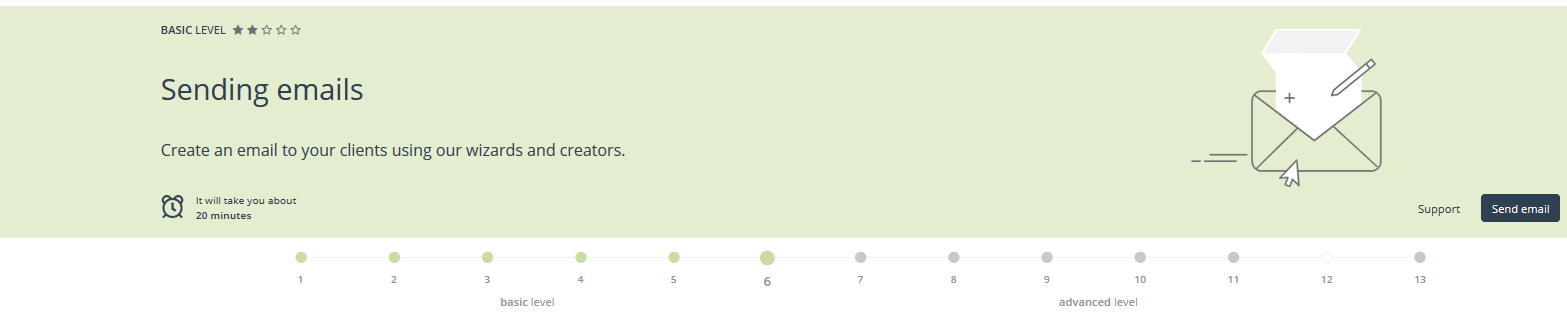
Level: basic
You need: 20 minutes
Support: Send email
SALESmanago consists of effectively functioning Email Marketing channel with a possibility of sending emails in various places in the system. Scheduling the sending dates of emails is a huge convenience that makes a great impact on the comfort of work in marketing departments.
Click Send emails. You will be welcomed in Drag&Drop Email Designer. Click Start and create your email step-by-step.
STEP 7. SEGMENTATION MATRIX
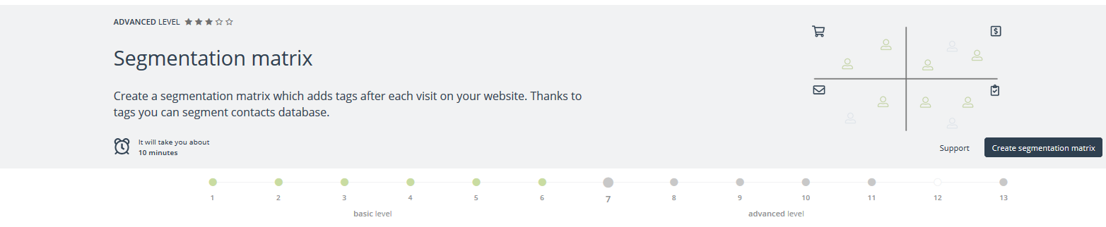
Level: advanced
You need: 10 minutes
Support: Segmentation Matrices Wizard
Segmentation Matrices Wizard is used to segment your contacts. You can create a matrix that will add tags to contact after its every visit on the website. It is possible to set a matrix with the Wizard or in the Automation Processes.
Click Create segmentation matrix in order to set a matrix which will add tags after each visit of the contact on your website. That will enable segmentation of contacts.
STEP 8. AUTOMATION RULES
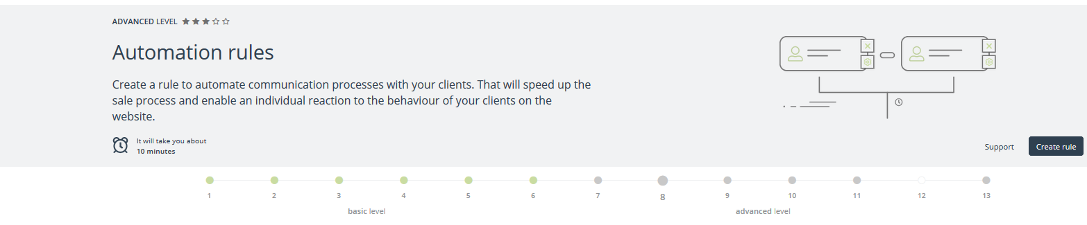
Level: advanced
You need: 10 minutes
Support: Adding a new automation rule
In SALESmanago system you can use automation rules to create advanced processes of marketing and sales activities.
Click Create rule in order to automate communication process with your clients. That will speed up the sale process and enable an individual reaction to the behaviour of your clients on the website.
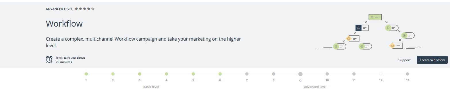
STEP 9. WORKFLOW
Level: advanced
You need: 25 minutes
Support: Workflow: creating an automated campaign
The purpose of Workflow is to help plan and automate marketing campaigns. It lets you easily set even complex campaigns in order. All registered contact activity can be used as events or conditions to trigger actions. Workflow campaigns can be adjusted to meet the demands of a project, allowing the creation of sophisticated marketing campaigns.
Click Create Workflow in order to create a complex, multichannel Workflow campaign and take your marketing on the higher level.
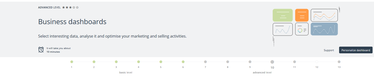
STEP 10. BUSINESS DASHBOARDS
Level: advanced
You need: 10 minutes
Support: Business dashboards
Business dashboards are the analytical panels which enable your own configuration of the dataset. You can decide what kind of statistics you want to see once you log into the system. This way all parameters received through the ongoing campaigns become measurable, and what’s more, they can be analyzed and the activities optimized. Two sets of editable dashboards have been pre-prepared which show the data concerning the marketing and sales activities.
Click Personalize Dashboard in order to select interesting data, analyse it and optimise your marketing and selling activities.
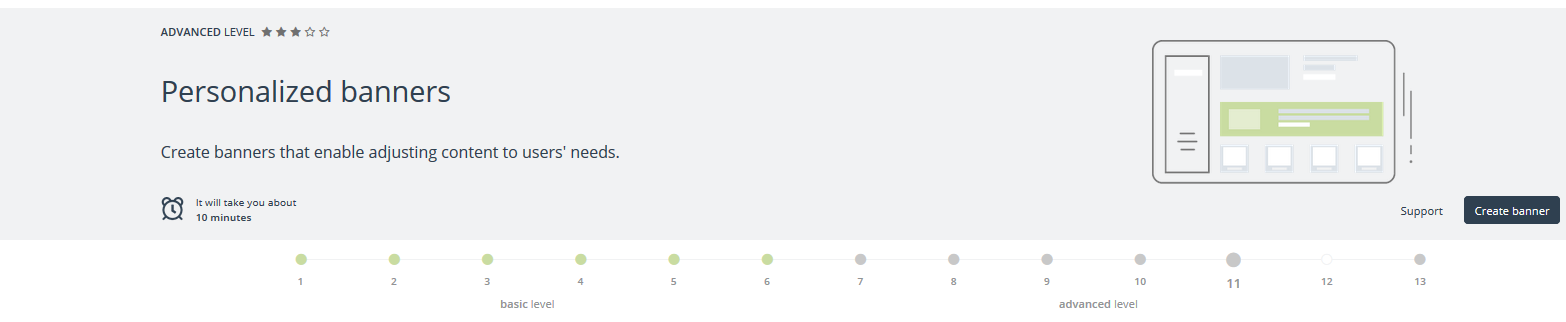
STEP 11. PERSONALIZED BANNERS
Level: advanced
You need: 10 minutes
Support: Personalized banners
Personalized banners allow you to tailor the content from the newsletter or on your website to specific user’s interests. This content can be adjusted by the segmentation tool or the stage of the funnel where the contact belongs. The content can also be adjusted to the automation rules tool.
Click Create banner and you can create interesting banners step-by-step.
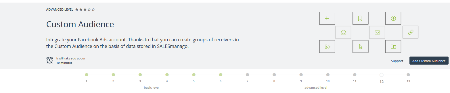
STEP 12. CUSTOM AUDIENCE
Level: advanced
You need: 10 minutes
Support: Add Custom Audience
While integrating SALESmanago with Facebook Ads you can create a group of the audience called Custom Audience. You can create a new group or choose any of the already existing one if an ad account has been authorized before.
Click Add Custom Audience and integrate your Facebook Ads account. Thanks to that you can create groups of receivers in the Custom Audience on the basis of data stored in SALESmanago.
13. AUTOMATIC SALES CHAT
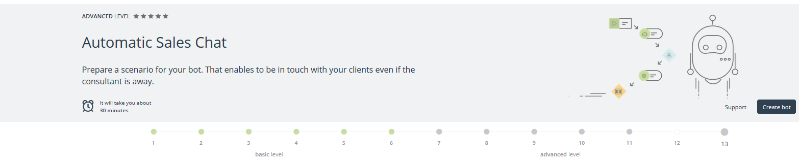
Level: advanced
You need: 30 minutes
Supprt: Automatic Sales Chat
Automatic Sales Chat is a smart bot which can be integrated with Facebook to replace customer service in cases where their work can be automated. It is a highly practical solution for any business that has to deal with customer queries on a regular basis.
Click Create Bot in order to prepare a scenario for your bot. That enables to be in touch with your clients even if the consultant is away.
Remember, the introduction of these 13 steps will get you closer to all benefits of our system. It is also the first step to discover more of what we offer.