Useful links
This email designer enables you to create responsive and professional email templates in an easy and fast way. Apart from personalizing the contents of the email with the data that comes from the contact card, you can include recently viewed products by a user or the products from the abandoned cart to increase your sales.
Benefits:
- possibility to create dynamic emails
- possibility to create emails with the products from abandoned carts
IMPORTANT: To add recently viewed products or products from the abandoned cart you need to add XML files to the system which contain the data about the products.
Sending such an email differs from sending ordinary emails. In the designer you have the possibility to create and save the templates of the message. Whereas you can send it by means of automation rules using actions: Send email with last viewed products and Send email after abandoned cart.
To access the Drag & Drop Email Designer, go to
Channels → Email Marketing → Dashboard → + New email → Drag & Drop
Contents
- Choose the product selection strategy
- Choose the layout and adjust general settings
- Choose product fields
- Adjust button settings
- Send an email containing a Dynamic Product Frame
1. Choose the product selection strategy
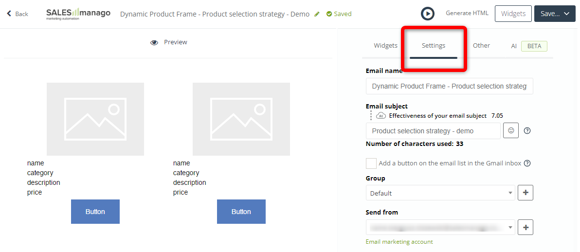
After adding a Dynamic Product Frame (column or row) to your email, go to the Settings tab:
Scroll down to the bottom of this tab to define the strategy based on which product recommendations will be displayed to individual recipients of your email.
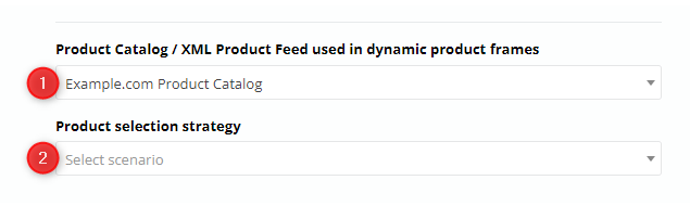
[1] Product Catalog / XML Product Feed used in dynamic product frames—select the source for the product recommendations that will be displayed in this email.
[2] Product selection strategy—choose the strategy based on which the SALESmanago system will recommend products to individual recipients of this email.
After selecting an item from the list, you will see a specification of the strategies that will be applied to individual product spaces.
EXAMPLE:
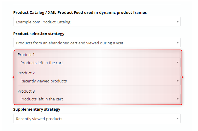
Products 1 and 3 will be selected from among the products that individual Contacts have added to their carts but not purchased. Product 2 will be selected from among the products that have recently been viewed by individual Contacts.
If you manually change the scenario for any of the products, the value in the Product selection strategy field [2] will change to Own. This way you can design your own custom strategy.
A good option is to select a supplementary strategy, i.e., the strategy that will be used to fill any empty product spaces (if the number of products recommended based on the main scenario is smaller than the number of product spaces in the widget). This maximizes the chance that all the spaces in the Product Frame will be filled—and the email will be sent.
IMPORTANT: If the number of products that can be recommended to a Contact based on both the main and supplementary strategies is smaller than the number of spaces in the Dynamic Product Frame, the email will not be sent to that Contact.
However, if you select one of the following strategies:
- Products left in the cart,
- Recently viewed products,
and you do not select any supplementary strategy, the email will be sent even if there are fewer products than product spaces.
2. Choose the layout and adjust general settings
Once you start your work in editing mode, choose Product frame (column) or Product frame (row) from the Widget tab according to your preferences about how you would like the products to be displayed in the frame. Choose the widget and drop it into the chosen space in the email.
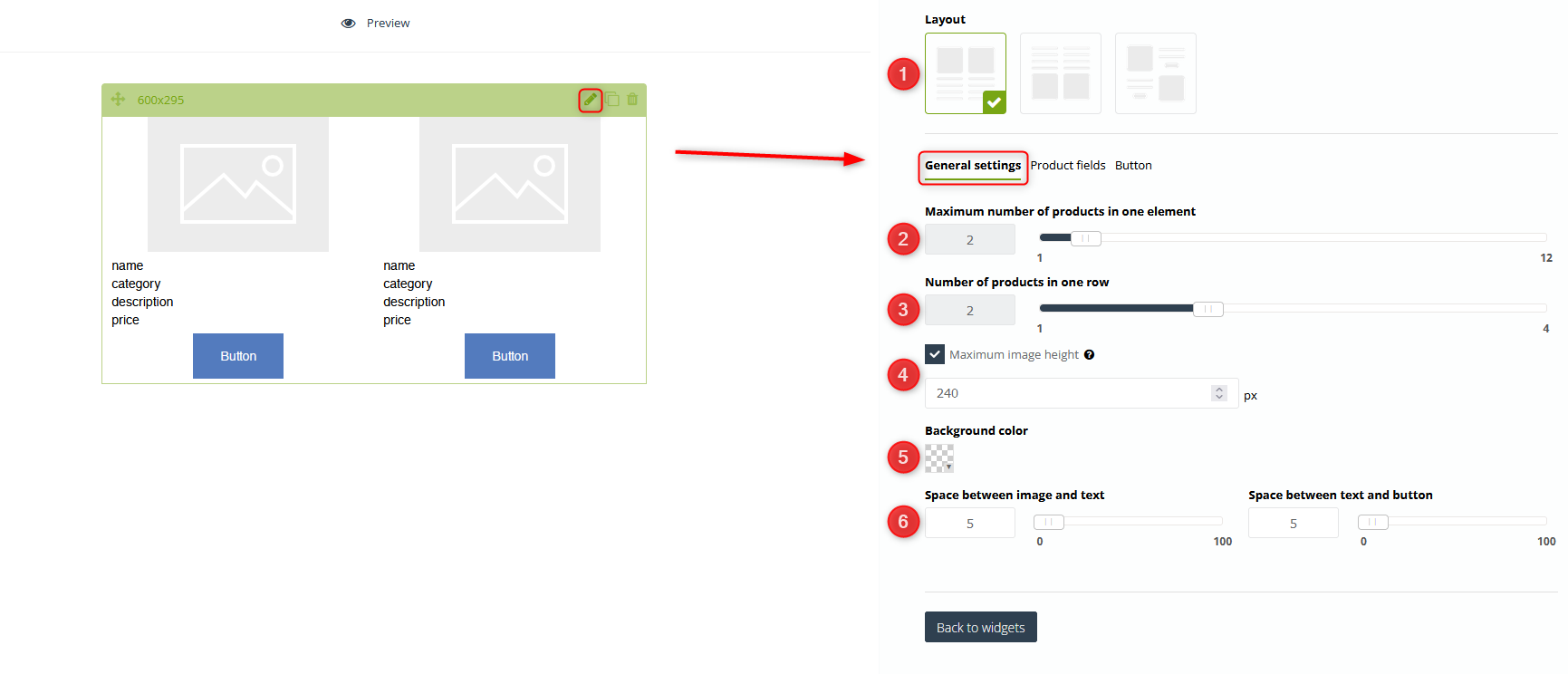
[1] Layout – choose one of three available layouts in which the product will display in the frame.
[2] Maximum number of products in one element – use a slider to select the maximum number of products that will be displayed in the frame.
IMPORTANT: In the case of the email with the products from abandoned cart, if the number of products in the cart will exceed the maximum number of products in the element, then the message will be filled up to the maximum number of products in the element, e.g. if the cart contains 4 products and the maximum number of products in one element amounts to 3, it means that the email will include 3 products. If it comes to the email with recently viewed products, if the user viewed 2 products and the maximum amount of products amounts to 4, it means that the message will contain two additional products apart from those two that were viewed. Those extra two products will be chosen on the basis of category.
[3] Number of products in one row – use a slider to adjust the maximum amount of products that will display in one row. If this number amounts to only one product, and if the maximum number of products in one element will be greater, the products will be moved below.
[4] Maximum image height – when the maximum height is set, larger photos larger will be adjusted proportionally.
[5] Background color – choose a color from a color palette. To do so, you need to untick transparent checkbox first.
[6] Set space between the image and the text or the text and the button.
3. Choose product fields
You can choose information that you want to display about the product in this tab. By default, it is name, description, category, and price. If the XML file includes non-standard information about the product (e.g. discounted price or detail) you can add them by clicking + on the chosen information. In the effect, this piece of information will appear in the text field.
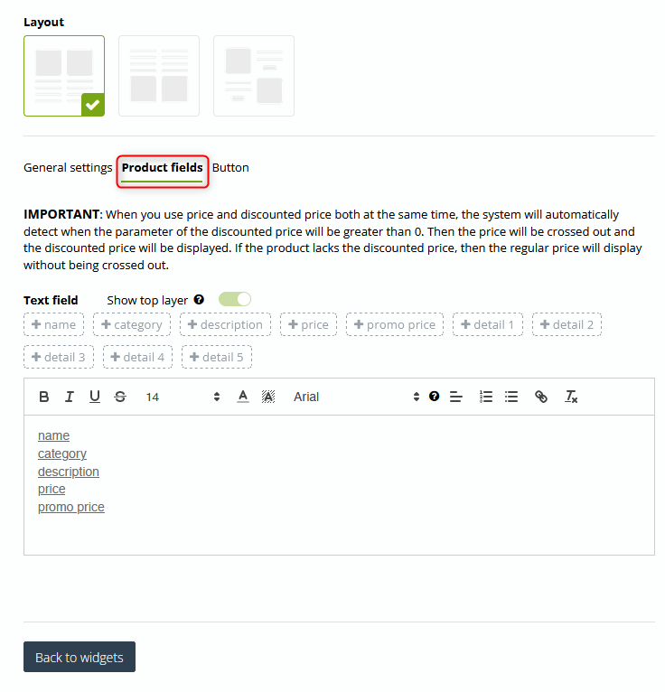
Product fields – by standard, XML files include 4 basic information about a product: name, the category of the product, description, and price. If the file contains non-standardized information such as details or discount price, you can add them in the tab. To do so, you need to click [ + ] on the tag with the piece of information.
You can freely edit the font in the product frame. Mark the information which appearance you would like to edit. You can change the font type and size, make it bold or underlined. You can choose colors, add links and insert bullets.
IMPORTANT: Checking Show top layer makes the text box change its background color according to the color selected for the widget. When clicked, the option will also become active for other widgets.
4. Adjust the button settings
In this tab, you can customize the appearance of the button.
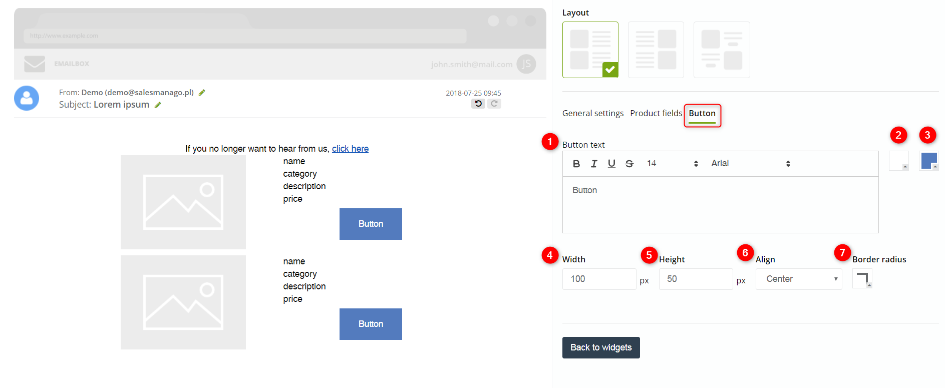
[1] Button text – type in the text you want to display on the button that redirects the user to the website of the product. You can freely edit the font, change its type and size, make it bold, set italics, underline it.
[2] – choose the font color on the button.
[3] – choose the background color of the button
[4] Width – adjust the width of the button measured in pixels or adjust it by means of arrows.
[5] Height – adjust the height of the button measured in pixels or adjust it by means of arrows.
[6] Align – adjust the adjustment of the button, center the button or set it either on right or left side.
[7] Border radius – choose the degree of the corner rounding of the button.
IMPORTANT: Because the link that redirects the user to the website of the product is automatically added to the button, you don’t need to add it by yourself in the tab.
5. Send an email containing a Dynamic Product Frame
An email containing a Dynamic Product Frame cannot be sent directly from the Drag & Drop Email Designer (or any other SALESmanago email creator). It cannot be sent from the Email List, either.
To configure an email with a Dynamic Product Frame to be sent, create an Automation Process including the Action: Send email to Contact >> and select the email in the Action’s settings:
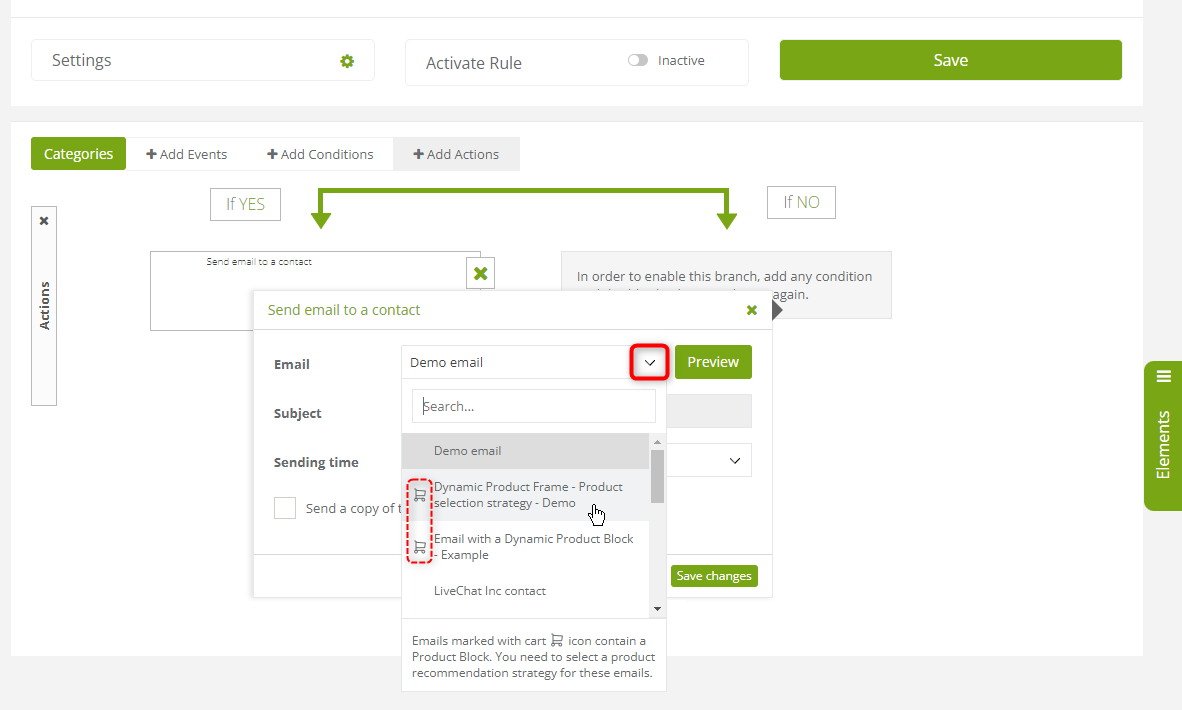
Note that emails containing a Dynamic Product Frame (Drag & Drop) or a Dynamic Product Block (Email Design Studio) are marked with a cart icon on the list.
Submit your review | |