The form appears on the website and contains fields that contact can fill in. SALESmanago lets you create and set your own contact forms in express designer in several minutes.
Benefits:
- you can place it statically on the website
- generating contacts
- you can easily replace another form with the one you create which integration is simpler
This is an exemplary form created with the designer:

In order to create a form in the Express wizard, you need to go to
Web Tools → Lead Generation → Lead Generation forms → Form → + Create new → Express
Contents
- Choose the type of the form
- Adjust the settings of the form
- Adjust the settings of thank you page after subscription
- Adjust the settings for the confirmation email
- Display settings
1. Choose the type of the form
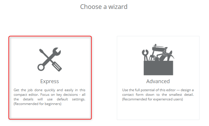
[A] Choose the type of the form – in the first step you need to choose the type of the form that will display on your website. You can edit it freely later on.
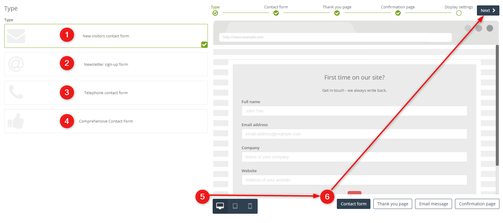
[1] New visitors contact form – choose a form dedicated to new customers.
[2] Newsletter sign-up form – choose a form designed for a subscription.
[3] Telephone contact form – choose a form that is designed to acquire a telephone number.
[4] Comprehensive Contact Form – choose a multi-purpose contact form.
[5] Form preview – check how your form looks on a screen, tablet or smartphone.
[6] Form preview – you can check how the form and a screen after subscription look like.
2. Adjust the settings of the form
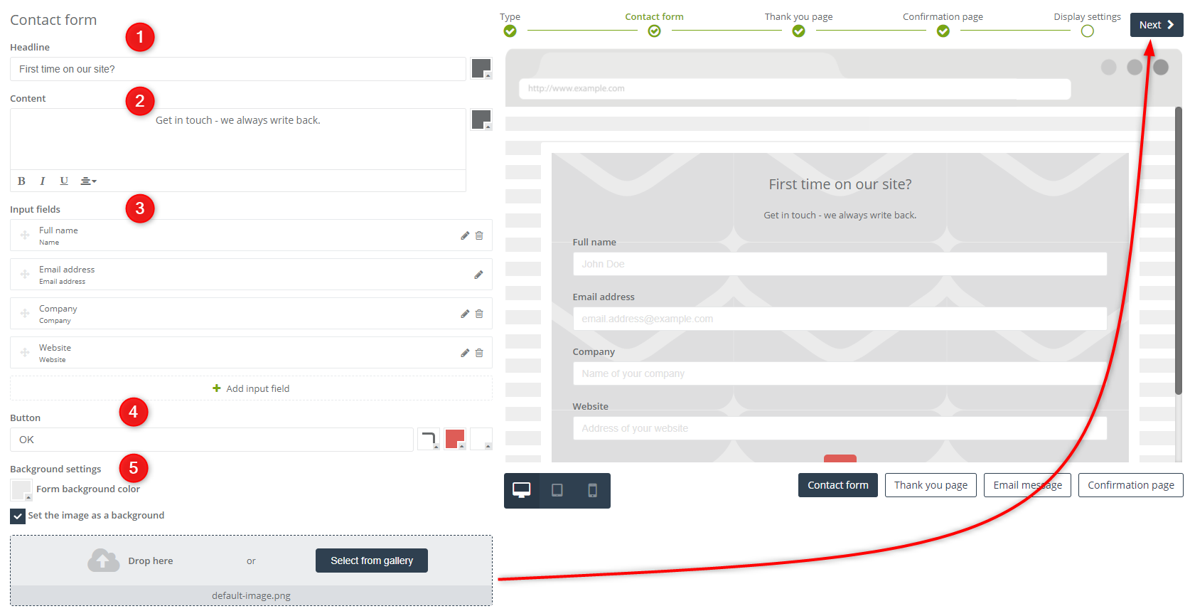
[1] Headline – type in the text that will display as a headline in the form. Find a colour picker on the right side of the field and change the colour of the font.
[2] Content – type in the description that will display in the form under the headline. The text field lets you edit the font (bold, italics, underlining) and text alignment. Find a colour picker on the right side of the field and change the font colour.
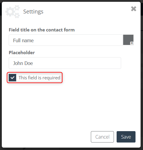
[3] Input fields – you can find fields that are currently displayed on the form. You can find a pencil icon and a bin icon on each input field. Once you click the pencil, you will go to the settings of the field. You can change its name or the font color, type in the text in the placeholder or select whether the edited field is required.
To add a new field you only need to click + Add input field and from the dropdown list choose the kind of information you want to ask. Next, you need to confirm the new field on the right side of the field. You can also change the field arrangement in the form, just hover the cursor on the left side of the field, drag it and drop it in a chosen place.
IMPORTANT: You cannot change the name of the fields in the system. It is connected with mapping the information from the contact card to the system. You cannot either delete an email address field because it is necessary for monitoring contacts.
Available input fields
- Full name
- Email address
- Phone number
- Date of birth
- Street address
- Company
- City
- Region
- Postal code
- Country
- Position
- Website
- Any text
- Agreement
- Custom detail – fields to type the contact data in
- Consent from consents list – checkbox to agree for receiving emails
- Selection options – allows adding radio buttons (single selection) or checkboxes (multiple selections)
- Selection list – allows creating drop down list with the options displayed in the form of the selection list.
- Loyalty Program
The description below contains information about selection options notifications (radio button and checkbox) and selection list notifications:
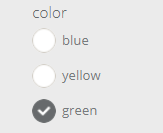
[a] radio button
Adding the radio buttons to the form allows respondents to choose one of any given by you options available to choose between
IMPORTANT: chosen by the user option will be saved on the contact card as a detail.
The view of exemplary radio buttons on the form:
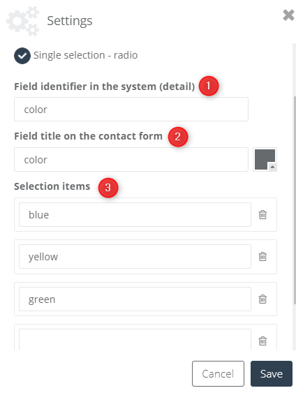
[a1] Field identifier in the system (detail) – type the name of the detail, which will be saved on the contact form including chosen by the user answer (saved as a detail value)
[a2] Field title on the contact form – type the name of question, which will be displayed on the pop-up.
[a3] Selection items – possible options (answers) to choose between assigned to the given question. The option chosen by the user will be saved on the contact card. (the detail name should be typed in the 1st point)
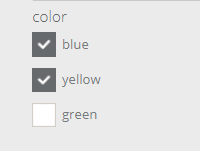
[b] checkbox
Adding the checkboxes to the form allows the contact to have a multiple selections of answers on the specific field. Typing the chosen data in checkbox settings you have to consider both the value and the detail of elements.
IMPORTANT: chosen by the user option will be saved on the contact card as a detail.
The view of exemplary check buttons on the form:
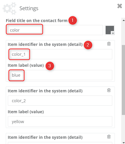
[b1] Field title on the contact form – type the name of question, which will be displayed on the pop-up.
[b2] Item identifier in the system (detail) – type the name of the detail, which will be saved on the contact form including the answer chosen by the user (saved as a detail value)
[b3] Item label (value) – possible options (answers) to choose between assigned to the given question. The option chosen by the user will be saved on the contact card. (the detail name should be typed in the 2nd point)
THE TIP: The view attached above shows an exemplary scheme, which should be followed while filling the relevant fields to add checkboxes to the form.
The first field defines a field title on the contact form – in this case: colour, the detail will be the phrase indicating the choice – possible among the available options (it should contain the field title to correctly identify the answer to the given question) ex. colour_1→ represents choosing blue colour; similarly: colour_2→ here: choosing yellow colour. Thanks to this, the information including all the answers assigned to the given question will be placed in the details of the specific contact (in this case about colour).
[c] selection list (drop list)
Adding the field “selection list” just as in the case of radio buttons, there is a possibility of selecting only one option, with this difference that the given options will be displayed in the form of the drop list, not radio buttons.
IMPORTANT: chosen by the user option will be saved on the contact card as a detail.
The view of an exemplary drop list on the form:
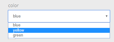
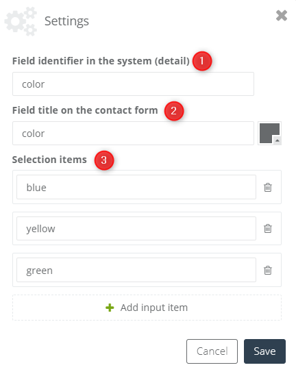
[c1] Field identifier in the system (detail) – type the name of the detail, which will be saved on the contact form including an answer chosen by the user (saved as a detail value)
[c2] Field title on the contact form – type the name of the question, which will be displayed in the pop-up.
[c3] Selection items – possible options (answers) to choose between assigned to the given question. Chosen by the user option will be saved on the contact card. (the detail name should be typed in the 1st point)
[4] Button – enter the text that will display on the button. Find three pickers next to the text field and change the border radius, background colour of the button and the font colour.
[5] Background settings
- background colour – click the colour picker and choose the background colour of the form.
- set the image as a background – tick the checkbox to add your own image to the gallery and set it as the background. If the image is small enough, it will be duplicated instead of being stretched.
3. Adjust the settings of the thank you page after the subscription
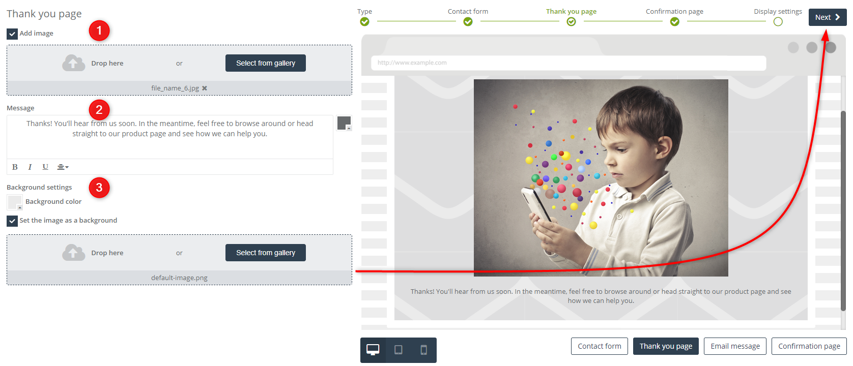
[1] Add image – tick the checkbox to add an image and select it to display in the frame.
[2] Message – type in the text of the message. You can edit the font and change the alignment of the text. Find a colour picker on the right side of the field and change the font colour.
[3] Background settings –
- background colour – click the colour picker and choose the background colour of the thank you page.
- set the image as a background – tick the checkbox to add your own image to the gallery and set it as the background of the thank you page.
4. Adjust the settings for the confirmation email
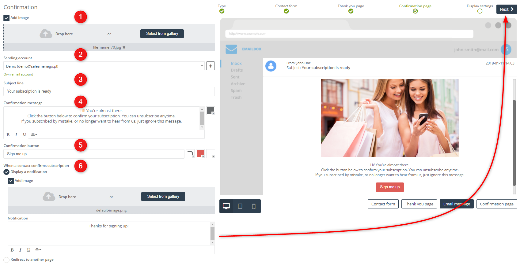
[1] Add an image – tick the checkbox and upload the image you will add in the confirmation email.
[2] Sending an account – from the dropdown list choose a sending account from which you will send the confirmation email. On the right side of the field, you can find [ + ] button that enables you to add a new sending account quickly.
[3] Subject line – type in the subject of the email.
[4] Confirmation message – type in any amount of the editable text in the text field that is the actual message included in the confirmation email. You can edit the font and change its alignment. Find the colour picker on the right side of the screen and change the font colour.
[5] Confirmation button – enter the text that appears on the button that confirms the subscription.
[6] When a contact confirms a subscription
- display a notification
add an image – tick the checkbox to upload the image.
notification – enter the text that will appear on the notification after the user subscribes.
- redirect to another page
page URL – enter the URL address of the page where the user will be redirected after confirming the subscription.
5. Display settings
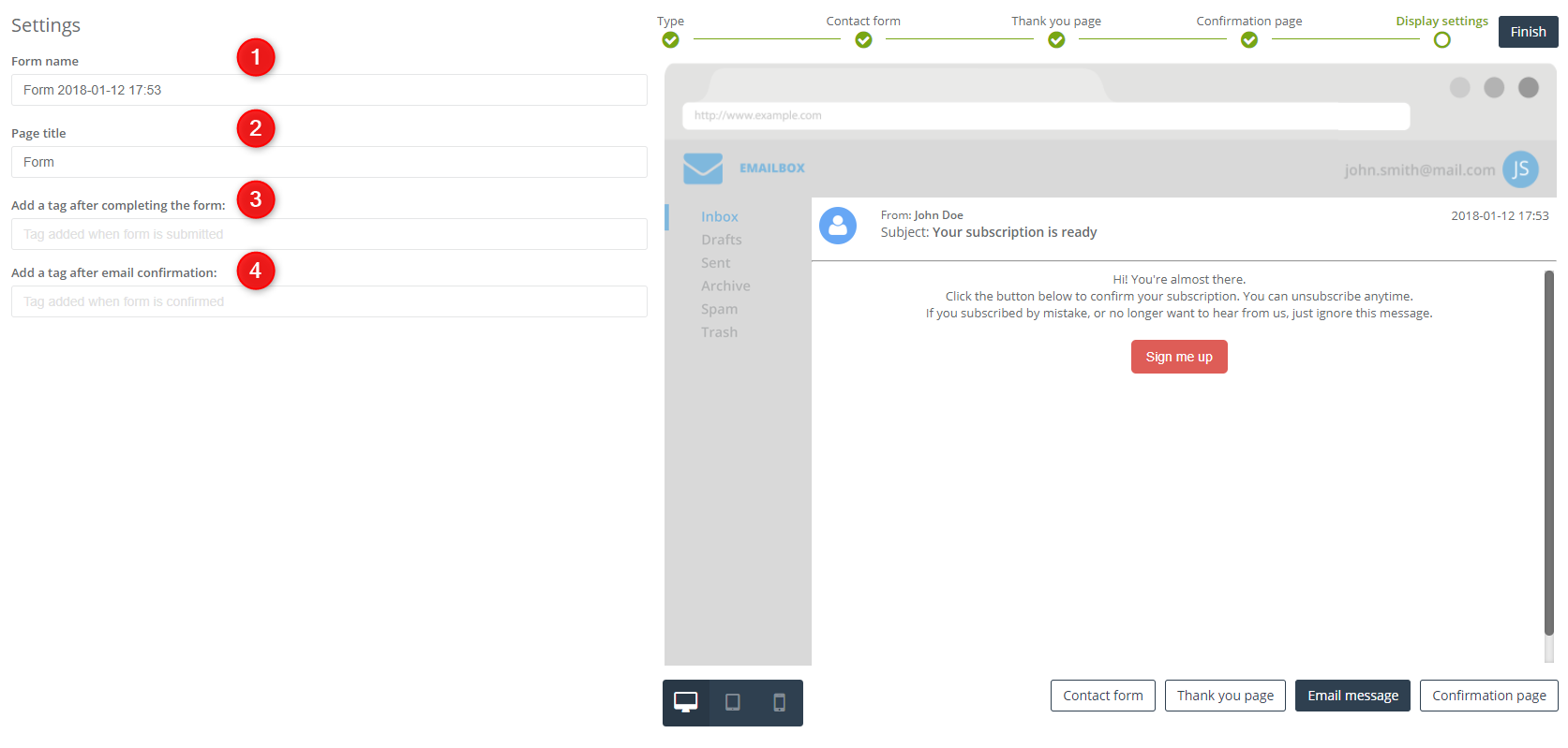
[1] Form name – type in the name of the form under which you can find it in the system.
[2] Page title – type in the text that will display on the browser tab when the only thing that displays on the website is the form.
[3] Add a tag after completing the form – enter the name of the tag that is assigned to a contact after completing the form.
[4] Add a tag after an email confirmation – enter the name of the tag that is assigned to contacts after they confirm the subscription.
Once you’re done click Finish to save the form.
Next, a pop-up window will display. You will find there a code that you need to paste into your website.
IMPORTANT: The code is responsive. That is why you don’t have to adjust the parameters in the designer because the code will adjust the size of the form to the size of the website and it will scale automatically.
