The Personal Shopping Inbox is a revolutionary website widget that combines One-to-One Messaging, Wishlists, Special Offers, and Recommendations in one fully customizable personal space. This tool is a goldmine for those who care about their revenue and want to augment the experience of their online store. At the same time, it is an extremely useful source of zero- and first-party data.

To create a Personal Shopping Inbox, go to
Personal Shopping Inbox → +New Personal Shopping Inbox
Contents
1. Basic Information
2. Create New Personal Shopping Inbox (Under the button)
a. Devices
b. Display settings
c. Design
d. Product fields
e. Settings
3. Create New Personal Shopping Inbox (Icon)
a. Devices
b. Display settings
c. Design
1. Basic Information
The Personal Shopping Inbox combines the benefits of several marketing tools. First and foremost, it is a notification center and wishlist combined with recommendations and loyalty program information. You can create the widget using an intuitive wizard. It is fully editable, so you can easily adjust it to your website’s layout.
Use Personal Shopping Inbox to boost in-store conversions, increase cart value, as well as to collect zero- and first-party data.

First, select the right wizard. If you want to create a Personal Shopping Inbox that will be displayed as a button that appears on the page, select the wizard Under the button [1]. You can also create a widget that you add to the page as an icon. If you choose to do so, select the Icon wizard [2].
2.Create New Personal Shopping Inbox (Under the button)
To create a new Personal Shopping Inbox, go to Personal Shopping Inbox → + New Personal Shopping Inbox.

Clicking the button will take you to the wizard selection screen.
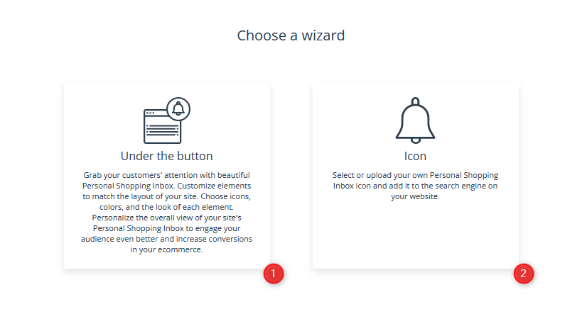
To create a Personal Shopping Inbox that will be displayed as a button on the page, select the wizard Under the button [1]
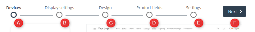
After navigating to a new page and selecting the wizard you are interested in, you will find the Personal Shopping Inbox wizard, which consists of 5 steps:
- Devices
- Display settings
- Design
- Product fields
- Settings
Additionally, you will find a Next [F] button that allows you to move between steps.
A. Devices
The first step in creating a Personal Shopping Inbox is to choose the device you want to display the widget on. In this way, you can better target your campaign message, for example, only to people using smartphones or those using desktops and laptops.

[1] Desktop—Widget will be displayed on computers and laptops only.
[2] Smartphone—Widget will be displayed on phones only.
[3] Desktop & smartphone—Widget will be displayed on all types of devices.
[4] Name—Enter the name of the Personal Shopping Inbox used for identifying it in the system.
The right part of the screen is where you will see a visualization of the widget you are currently working on.
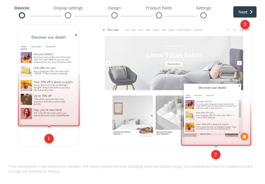
[1] Smartphone preview—A real-time preview showing how your changes affect the appearance of the Personal Shopping Inbox on a smartphone.
[2] Desktop preview—A real-time preview showing how your changes affect the appearance of the Personal Shopping Inbox on a desktop.
IMPORTANT: The notifications in the preview are samples. The newly created Personal Shopping Inbox will be empty, and notifications must be created and sent via the Notification Wizard.
Learn how to create notifications using the wizard >>
When you have made the basic settings, click Next [3].
B. Display settings
On the second screen, you move on to entering data. Here, you specify how the widget and its tabs will be displayed.

If you want the widget to appear on both device types, you will see an option to switch the view and input fields on the top left part of this page. The process for creating both types of notifications is similar and involves completing a sequence of steps. By default, the settings you have made for the desktop view will also be applied to the mobile version. When changing the view, you can manually change the data to make the Personal Shopping Inbox better suited to each device type.
ATTENTION: If you’re making a Personal Shopping Inbox that displays on both computers and smartphones, keep in mind that you’ll need to select the settings for both device types separately, as they won’t be automatically mirrored.
On the website
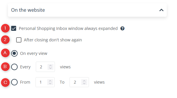
[1] Personal Shopping Inbox window always expanded—Check this box to always display the widget as an expanded window. If you uncheck the box, site visitors will only see a button to click to expand the Personal Shopping Inbox window.
[2] After closing don’t show again—Check this box to prevent the widget from displaying as expanded at each page view. If a contact closes the Personal Shopping Inbox, it will display as collapsed during the next page view and can be expanded by clicking the button.
[A] On every view—Apply the settings you made for each view.
[B] Every X views—Apply the settings to the widget display every X views.
[C] From X to Y views—Apply the settings you entered to the indicated page view interval.
Display in window

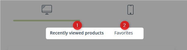
[1] Selecting tabs—By checking the boxes, select which tabs you want to add to the Personal Shopping Inbox.
[2] Selecting tab order—Adjust the order of tabs in the widget by moving individual blocks.
[3] Notifications—Enter the name of the tab [A] and the title of the window [B] that will be displayed to the user when this tab is selected. In Notifications, you can display information about new products and special offers in your online store.
ATTENTION: A character limit is imposed on both of these fields:
- Tab name—20 characters
- Title—30 characters

[4] Recently viewed products—Enter the name of the tab [A] and the title of the window [B] that will be displayed to the user when this tab is selected. Here, the user will find Products they have recently viewed on your site.
ATTENTION: A character limit is imposed on both of these fields:
- Tab name—20 characters
- Title—30 characters
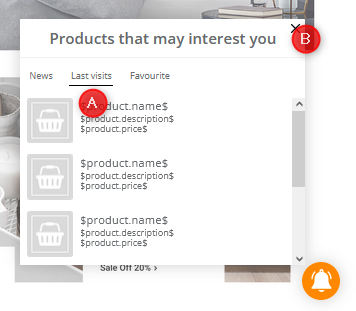
[5] Favorites—Enter the name of the tab [A] and the title of the window [B] that will be displayed to the user when this tab is selected. Here, the user will find the Products they have liked on your page.
ATTENTION: A character limit is imposed on both of these fields:
- Tab name—20 characters
- Title—30 characters
IMPORTANT: To use this feature, you must first add a “like” mechanism to your page.
- Save the creation.
- Copy the code generated in the last step in the “Products” tab.
Technical part of the instruction (for developers)
- Edit the HTML template of your product page.
- Find a place where you want the “like button” to be displayed.
- Add the following div:
- <div data-smproduct=”PRODUCT_EXTERNAL_ID”></div>
- Remember to replace “PRODUCT_EXTERNAL_ID” with the product’s “externalid” parameter (the externalid must match the external ID from your product feed XML).
IMPORTANT: You can also add the code multiple times on the product list page. Every time you add it, use the corresponding product ID.
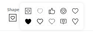
You can further customize the Favorites tab by choosing the shape of the “like” button and its color.
[A] Shape of the “like” button—Click the button to select the desired shape.
[B] Color selection—Click this box to select the color of the “like” button.
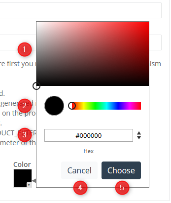
[1] Select color hue—Move the cursor within the rectangle filled with the gradient of the indicated color to select the hue you want to assign to the selected element.
[2] Select color—By moving the pointer left and right, pick the color you want to assign to the selected element. You can adjust the hue of the color by returning to the hue selection box [1].
[3] Enter color manually—Enter the designation of the selected color. Use the arrows to switch between different input methods (Hex, RGB, HSL).
[4] Cancel—Click to cancel the color selection.
[5] Choose—Click to save the selected color.
ATTENTION: If you select colors of any element manually in the wizard, the procedure will be the same or similar. The colors of some elements have an additional parameter: transparency. It can be set with the slider or by entering a value in section [3] Enter color manually in the field marked A.
C. Design
On the Design tab, you can define the visual aspects of the Notification button and Notification window.
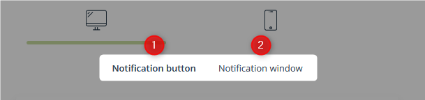
To edit the button settings, select the Notification button [1]. To edit the window appearance, select Notification window [2].
Design: Notification button
Design

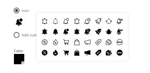
[1] Icon—Select this option if you want to use the icons available in the wizard.
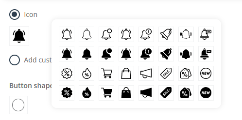
To change the icon shape, click on the image, and in the expanded window, choose the shape that best suits your needs.
[2] Add custom icon—This option allows you to add a custom icon for the notification button.
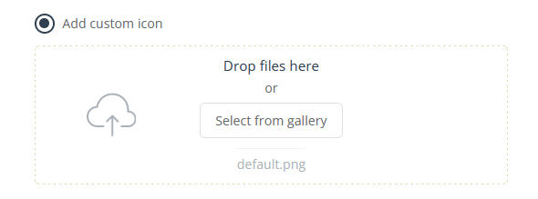
To add an icon, you can either drag an image stored on your hard drive or select a file previously uploaded in the gallery. You can use JPG, PNG, WebP, ICO/CUR, and BMP files as icons. The GIF format is not supported by browsers.
[3] Button shape—Here, you have the option to select the shape of the notification button.
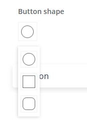
To change the button shape, click on the image, and in the expanded window select the shape that best suits your needs.
Position
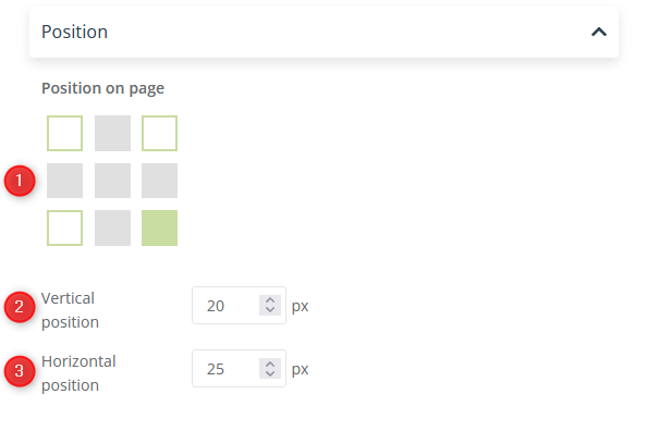
[1] Position on page—Using a simple diagram, select where to display the button on the page. Select the appropriate square by clicking on it.
[2] Vertical position—Use the arrows or manually enter a value (in pixels) for the button’s vertical alignment within the selected page area.
[3] Horizontal position—Use the arrows or manually enter a value (in pixels) for the button’s horizontal alignment within the selected page area.
Color

[1] Gradient—Choose a ready-made gradient color theme for your Personal Shopping Inbox.
[2] Flat color—Choose a ready-made flat color theme for your Personal Shopping Inbox.
[3] Custom settings—Set your own color scheme for Button [A] and Icon [B]. To select a color, click the appropriate box and enter the parameters for the color you are interested in.
Design: Notification window
Design

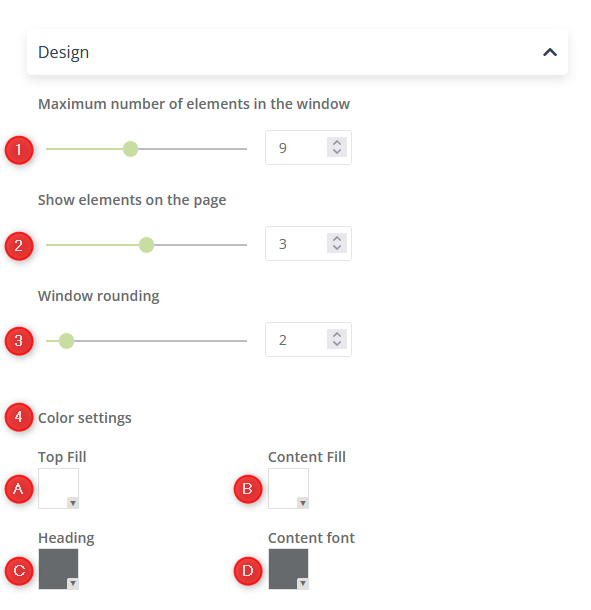
[1] Maximum number of elements in the window—Use the slider or counter to set the maximum number of items (notifications, products) that can be displayed in the window. You can select a maximum of 20 items.
[2] Show elements on the page [only for desktop]—Use the slider or counter to set the maximum number of items (notifications, products) that can be displayed on the page (i.e., how many items the user will see without scrolling down). You can select up to 5 items.
[3] Window rounding [only for desktop]—Use the slider or counter to set the rounding degree of the Personal Shopping Inbox window. The available scale is 0–20.
[4] Color settings—Choose your own color scheme for each item:
[A] Top fill—header background
[B] Content fill—window background
[C] Heading—header font
[D] Content font—window font
To select a color, click the appropriate box and enter the parameters for the color you are interested in.
ATTENTION: For the Smartphone view, you will not set the [2] Show elements on the page and [3] Window rounding items.
Shadow
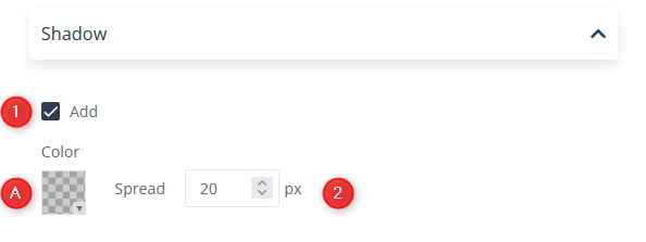
[1] Add—Check this box if you want to add a shadow to the Personal Shopping Inbox.
[A] Color—Select a shadow color. To select a color, click the appropriate box and enter the parameters for the color you are interested in.
[B] Spread—Enter manually or use the arrows to set the spread of the shadow that will surround the window. You can choose a value from 0 to 20.
Font
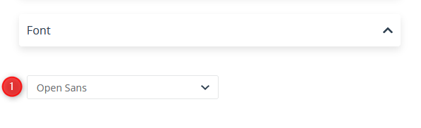
[1] Font—From the drop-down list, select the font that will be displayed as both the header and the window content font.
Closing image
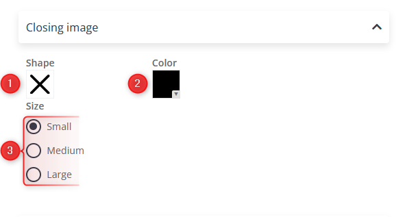
[1] Shape—Click the button to select the desired shape.

2] Color—Click to select the color of the window closing image.
[3] Size—Select the size of the close button.
Tabs
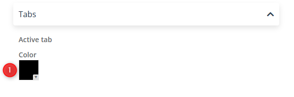
[1] Color—Click this box to select a highlight color for the active tab.
D. Product fields
In the Product Fields tab, you define how the product fields are displayed in the Personal Shopping Inbox.
To edit settings of the tab with history of viewed products select Recently viewed products [1]. To edit the favorite products section, select Favorites [2].
ATTENTION: The editing options and data entry method are the same for both tabs. Note, however, that you must enter the data separately for each tab, as it will not duplicate automatically.
IMPORTANT: To keep track of the changes you make in the wizard, in the preview section, switch the tab on the preview of Personal Shopping Inbox to the one you are working on.
URL

[1] Load a product link—Select this option if you want product links to be automatically pulled.
Details
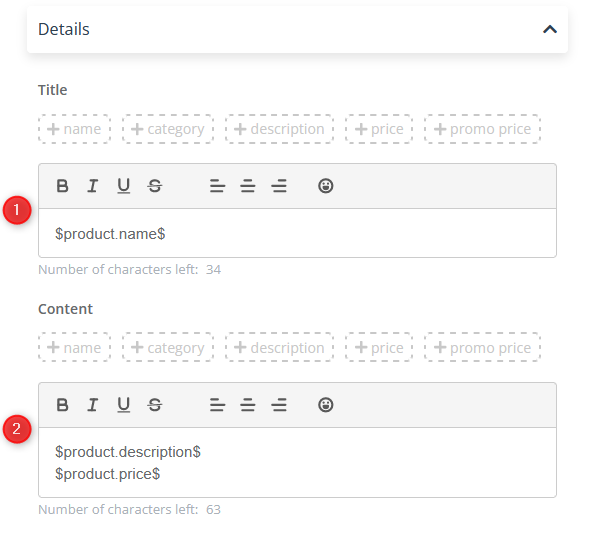
[1] Title—Enter the title of the element that users will see. You can use pre-made elements that will pull the relevant data from an XML file:
- name
- category
- description
- price
- promo price
There’s a 48-character limit.
ATTENTION: Before adding emoticons or custom characters, check the preview to make sure everything displays correctly.
[2] Content—Enter the content that users will see. You can use pre-made elements that will pull the relevant data from an XML file:
- name
- category
- description
- price
- promo price
There’s a 100-character limit.
E. Settings
The final step of creating a Personal Shopping Inbox is to define the technical settings and activate it.
Products
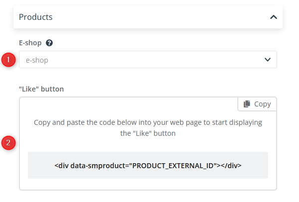
[1] E-shop—From the drop-down list, select the product feed that you want to link to your Personal Shopping Inbox.
IMPORTANT: After selecting a product feed and saving the Personal Shopping Inbox, you will no longer be able to change the feed in that Center.
[2] “Like” button—In this section, you will find the code. Paste it into your page for the “Like” button to appear.
Domain
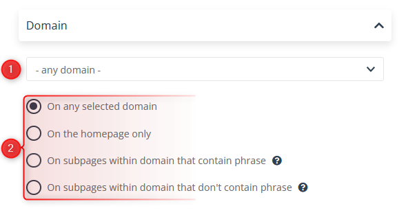
[1] Domain—From the drop-down list, select the location where the Personal Shopping Inbox will be displayed. Select the corresponding check box [2]:
- On any selected domain
- On the homepage only
- On subpages within the domain that contain the phrase (after clicking on it, a box will appear for entering a phrase or phrases)

IMPORTANT: Personal Shopping Inbox will be displayed on all pages that contain the specified phrase in their URL address.
- On subpages within the domain that don’t contain the phrase (after clicking on it, a box will appear for entering a phrase or phrases)
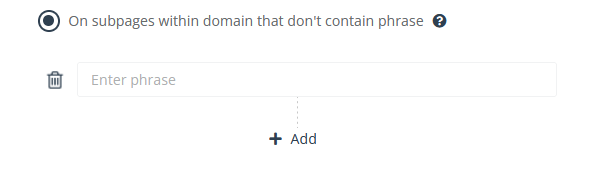
IMPORTANT: Personal Shopping Inbox will be displayed on all pages that don’t contain the specified phrase in their URL address.
Display when
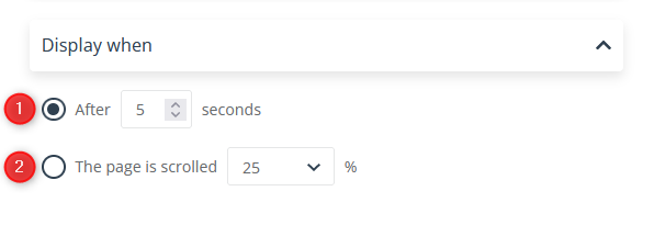
[1] Time delay—Check this option if you want the Personal Shopping Inbox to display after a specified time (in seconds). Use the arrows or manually enter a number between 0 and 9999.
[2] Scroll delay—Check this option if you want the Personal Shopping Inbox to appear when the page is scrolled down. The degree of scrolling is indicated as a percentage. Select a value from the drop-down list: 25%, 50%, 75%, or 100%.
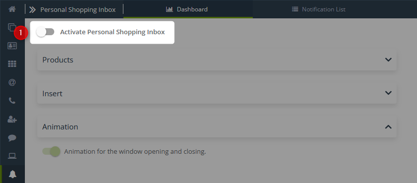
Animation
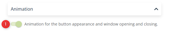
1] Add animation effect—Select this option if you want to add animation for the button appearance and window opening and closing.
Activation
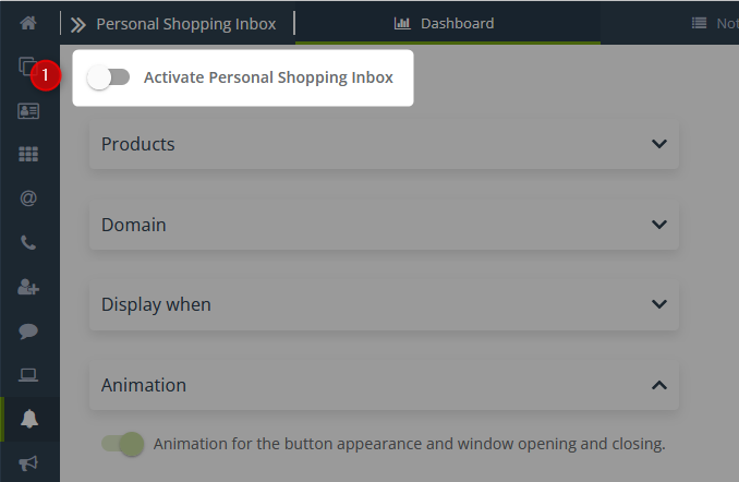
[1] Activation—Move the slider to the active position to activate the Personal Shopping Inbox after saving.
Saving

[1] Save—Click the button to save the created Personal Shopping Inbox. Note that, once saved, you will not be able to edit the selected product feed.
3. Create New Personal Shopping Inbox (Icon)
To create a new Personal Shopping Inbox, go to Personal Shopping Inbox → + New Personal Shopping Inbox.

Clicking the button will take you to the wizard selection screen.
To create a Personal Shopping Inbox that will be displayed as an icon, select the wizard Icon [2]. By selecting this option, you can choose or upload your own Personal Shopping Inbox icon and add it to your website.
After navigating to a new page and selecting the wizard you are interested in, you will find the Personal Shopping Inbox wizard, which consists of 5 steps:
- Devices
- Display settings
- Design
- Product fields
- Settings
Additionally, you will find a Next [F] button that allows you to move between steps.
A. Devices
The first step in creating a Personal Shopping Inbox is to choose the device you want to display the widget on. In this way, you can better target your campaign message, for example, only to people using smartphones or those using desktops and laptops.
[1] Desktop—Widget will be displayed on computers and laptops only.
[2] Smartphone—Widget will be displayed on phones only.
[3] Desktop and smartphone—Widget will be displayed on all types of devices.
[4] Name—Enter the name of the Personal Shopping Inbox used for identifying it in the system.
The right part of the screen is where you will see a visualization of the widget you are currently working on.
[1] Smartphone preview—A real-time preview showing how your changes affect the appearance of the Personal Shopping Inbox on a smartphone.
[2] Desktop preview—A real-time preview showing how your changes affect the appearance of the Personal Shopping Inbox on a computer.
IMPORTANT: The notifications in the preview are samples. The newly created Personal Shopping Inbox will be empty, and notifications must be created and sent via the Notification Wizard.
Learn how to create notifications using the wizard >>
When you have made the basic settings, click Next [3].
B. Display settings
On the second screen, you move on to entering data. Here, you specify how the widget and its tabs will be displayed.
If you want the widget to appear on both device types, you will see an option to switch the view and input fields on the top left part of this page. The process for creating both types of notifications is similar and involves completing a sequence of steps. By default, the settings you have made for the desktop view will also be applied to the mobile version. When changing the view, you can manually change the data to make the Personal Shopping Inbox better suited to each device type.
ATTENTION: If you’re making a Personal Shopping Inbox that displays on both computers and smartphones, keep in mind that you’ll need to select the settings for both device types separately, as they won’t be automatically mirrored.
On the website
[1] Personal Shopping Inbox window always expanded—Check this box to always display the widget as an expanded window. If you uncheck the box, site visitors will only see a button to click to expand the Personal Shopping Inbox window.
[2] After closing don’t show again—Check this box to prevent the widget from displaying as expanded at each page view. If a user closes the Personal Shopping Inbox, it will display as collapsed during the next page view and can be expanded by clicking the button.
[A] On every view—Apply the settings you made for each view.
[B] Every X views—Apply the settings to the widget display every X views.
[C] From X to Y views—Apply the settings you entered to the indicated page view interval.
Display in window
[1] Selecting tabs—By checking the boxes, select which tabs you want to add to the Personal Shopping Inbox.
[2] Selecting tab order—Adjust the order of tabs in the widget by moving individual blocks.
[3] Notifications—Enter the name of the tab [A] and the title of the window [B] that will be displayed to the user when this tab is selected. In Notifications, you can display information about new products and special offers in your online store.
ATTENTION: A character limit is imposed on both of these fields:
- Tab name—20 characters
- Title—30 characters
[4] Recently viewed products—Enter the name of the tab [A] and the title of the window [B] that will be displayed to the user when this tab is selected. Here, the user will find Products they have recently viewed on your site.
ATTENTION: A character limit is imposed on both of these fields:
- Tab name—20 characters
- Title—30 characters
[5] Favorites—Enter the name of the tab [A] and the title of the window [B] that will be displayed to the user when this tab is selected. Here, the user will find the Products they have liked on your page.
ATTENTION: A character limit is imposed on both of these fields:
- Tab name—20 characters
- Title—30 characters
IMPORTANT: To use this feature, you must first add a “like” mechanism to your page.
- Save the creation.
- Copy the code generated in the last step in the “Products” tab.
- Paste the code on the product page where you want it to appear.
- In the code, replace the phrase “PRODUCT_EXTERNAL_ID” with the product’s “externalid” parameter.
You can further customize the Favorites tab by choosing the shape of the “like” button and its color.
[A] Shape of the “like” button—Click the button to select the desired shape.
[B] Color selection—Click this box to select the color of the “like” button.
[1] Select color hue—Move the cursor within the rectangle filled with the gradient of the indicated color to select the hue you want to assign to the selected element.
[2] Select color—By moving the pointer left and right, pick the color you want to assign to the selected element. You can adjust the hue of the color by returning to the hue selection box [1].
[3] Enter color manually—Enter the designation of the selected color. Use the arrows to switch between different input methods (Hex, RGB, HSL).
[4] Cancel—Click to cancel the color selection.
[5] Choose—Click to save the selected color.
ATTENTION: If you select colors of any element manually in the wizard, the procedure will be the same or similar. The colors of some elements have an additional parameter: transparency. It can be set with the slider or by entering a value in section [3] Enter color manually in the field marked A.
C. Design
On the Design tab, you can define the visual aspects of the Notification button and Notification window.

o edit the button settings, select the Notification button [1]. To edit the window appearance, select Notification window [2].
Design: Notification button
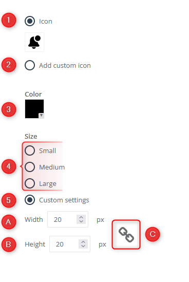
[1] Icon—Select this option if you want to use the icons available in the wizard.
To change the icon shape, click on the image, and in the expanded window, choose the shape that best suits your needs.
[2] Add custom icon—This option allows you to add a custom icon for the notification button.

To add an icon, you can either drag an image stored on your disk or select a file previously uploaded in the gallery. You can use JPG, PNG, WebP, ICO/CUR, and BMP files as icons. The GIF format is not supported by browsers.
[3] Color—Set your own color scheme. To select a color, click the appropriate box and enter the parameters for the color you are interested in.
[4] Size—Select the size of the icon.
[5] Custom settings—Manually set the icon size.
[A] Width—Enter the icon width manually, or use the arrows to set it. You can select a value between 10 and 50.
[B] Height—Enter the icon height manually, or use the arrows to set it. You can select a value between 10 and 50.
[C] Scaling—Click the scaling icon to set automatic size scaling.

When you change one parameter, the other will automatically change to maintain the ratio.
Design: Notification window
Design
[1] Maximum number of elements in the window—Use the slider or counter to set the maximum number of items (notifications, products) that can be displayed in the window. You can select a maximum of 20 items.
[2] Show elements on the page [only for desktop]—Use the slider or counter to set the maximum number of items (notifications, products) that can be displayed on the page (i.e., how many items the user will see without scrolling down). You can select up to 5 items.
[3] Window rounding [only for desktop]—Use the slider or counter to set the rounding degree of the Personal Shopping Inbox window. The available scale is 0–20.
[4] Color settings—Choose your own color scheme for each item:
[A] Top fill—header background
[B] Content fill—window background
[C] Heading—header font
[D] Content font—window font
To select a color, click the appropriate box and enter the parameters for the color you are interested in.
ATTENTION: In the Smartphone view, you will not set the [2] Show elements on the page and [3] Window rounding items.
Shadow
[1] Add—Check this box if you want to add a shadow to the Personal Shopping Inbox.
[A] Color—Select a shadow color. To select a color, click the appropriate box and enter the parameters for the color you are interested in.
[B] Spread—Enter manually or use the arrows to set the spread of the shadow that will surround the window. You can choose a value from 0 to 20.
Font
[1] Font—From the drop-down list, select the font that will be displayed as both the header and the window content font.
Closing image
[1] Shape—Click the button to select the desired shape.
[2] Color—Click to select the color of the window closing image.
[3] Size—Select the size of the close button.
Tabs
[1] Color—Click this box to select a highlight color for the active tab.
D. Product fields
In the Product Fields tab, you define how the product fields are displayed in the Personal Shopping Inbox.
To edit settings of the tab with history of viewed products select Recently viewed products [1]. To edit the favorite products section, select Favorites [2].
ATTENTION: The editing options and data entry method are the same for both tabs. Note, however, that you must enter the data separately for each tab, as it will not duplicate automatically.
IMPORTANT: To keep track of the changes you make in the wizard, in the preview section, switch the tab on the preview of Personal Shopping Inbox to the one you are working on.
URL
[1] Load a product link—Select this option if you want product links to be automatically pulled.
[1] Title—Enter the title of the element that users will see. You can use pre-made elements that will pull the relevant data from an XML file:
- name
- category
- description
- price
- promo price
There’s a 48-character limit.
ATTENTION: Before adding emoticons or custom characters, check the preview to make sure everything displays correctly.
[2] Content—Enter the content that users will see. You can use pre-made elements that will pull the relevant data from an XML file:
- name
- category
- description
- price
- promo price
There’s a 100-character limit.
E. Settings
The final step in creating a Personal Shopping Inbox is to define the technical settings and activate it.
Products
[1] E-shop—From the drop-down list, select the product feed that you want to link to your Personal Shopping Inbox.
IMPORTANT: After selecting a product feed and saving the Personal Shopping Inbox, you will no longer be able to change the feed in that Inbox.
[2] “Like” button—In this section, you will find the code. Paste it into your page for the “Like” button to appear.
Insert
Create a DIV element in which you place a Personal Shopping Inbox on the page
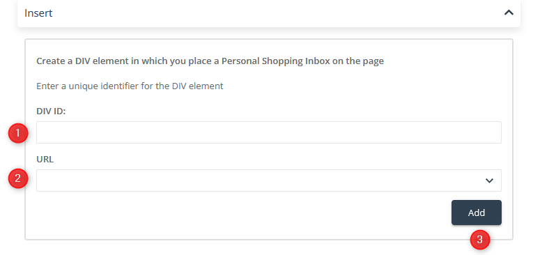
[1] DIV ID—Enter a unique identifier for the DIV element.
[2] URL—In the drop-down list, select the location where the Personal Shopping Inbox will display.
Animation

[1] Add animation effect—Select this option if you want to add an animation for the button appearance and window opening and closing.
Activation
[1] Activation—Move the slider to the active position to activate the Personal Shopping Inbox after saving.
Saving
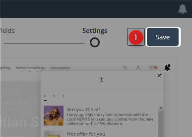
[1] Save—Click the button to save the created Personal Shopping Inbox. Note that, once saved, you will not be able to edit the selected product feed.