Predictive analytics uses transactional and behavioral data, statistical algorithms, and machine learning to estimate future results and predict future events. In SALESmanago, prediction values are provided for both individual Contacts and your entire database.
This article describes the Predictive Analytics Dashboard, which presents collective data for your entire database. To view prediction values for individual Contacts, visit their Contact Cards.
Learn more about Predictive Analytics on the Contact Card >>
By using the Predictive Analytics features provided by SALESmanago, you can identify current trends in your Contacts’ behaviors and adapt your marketing activities accordingly, which can lead to reduced spending on marketing activities, improved customer retention, and ultimately, higher profits.
Learn more about Predictive Analytics in SALESmanago and how to apply it in practice >>
To access the Predictive Analytics Dashboard, go to
Insights → Artificial Intelligence → Predictive Analytics
NOTE: This feature is not available in all SALESmanago plans. If you are interested in this add-on, please contact your Customer Success Manager.
Contents
- Getting started
- Customer Lifetime Value (CLV) analysis
- Predictive Modeling: Purchase Occurrence
- Predictive Modeling: Attribution
- Predictive Modeling: Churn
1. Getting started
Predictive analytics refers to the use of historical data and machine learning algorithms to identify patterns and trends within existing data and, on this basis, build models capable of making predictions about future events. In SALESmanago, predictive analytics is based on Contact data, including website activity and purchasing behavior.
The Predictive Analytics Dashboard (Menu → Insights → Artificial Intelligence → Predictive Analytics) presents the following prediction values, relating to your entire database:
- Customer Lifetime Value (CLV),
- purchase occurrence,
- attribution,
- churn.
The dashboard is divided into four sections that are described in detail further in this article.
To learn how you can apply this data in practice, read the article about Predictive Analytics in SALESmanago >>
2. Customer Lifetime Value analysis
The Customer Lifetime Value (CLV) analysis shows the averaged data relating to purchases made by your Contacts in your e-store.
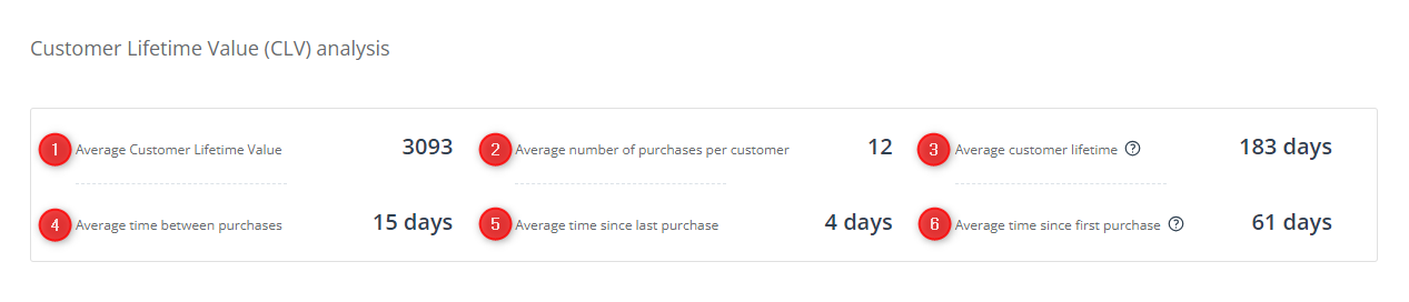
[1] Average Customer Lifetime Value—The average amount of money spent by a Contact in your store throughout their lifetime, i.e., throughout the period when they remain your active customer.
[2] Average number of purchases per customer—The number of purchases that your Contacts make throughout their lifetimes on average.
[3] Average customer lifetime—The average number of days between a Contact’s first and last purchase in your store.
[4] Average time between purchases—The average number of days that pass between two consecutive purchases made by a Contact.
[5] Average time since last purchase—The average number of days that have passed between a Contact’s most recent purchase and the present moment.
[6] Average time since first purchase—The average number of days that have passed between a Contact’s first purchase and the present moment. This metric is also known as the Average Customer Age.
3. Predictive Modeling: Purchase Occurrence
This section of the Predictive Analytics Dashboard presents purchase predictions for your entire database, modeled based on the transactional and behavioral data of Contacts included in the sample.
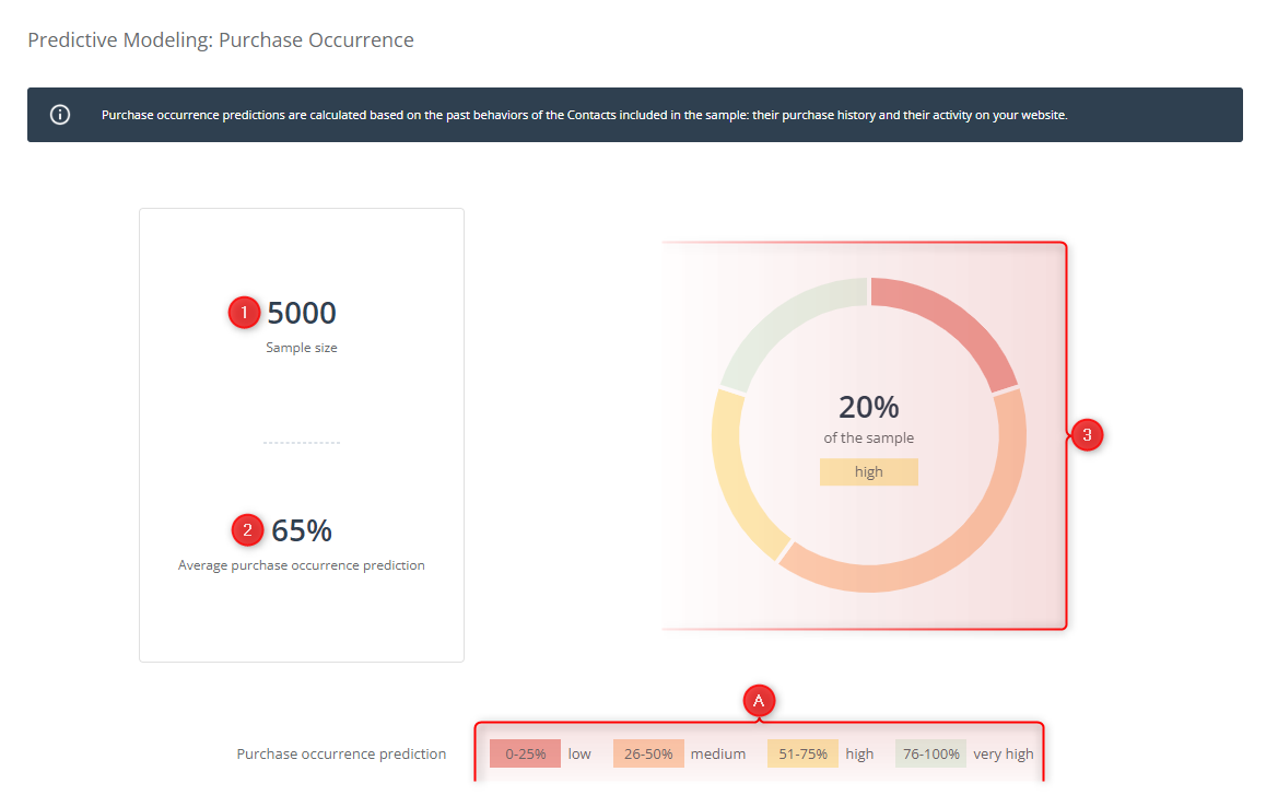
[1] Sample size—The number of Contacts whose historical data is used to calculate the purchase predictions. The sample includes all Contacts (both monitored and not monitored) that have ever made a purchase in your store, except for Contacts deleted from your database.
TIP: The larger the sample, the more reliable the predictions. If your sample is relatively small, consider importing additional historical data into SALESmanago. Be careful, however, not to import the same data twice. If you need assistance with this process, contact us at support@salesmanago.com.
[2] Average purchase occurrence prediction—The average likelihood of purchase occurrence for your entire database, calculated based on the historical data of Contacts included in the sample. The higher this value, the better.
[3] Chart—Here, you can check the percentage of Contacts that have a low; medium; high; or very high purchase prediction value.
Each range of prediction values is marked in a different color. Click on a selected segment of the chart to see the percentage of Contacts falling within that range.
[A] Legend—Here, you can see which percentage values and colors correspond to the particular ranges of purchase prediction values.
4. Predictive Modeling: Attribution
This section of the Predictive Analytics Dashboard shows how likely it is that your individual marketing channels will contribute to the purchase decision of a Contact (as a touchpoint). The “spider’s web” you can see in this section includes most marketing channels (or their subtypes) that can be used and managed via SALESmanago. The data presented is based on the transactional history and website visits of your Contacts.
If you want to determine the likelihood for a specific channel, find it on the diagram and check the color of the dot that corresponds to that channel. Then, refer to the legend [A] to establish the prediction value (low, medium, high, very high) for this particular channel.
EXAMPLE: In the screenshot below, the dot corresponding to “Recommendation Frames (clicked)” is yellow, so the attribution prediction value for this channel is high (51–75%). This means that Recommendation Frames, when clicked, are likely to contribute to the purchase decision of a Contact.
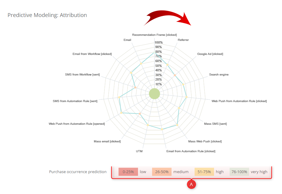
The channels included in the diagram are described below, going clockwise from the top:
- Recommendation frame [clicked]—Here, you can see how likely it is that a Contact will make a purchase if they click on a Recommendation Frame created in SALESmanago and displayed on your website.
- Referrer—Here, you can see how likely it is that a Contact will make a purchase if they visit your website after clicking a link on another (external) website.
Note that two types of links leading to your website are excluded from the Referrer category and presented separately: Google Ads and search engines.
- Google Ad [clicked]—Here, you can see how likely it is that a Contact will make a purchase if they visit your website after clicking on a Google Ad. A source is considered a Google Ad if it meets one of the following conditions:
- the referrer is google.com AND the target (destination) URL contains /aclk/,
- the referrer is g.doubleclick.net,
- the visited URL on your website includes /gclid/.
- Search engine—Here, you can see how likely it is that a Contact will make a purchase if they visit your website after clicking a result in a search engine (SERP).
See the list of search engines supported by SALESmanago’s attribution system >>
- Web Push from Automation Rule [clicked]—Here, you can see how likely it is that a Contact will make a purchase if they click a Web Push notification created in SALESmanago and sent as part of an Automation Rule.
- Mass SMS [sent]—Here, you can see how likely it is that a Contact will make a purchase if they receive an SMS message sent via SALESmanago as a mass communication.
- Mass Web Push [clicked]—Here, you can see how likely it is that a Contact will make a purchase if they click a Web Push notification created in SALESmanago and sent as a mass notification.
- Email from Automation Rule [clicked]—Here, you can see how likely it is that a Contact will make a purchase if they click a link in an email created in SALESmanago and sent as part of an Automation Rule.
- UTM—Here, you can see how likely it is that a Contact will make a purchase if they visit your website after clicking a link containing a UTM parameter.
- Mass email [clicked]—Here, you can see how likely it is that a Contact will make a purchase if they click a link in an email created in SALESmanago and sent as a mass mailing.
- Web Push from Automation Rule [opened]—Here, you can see how likely it is that a Contact will make a purchase if a Web Push notification created in SALESmanago and sent as part of an Automation Rule is displayed to them.
- SMS from Automation Rule [sent]—Here, you can see how likely it is that a Contact will make a purchase if they receive an SMS message sent as part of an Automation Rule.
- SMS from Workflow [sent]—Here, you can see how likely it is that a Contact will make a purchase if they receive an SMS message sent as part of a Workflow.
- Email from Workflow [clicked]—Here, you can see how likely it is that a Contact will make a purchase if they click a link in an email created in SALESmanago and sent as part of a Workflow.
[A] Legend—Here, you can see which percentages and colors correspond to the particular prediction value ranges.
5. Predictive Modeling: Churn
This section of the Predictive Analytics Dashboard presents churn predictions for your entire database, modeled based on the transactional and behavioral data of Contacts included in the sample.
Churn is the loss of customers or users. By referring to churn predictions, you can gain an understanding of the percentage of Contacts that are unlikely to return to your e- store. Based on this knowledge, using tools provided by SALESmanago, you can take actions aimed at re-engaging Contacts at risk of churn and turning them into loyal customers.
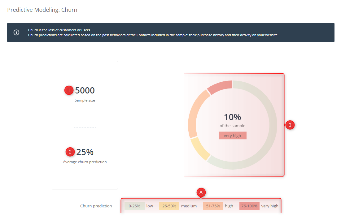
[1] Sample size—The number of Contacts whose historical data is used to calculate the churn predictions. The sample includes all Contacts (both monitored and not monitored) that have ever made a purchase in your store, except for Contacts deleted from your database.
TIP: The larger the sample, the more reliable the predictions. If your sample is relatively small, consider importing additional historical data into SALESmanago. Be careful, however, not to duplicate the existing data. If you need assistance with this process, contact us at support@salesmanago.com.
[2] Average churn prediction—The average likelihood of churn for your entire database, calculated based on the historical data of Contacts included in the sample. The lower this value, the better.
[3] Chart—Here, you can check the percentage of Contacts that have a low, medium, high, or very high churn prediction value.
Each range of prediction values is marked in a different color. Click on a selected segment of the chart to see the percentage of Contacts falling within that range.
[A] Legend—Here, you can see which percentage values and colors correspond to the particular ranges of churn prediction values.