Revenue Attribution Analytics and Product Analytics are the best analytical panels for eCommerce. Thanks to them you can find out which channels and which campaigns generate the best revenue and how SALESmanago helps to increase sales. What is more, you can see clearly which products are bestsellers in your shop. You are also able to decide what data is analyzed in your personalized business dashboards. Create panels which match your needs and:
- analyze how exactly the revenue is generated in your company,
- learn about the most important elements of marketing campaigns which generate the best revenue,
- check out how all your actions in SALESmanago system help to increase revenue and number of transactions,
- get information about ROI and effectiveness of all your online marketing activities.
In our new analytical panels you will find data as follows:
- CROSS CHANNEL REVENUE ATTRIBUTION – enables precise analysis of interactions that took place prior to the purchase – you can find out when and thanks to which channels your clients buy products. You are also able to understand what the influence of each channel on various stages in the selling process is.
- REVENUE SOURCES ANALYTICS – shows revenue from all sources – you can discover what the total sales generated by all your online campaigns is. Thanks to that, you can manage your marketing budget and optimize ROMI.
- REVENUE GENERATED WITH HELP OF SALESmanago – detailed analysis of your revenue – you can find out how campaigns run with help of SALESmanago increase your revenue.
- BEST CONVERSION PATHS – check the analytics of conversion paths which tells you from which sources your clients go to your website and buy products.
- ADVANCED PRODUCT ANALYTICS – follow bestsellers – you always know which products, categories, brands and producers are the most popular ones. Being aware of that you can prepare better recommendations.
Thanks to Revenue attribution analytics and Product analytics you know the following:
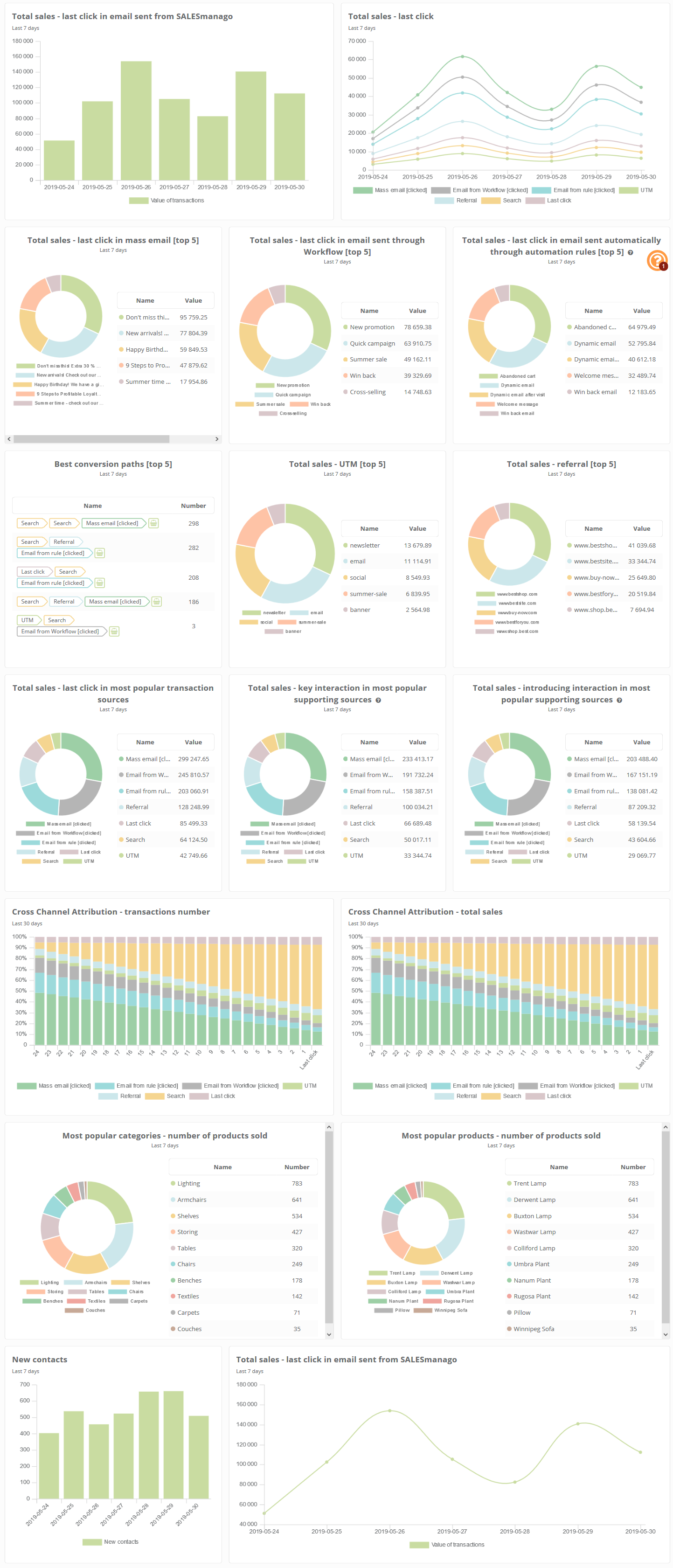
- total sales with the division into sources of the last click in a mass email, automatic message sent from rules, message sent from Workflow
- number of transactions with the division into sources of the last click in a mass email, automatic message sent from rules, message sent from Workflow
- total sales and number of transactions with the division into 5 best UTM tags
- total sales and number of transactions with the division into domains from with the referral took place
- total sales with the division into sources of click – from penultimate back
- total sales and number of transactions with the division into searches
- categories, producers, brands and products that were bought more frequently
- the average sum of sales and the average number of products sold with the division into sources of the last click
- number of transactions, number of products sold and total sales with the division into sources of the last click
- the average sum of one transaction and the average number of products sold with the division into sources of the last click
Learn more about business dashboards
Content:
- Glossary in widgets
- Revenue attribution analytics
- Product analytics
GLOSSARY IN WIDGETS
- last click – it is the source of transaction that took place shortly before the transaction (that led the contact to your website).
- total sales – the total sum of transactions (external event, type PURCHASE) in the selected period of time
- number of transactions – all transactions (external event, type PURCHASE) in the selected period of time
- number of products in one transaction – how many products were bought in one transaction (sent in one external event)
- key interaction – it takes place immediately before the last click – it means that it is penultimate source of entering your website by the contact. Let’s assume that the last click is marked as N. Then key interaction is marked as N-1.
- introducing interaction – source of entering your website which takes place before the key interaction. If we assume that the last click is marked as N, introducing interactions are marked as N-2, N-3, N-4, N-5, N-6.
- referral – redirection, an automated process that takes the user to another location.
REVENUE ATTRIBUTION ANALYTICS
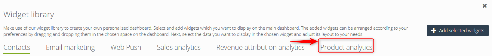
So as to go to Revenue attribution analytics, select Revenue Attribution Analytics in the main menu and next Edit → Widgets library → Revenue attribution analytics or Product analytics.
Below you can see part of the view in widgets library. Select widgets for your dashboard here.
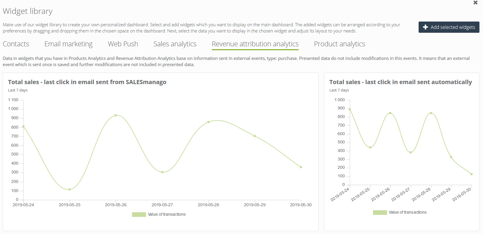
In the next step go to Revenue attribution analytics. Click to select widgets (selected widgets are marked with green, click again to unselect).
Confirm your choice clicking Add selected widgets.
When you hover the cursor on a widget, you see the following options: delete (to remove the widget from your dashboard), duplicate (to have more than one widget of this kind on your dashboard), settings.
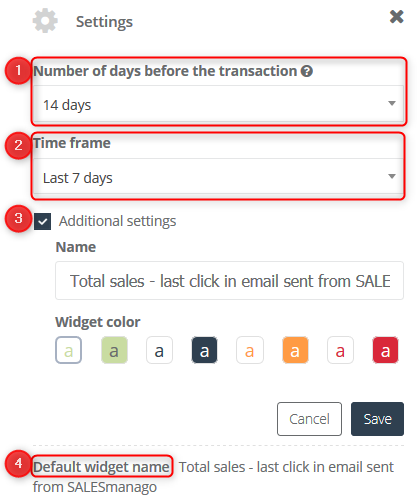
In the settings you have options as follows:
[1] Numbers of days before the transaction – it is the time period before the transaction in which sources of transactions are analyzed. For instance, when you select the period of 14 days in this field, all sources leading to website entering and purchase are analyzed.
Example: If Selected time period [2] is the last 7 days, it means that all transactions that took place up to 7 days before will be analyzed. If you select this option on May 28th, 2019, all transactions from the time period May 21st – May27th will be analyzed. If the number of days before the transactions will be specified as 14 days, it means that 14 days before each transaction (that took place in this time period: May 21st – May27th) will be taken into account. When the transaction took place on May 21st, the sources of this transaction will be analyzed for this period: May 7th – May 21st.
IMPORTANT: Each purchase that takes place in the selected period of time [2] is analyzed. It can happen that number of days before the transactions (14 days in this particular case) extends beyond the time period [2]. However, for each transaction all sources are analyzed 14 days back, even if time period is exceeded.
This option is particularly important when we analyze sources of transactions before the last click and is crucial in the case of slow-moving products.
[2] Time frame – all transactions that took place in this time period will be analyzed.
[3] Additional settings – here you can change name and colour of your widget.
[4] Default widget name – it is a suggested name that describes data in the widget; it can be changed at any time.
[5] Save – click when your settings are ready.
Below there is a list of all widgets that you have in SALESmanago system in Revenue attribution analytics along with brief description.
Widgets:
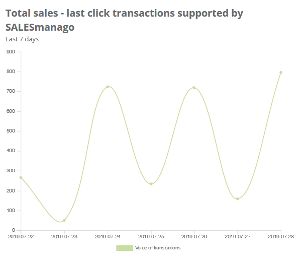
1. Total sales – last click transactions supported by SALESmanago
In these widgets you have total sales of all last click transactions that were supported by SALESmanago (e.g. Workflow, Email, Automation Rules, Recommendation Frames). The linear plot shows data for particular days.
![]()
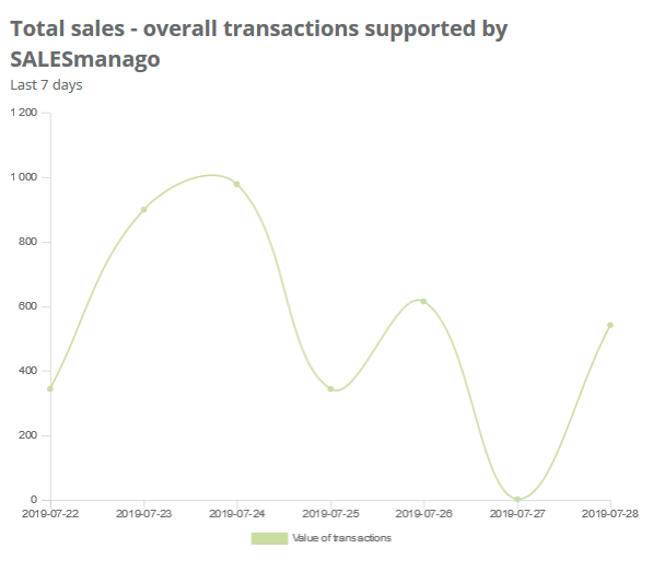
2. Total sales – overall transactions supported by SALESmanago
In this widgets you have total sales of overall transactions that were supported by SALESmanago (e.g. Workflow, Email, Automation Rules, Recommendation Frames). The linear plot shows data for particular days.
![]()
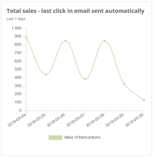
3. Total sales – last click in email sent automatically
In this widget you have total sales with the division into sources of the last click in email sent automatically. (sent from rules and Workflow). The linear plot shows data for particular days.
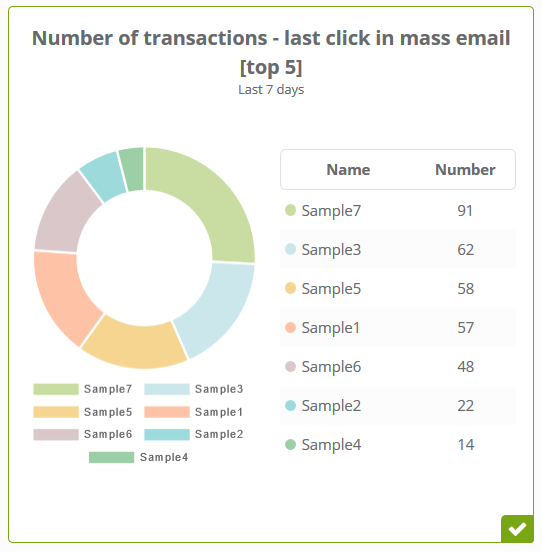
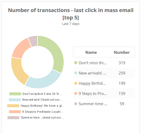
4. Number of transactions – last click in mass email [top 5]
In this widget you have number of transactions with the division into sources of the last click in mass email (e.g. newsletters, mailing). This pie chart shows the top 5 values that generated the biggest number of transactions. Figures are shown for the selected time period.
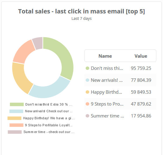
5. Total sales – last click in mass email [top 5]
In this widget you have total sales with the division into sources of the last click in mass email. This pie chart shows the top 5 values, that is emails, that generated the biggest total sales. Figures are shown for the selected time period.
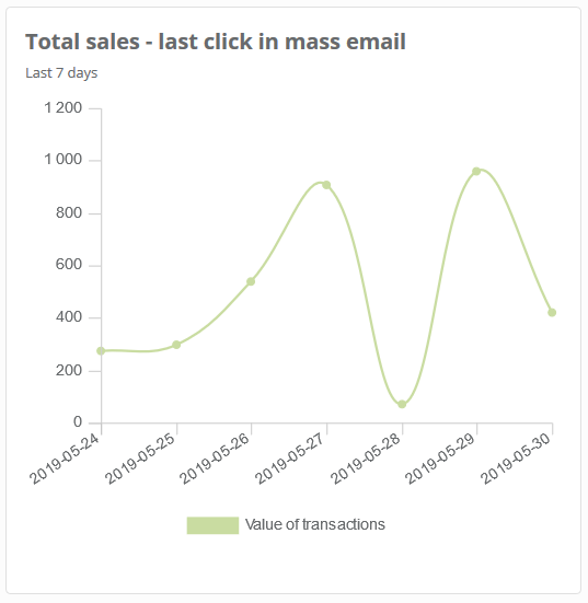
6. Total sales – last click in mass email
In this widget you have total sales with the division into sources of the last click in mass email. The linear plot shows data for all messages for particular days.
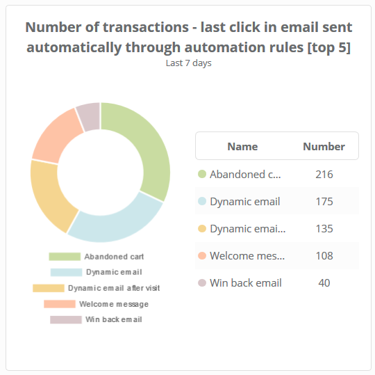
7. Number of transactions – last click in email sent automatically through automation rules [top 5]
In this widget you have number of transactions with the division into sources of the last click in email sent automatically through automation rules. The pie chart shows top 5 values – that is top 5 rules from which emails generated the biggest number of transactions. Figures are shown for the selected time period.
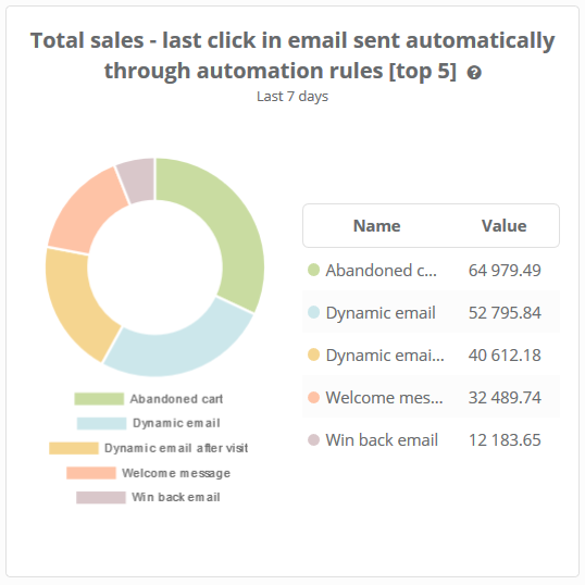
8. Total sales – last click in email sent automatically through automation rules [top 5]
In this widget you have total sales of the last click with the division into sources of the last click in email sent automatically through automation rules. The pie chart shows top 5 values – that is top 5 rules from which emails generated the biggest sales. Figures are shown for the selected time period.
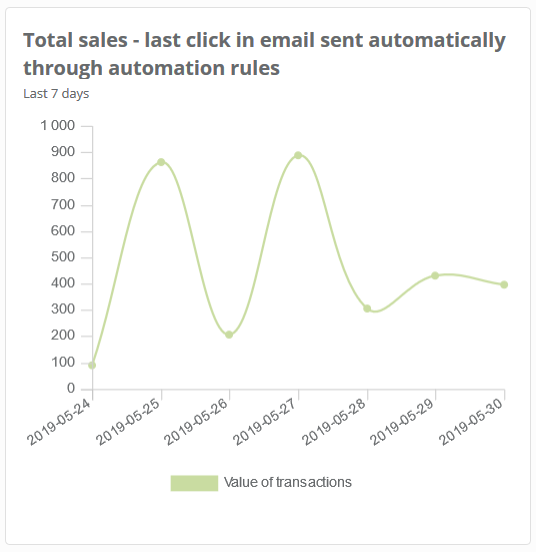
9. Total sales – last click in email sent automatically through automation rules
In this widget you have total sales of the last click with the division into sources of the last click in email sent automatically through automation rules. The linear plot shows data concerning all rules which send emails for particular days.
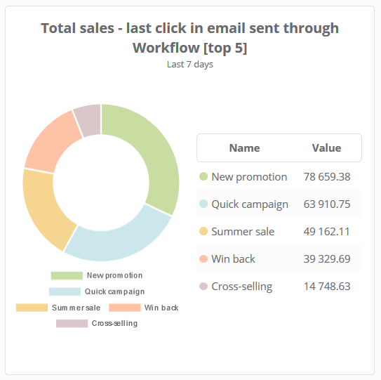
10. Total sales – last click in email sent through Workflow [top 5]
In this widget you have total sales with the division into sources of the last click in email sent through Workflow. In this widget you have total sales with the division into sources of the last click in email sent through Workflow. The pie chart shows 5 top values – that is Workflow campaigns from which emails generated the biggest sales. Figures are shown for the selected time period.
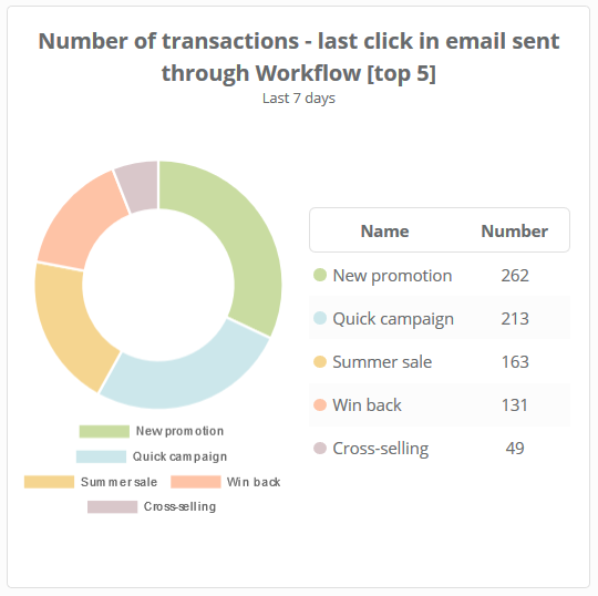
11. Number of transactions – last click in email sent through Workflow [top 5]
In this widget you have number of transactions with the division into sources of the last click in email sent through Workflow. The pie chart shows 5 top values – that is Workflow campaigns from which emails generated the biggest number of transactions. Figures are shown for the selected time period.
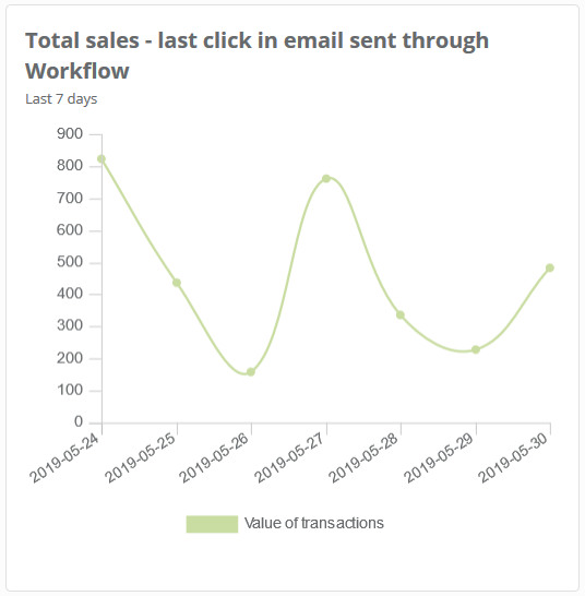
12. Total sales – last click in email sent through Workflow
In this widget you have number of transactions with the division into sources of the last click in email sent through Workflow. The linear plot shows data for selected days. These are Workflow campaigns that generated the biggest sales. Figures are shown for the selected time period.
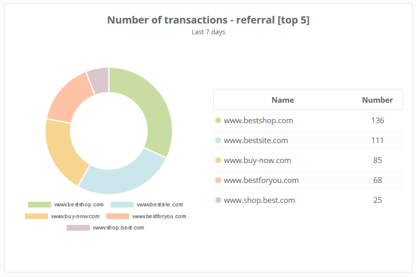
13. Number of transactions – referral [top 5]
In this widget you have number of all transactions with the division into domains from which clients were redirected. The pie chart shows top 5 values. Figures are shown for the selected time period.
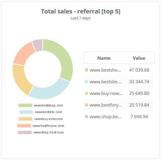
14. Total sales – referral [top 5]
In this widget you have total sales with the division into domains from which clients were redirected. The pie chart shows top 5 valuesFigures are shown for the selected time period.
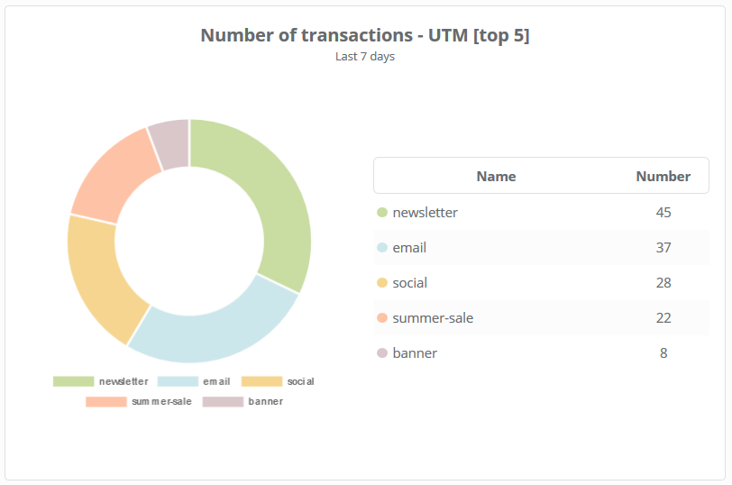
15. Number of transactions – UTM [top 5]
In this widget you have number of all transactions with the division into top 5 best UTM tags . This pie chart shows top 5 values. Figures are shown for the selected time period.
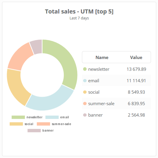
16. Total sales – UTM [top 5]
In this widget you have total sales with the division into top 5 best UTM tags. This pie chart shows top 5 values. Figures are shown for the selected time period.
17. Number of transactions – last click
In this widget you have number of all transactions with the division into sources of the last click. Figures are shown for the selected time period.

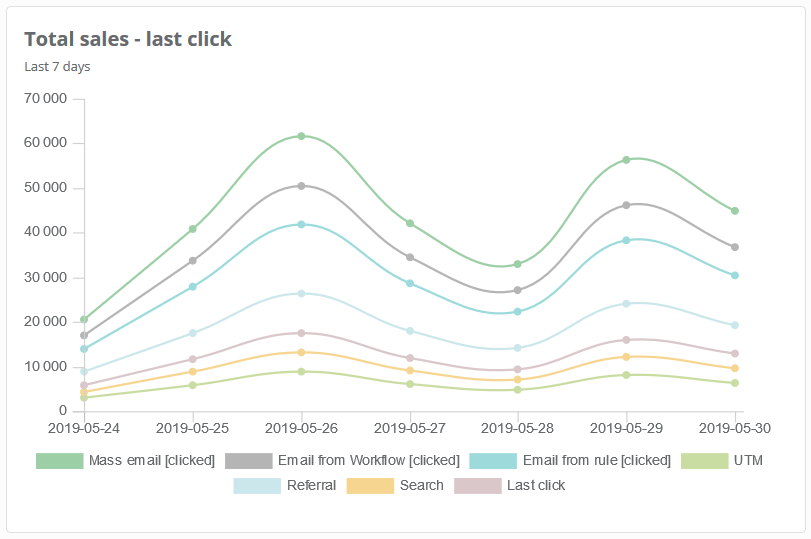
18. Total sales – last click
In this widget you have total sales with the division into sources of the last click. Figures are shown for the selected time period.
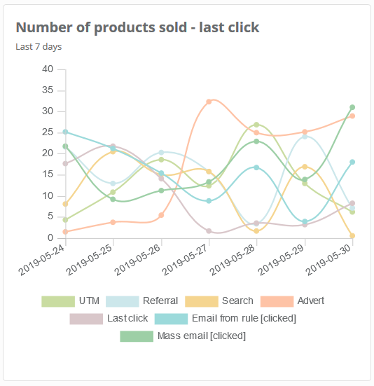
19. Number of products sold – last click
In this widget you have number of products sold with the division into sources of the last click. Figures are shown for the selected time period.
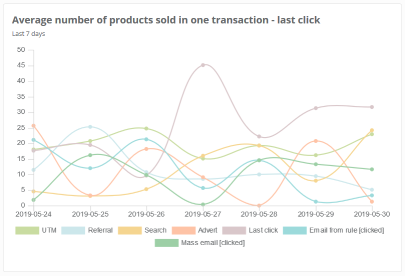
20. Average number of products sold in one transaction – last click
In this widget you have average number of products sold in one transaction with the division into sources of the last click. Figures are shown for the selected time period.
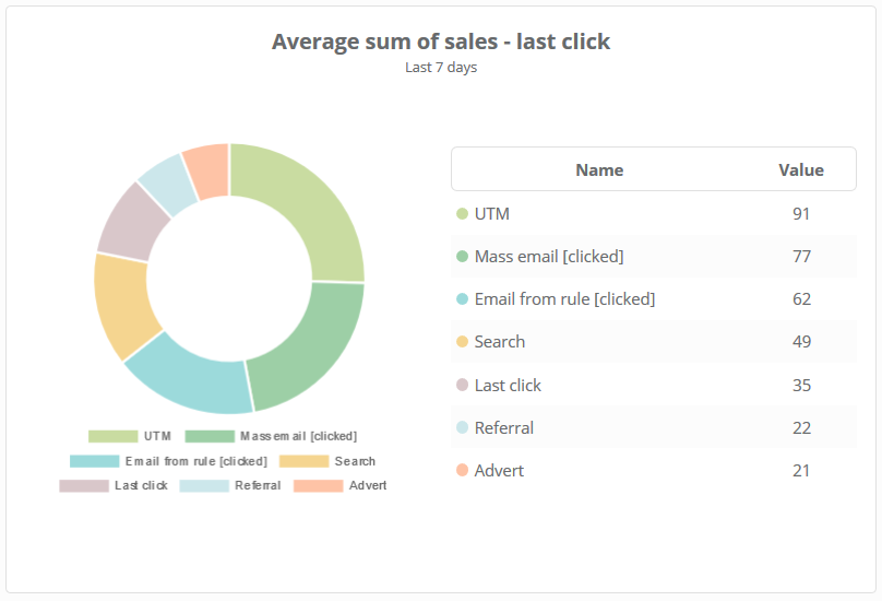
21. Average sum of sales – last click
In this widget you have average sum of sales with the division into sources of the last click. Figures are shown for the selected time period.
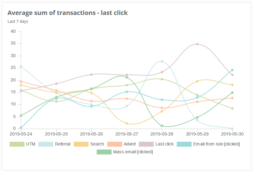
22. Average sum of one transaction – last click
In this widget you have average value of one transaction with the division into sources of the last click. Figures are shown for the selected time period.
23. Total sales – last click in most popular transaction sources [top 5]
In this widget you have total sales with the division into last click in the most popular sources of transactions. The pie chart shows the top 5 the biggest values. Figures are shown for the selected time period.

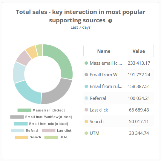
24. Total sales – key interaction in most popular supporting sources
In this widget you have number of transactions with the division into the most popular key interactions . Figures are shown for the selected time period.
Example: Data below shows that the key interaction (from all supporting transaction sources) was search.
25. Total sales – introducing interaction in most popular supporting sources
In this widget you have total sales with the division into the most popular introducing interactions in the supporting sources of transactions. Figures are shown for the selected time period.
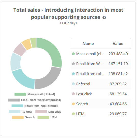
Example: Data below shows that the most effective supporting transaction was referral.
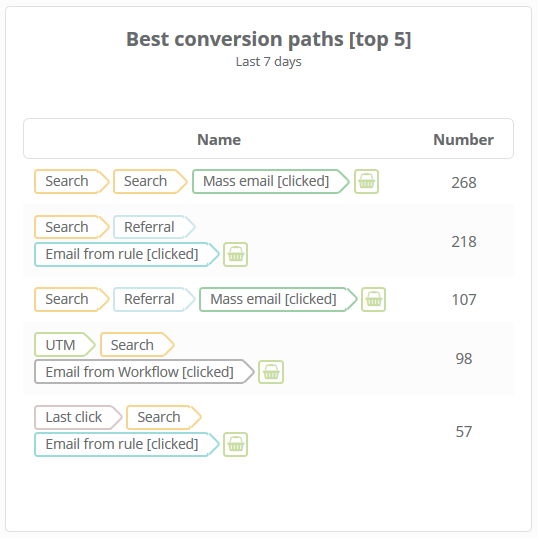
26. Best conversion paths [top 5]
In this widget you have the most popular paths which led clients to purchase. It means that the biggest number of transactions (89) took place after double search followed by clicking in mass email. Such path led to 89 transactions. Thanks to data presented in this widget you are aware which actions (and which set of actions) led the most frequently to purchases. Figures are shown for the selected time period.
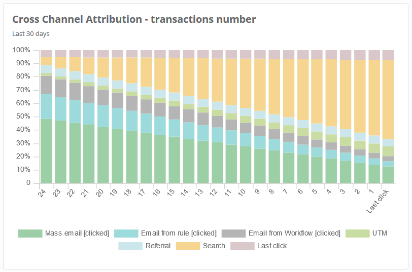
27. Cross Channel Attribution – number of transactions
In this widget you have in percentages which sources (UTM, referral, search, advert, last click, email from rules, mass email) supported number of transactions best on particular stages leading to a purchase (last click and supporting sources of transactions). Contrary to best conversion paths, here you have collective data that provides you with broader perspective on interactions of your clients which led to transactions. Figures are shown for the selected time period.
28. Cross Channel Attribution – total sales
In this widget you have in percentages which sources (UTM, referral, search, advert, last click, email from rules, mass email) supported total sales best on particular stages leading to a purchase (last click and supporting sources of transactions). Contrary to best conversion paths, here you have collective data that provides you with broader perspective on interactions of your clients which led to transactions. Figures are shown for the selected time period.
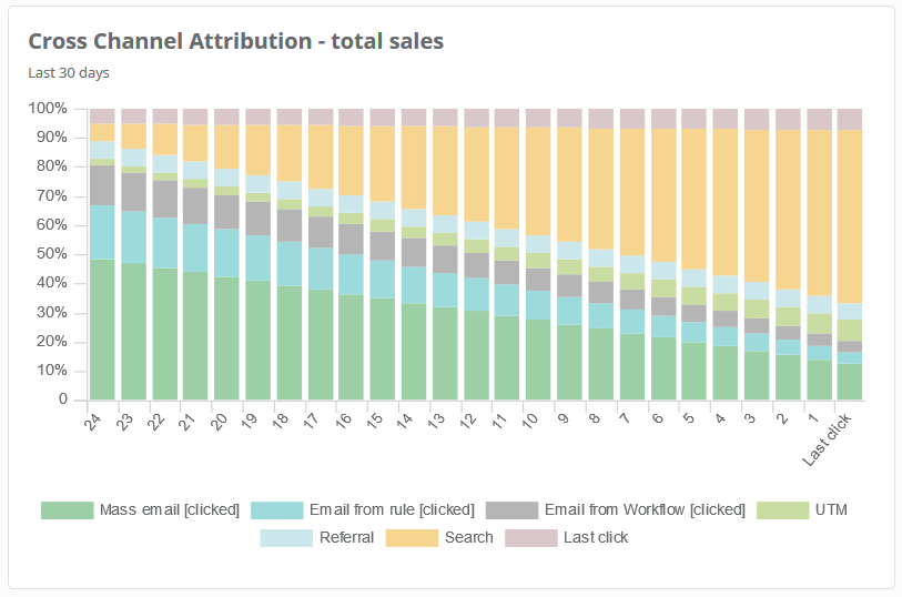
Example: In all last click transactions there were 60% of transactions with the search as a source. At the same time there were only 5% of transactions with email [click] as a source. However, it is important to know that sometimes it is not the last interaction that influenced the final decision to purchase. It can be also the fact that the client had already been familiar with the product or brand.
Example: When you analyze the last column only (last click), you may think that email from Workflow [click] or referral (redirection) did not play any significant role when the client was making a decision to purchase a product. However when you analyze other columns too, you can find out that the influence of these sources was much bigger.
29. Total sales – last click transactions supported by SALESmanago
In this widget you have total sales of the last click transactions where you see only transactions supported by SALESmanago. Figures are shown for the selected time period.
30. Total sales – overall transactions supported by SALESmanago
In this widget you can see total sales of overall transactions supported by SALESmanago. Figures are shown for the selected time period.
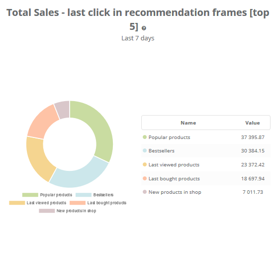
31. Total sales – last click in recommendation frames [top 5]
In this widget you can see total sales with the division into sources of the last click in recommendation frames. Figures are shown for the selected time period.
32. Number of transactions – last click in recommendation frames [top 5]
In this widget you can see number of transactions with the division into sources of the last click in recommendation frames. Figures are shown for the selected time period.
![]()
33. Total sales – last click in recommendation frames
In this widget you can see total sales with the division into sources of the last click in recommendation frames. Figures are shown for the selected time period.

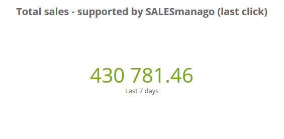
34. Total sales – supported by SALESmanago (last click)
In this widget you have total sales of all transactions that took place thanks to the support of SALESmanago (e.g. Workflow, Email, Automation Rules, Recommendation frames) and whose source is the last click. Figures are shown for the selected time period.
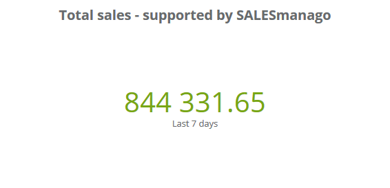
35. Total sales – supported by SALESmanago
In this widget you have total sales of all transactions supported by SALESmanago (e.g. Workflow, Email, Automation Rules, Recommendation frames). Figures are shown for the selected time period.
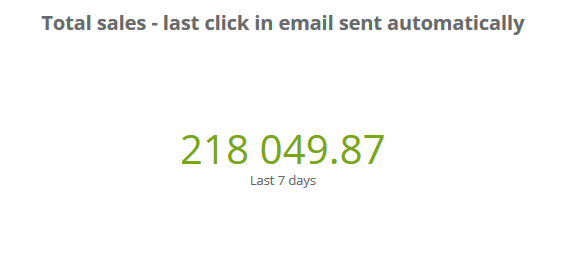
36. Total sales – last click in email sent automatically
In this widget you have total sales of all transactions that took place after clicking email sent automatically. Figures are shown for the selected time period.
37. Total sales – last click in mass email
In this widget you have total sales of all transactions that took place after clicking mass email. Figures are shown for the selected time period.

38. Number of transactions – last click in mass email
In this widget you have number of transactions that took place after clicking mass email. Figures are shown for the selected time period.

39. Total sales – last click in email sent automatically through automation rules
In this widget you have total sales of all transactions that took place after clicking email sent automatically through automation rules. Figures are shown for the selected time period.

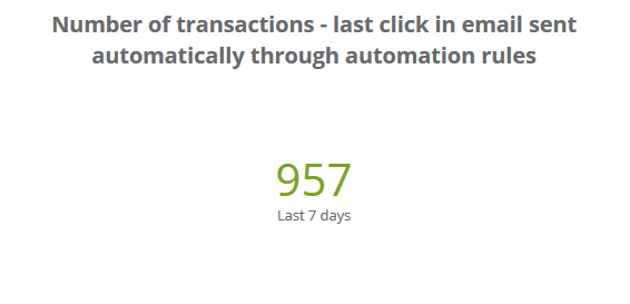
40. Number of transactions – last click in email sent automatically through automation rules
In this widget you have number of all transactions that took place after clicking email sent automatically through automation rules. Figures are shown for the selected time period.
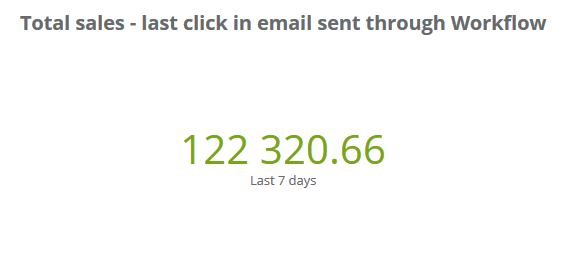
41. Total sales – last click in email sent through Workflow
In this widget you have total sales of all transactions that took place after clicking email sent through Workflow. Figures are shown for the selected time period.
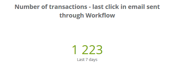
42. Number of transactions – last click in email sent through Workflow
In this widget you have number of all transactions that took place after clicking email sent through Workflow. Figures are shown for the selected time period.
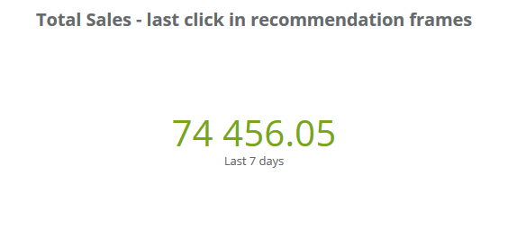
43. Total sales – last click in recommendation frames
In this widget you have total sales of all transactions that took place after clicking in recommendation frames. Figures are shown for the selected time period.
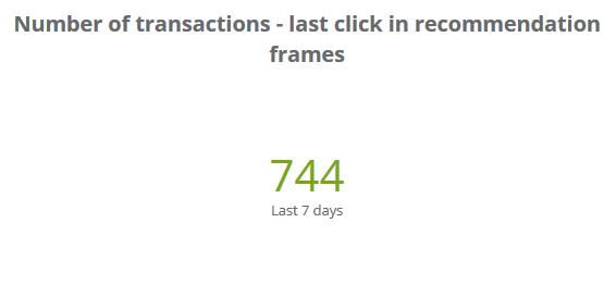
44. Number of transactions – last click in recommendation frames
In this widget you have number of all transactions that took place after clicking in recommendation frames. Figures are shown for the selected time period.
PRODUCT ANALYTICS
In Product Analytics section there are widgets that focus on products sold.
So as to go to Product Analyticsselect Dashboard in the main menu and next click Edit → Widgets library.
Then go to Products Analytics. Here you have all collection of widgets. Click widgets that you want to have in your dashboard (selected widgets are marked with green, click again to unselect).
Below you can see part of the view of the widgets library.
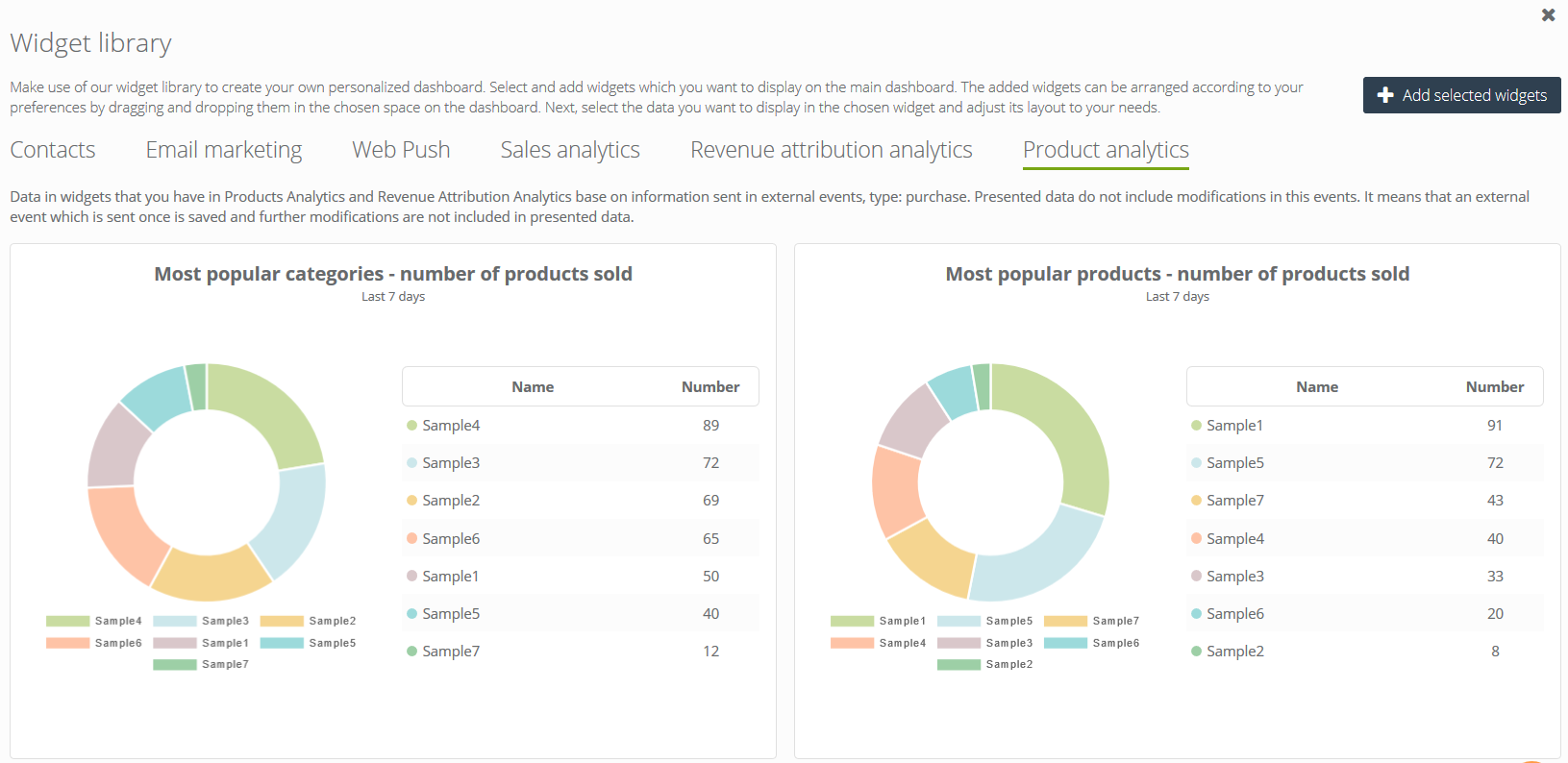
Confirm your choice clicking Add selected widgets.
Widgets in Products Analytics.
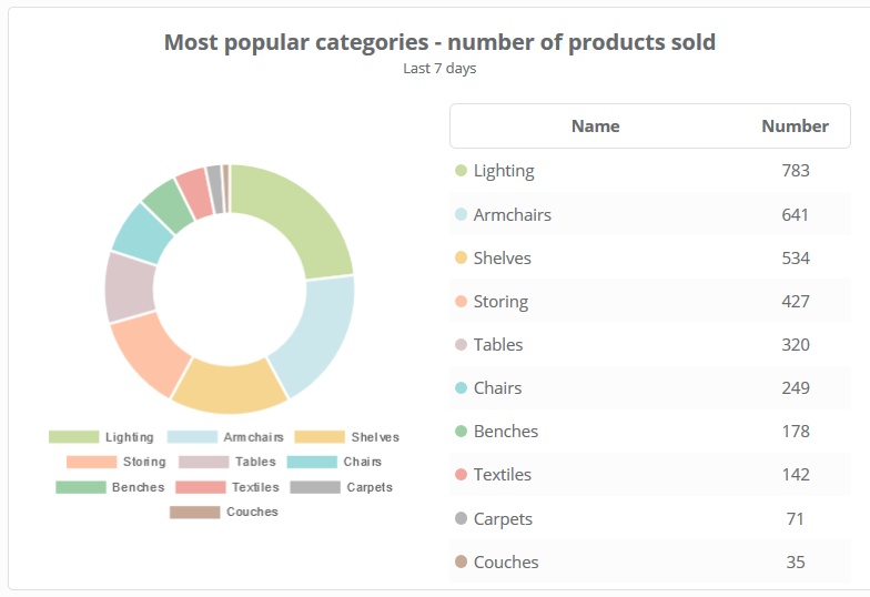
1. Most popular categories – number of products sold
This is a number of products sold in a particular category. The widget shows categories in which was the biggest sales in the selected time period.
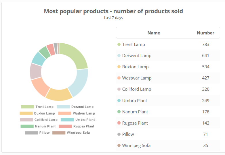
2. Most popular products – number of products sold
These are products that were sold the most frequently in the selected time period.
3. Most popular producers – number of products sold
These are producers whose products were sold the most frequently in the selected time period.

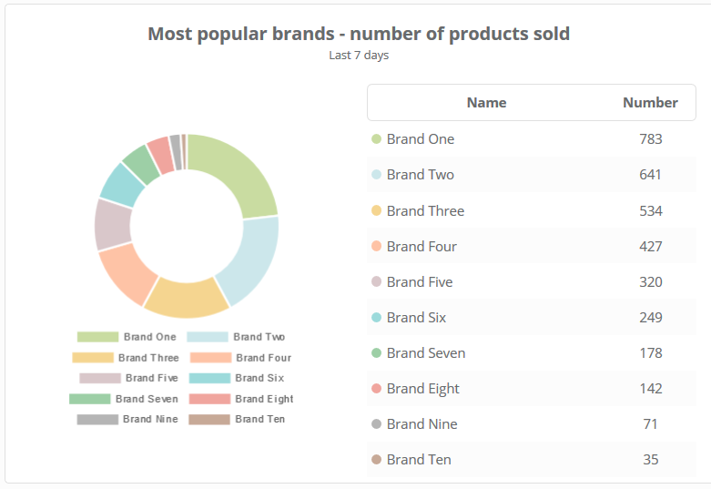
4. Most popular brands – number of products sold
These are brands of products that were sold the most frequently in the selected time period.
IMPORTANT:
- Information about sources of transactions is gathered on the basis of generated and collected visits, it means that it concerns transactions carried out by monitored contacts.
- Revenue analytics does not include direct sources of entering website.
- Data concerning transactions in revenue analytics and product analytics does not include changes in external events, type PURCHASE. It means that when you send the external event first, and then you modify or delete it, these changes are not included in the analysis.
- The parameter sm_source=recommendation_frame is added to products that are viewed when you click the recommendation frame. Thanks to that, you can check the movement generated by frames
- You can decide who can see business dashboards. You can turn them on/off at any time. Learn more about business dashboards