Useful links
This article explains the general principles behind SALESmanago’s Web Engagement Studio—an intuitive solution for designing various creations that can be displayed on your website to capture visitors’ attention, drive engagement, and collect zero-party data. Featuring a simple drag-and-drop interface, customizable layout options, and a library of widgets, the Web Engagement Studio allows you to create multiple types of elements (starting with landing pages, forms, and Thank You Pages) within a single tool. Use it to build effective marketing campaigns that convert anonymous visitors into leads.
To access the Web Engagement Studio, go to
Web Tools → Lead Generation → Web Engagement Studio
Contents
- Getting started
- Web Engagement Studio overview
- Creation process
- Basic actions
- Settings
- Saving options
- Version history
1. Getting started
The Web Engagement Studio enables you to create attractive, eye-catching designs that are helpful in engaging website visitors and converting them into leads. At the moment, you can use this designer for three types of creations (website elements):
- Landing pages
- Forms
- Thank You Pages
NOTE: A form can be included in a landing page. To achieve this, first, create a form and save it as active (published). Then, when creating a landing page, use the widget: Form, and select the form in the widget’s settings.
Read more about creating forms in the Web Engagement Studio >>
To access the Web Engagement Studio, go to Menu → Web Tools → Lead Generation → Web Engagement Studio. Click New creation in the top right-hand corner of the screen.
Select the type of creation you want to build:
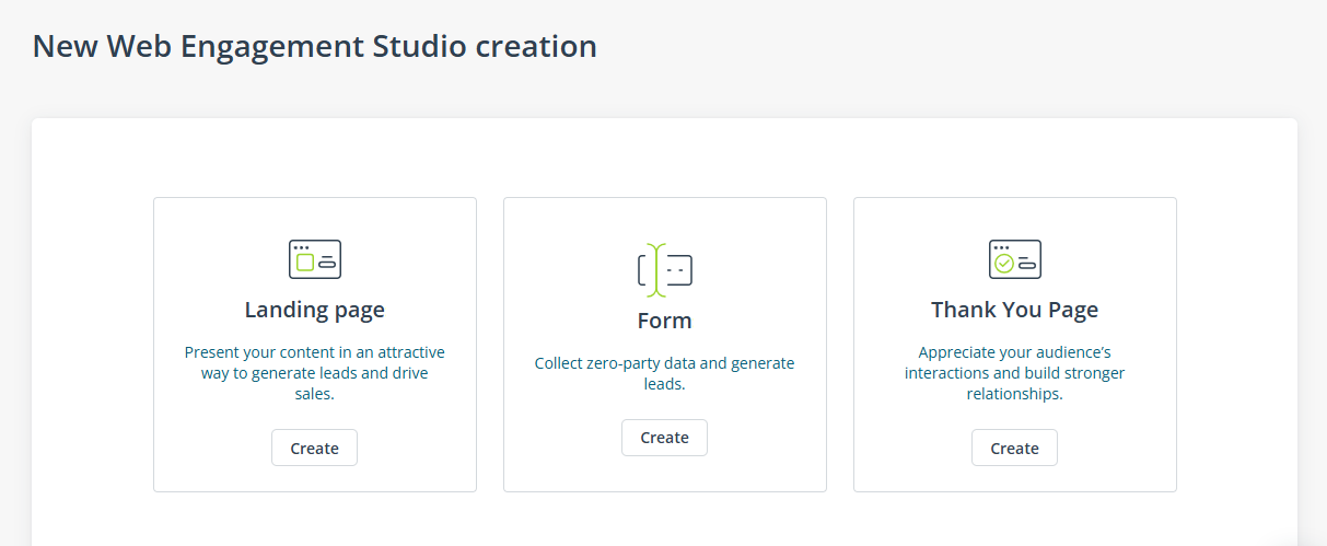
Now, you can start working on the creation of your choice.
2. Web Engagement Studio overview
The Web Engagement Studio provides a similar interface regardless of the creation type. The broad choice of widgets and the user-friendly drag-and-drop interface allow you to work intuitively, achieving the best results in the shortest time.
A. Design zone
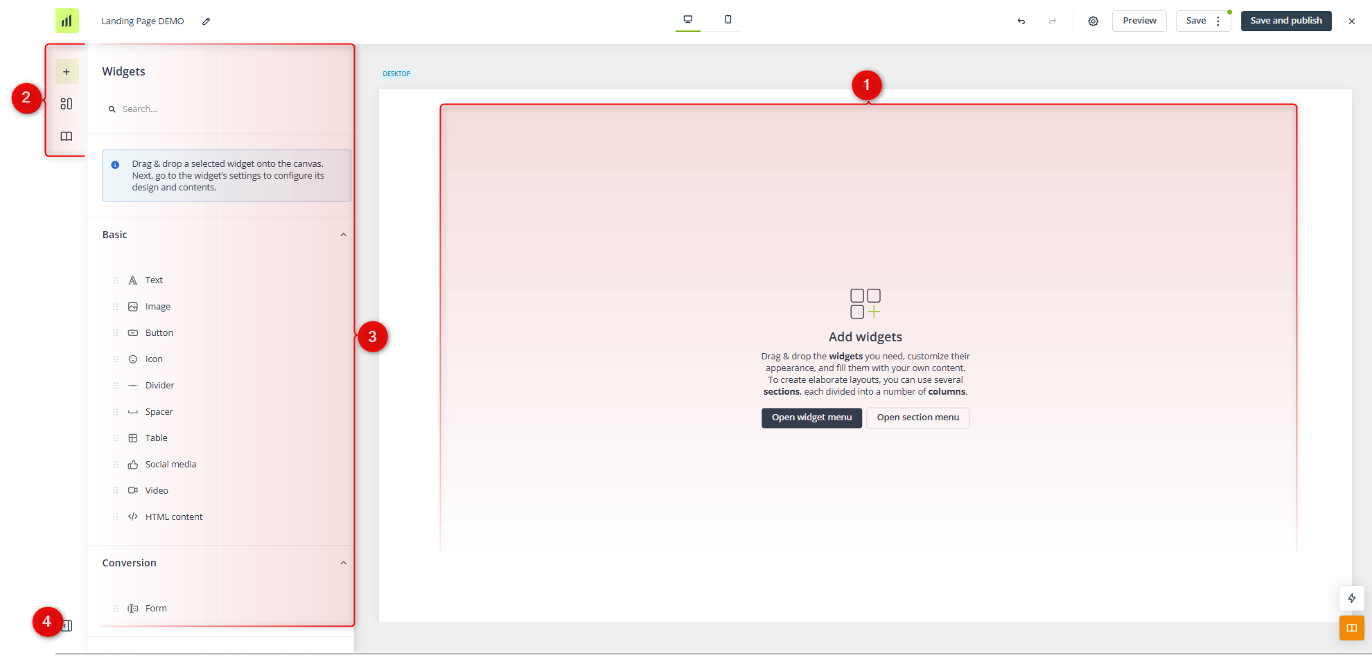
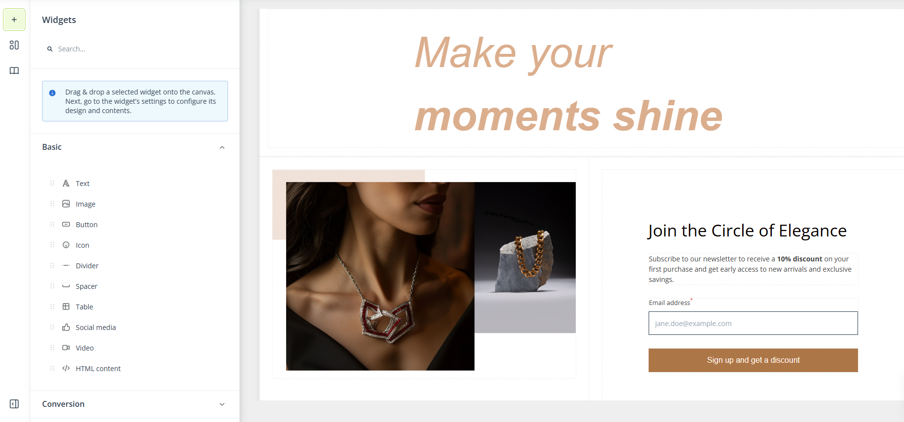
[1] Design area—This is where your creation takes shape. Drag elements from the side menu here and arrange them to build your ideal design.
[2] Main menu—Switch between these buttons to access the various options and settings available within the Web Engagement Studio:
- Widgets—Drag and drop selected widgets (or data fields, in the case of a form) into the design area. Edit the content and appearance as necessary.
- Layout—Define the layout of your Web Engagement creation. Adjust its size and general style.
- Library—Save widgets and sections as predefined elements and easily re-use them across all Web Engagement creations.
[3] Options and settings—Depending on the button currently selected in the main menu ([2]), here, you can select and configure widgets, adjust the layout, or manage elements saved in the Library.
[4] Collapse menu—Click to close the “options and settings” panel ([3]).
B. Top bar
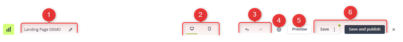
[1] Name—Here, you can view the name of your creation. Click the pencil icon to edit it.
[2] Devices—Switch between these device icons at any time to preview how your Web Engagement creation will appear on different devices.
[3] Undo/Redo—Click here to undo an action or redo a previously undone action.
[4] Settings—Here, you can define the general settings for your Web Engagement creation. These options are described in detail in Section 5 below.
[5] Preview—Here, you can see how your creation will look on desktop and mobile devices. You can view the generic version or select a Contact from the list and check the personalized version, where placeholders are replaced with actual Contact data.
[6] Saving options—Here, you can save your work as a draft or as a finished but inactive creation. You also have the option to save your creation and immediately publish (activate) it. For a detailed explanation of these options, see Section 6 below.
3. Creation process
The Web Engagement Studio allows you to design various types of creations that can help you engage your audience and convert them into loyal customers.
With landing pages, you can present your content attractively and generate new leads. A landing page can also contain a form (created separately in the dedicated Web Engagement Studio creator).
Forms help you turn anonymous visitors into Contacts and collect various zero-party data, which can then be used to run highly personalized campaigns.
Read about creating forms in the Web Engagement Studio >>
Read more about collecting and using zero-party data with SALESmanago >>
Thank You Pages are a good way to express your appreciation for the recipients’ interactions with your marketing communications, helping to build and strengthen customer relationships.
A. Widgets
The Web Engagement Studio provides a wide range of advanced widgets, enabling you to shape your content freely and convey your message effectively to your audience. You can access the list of available widgets from the left-side menu:
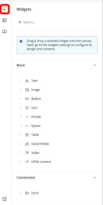
Basic widgets allow you to include the essential content in your creation, such as text, images, buttons, or social media links.
Conversion widgets are designed to encourage your audience to engage with your website.
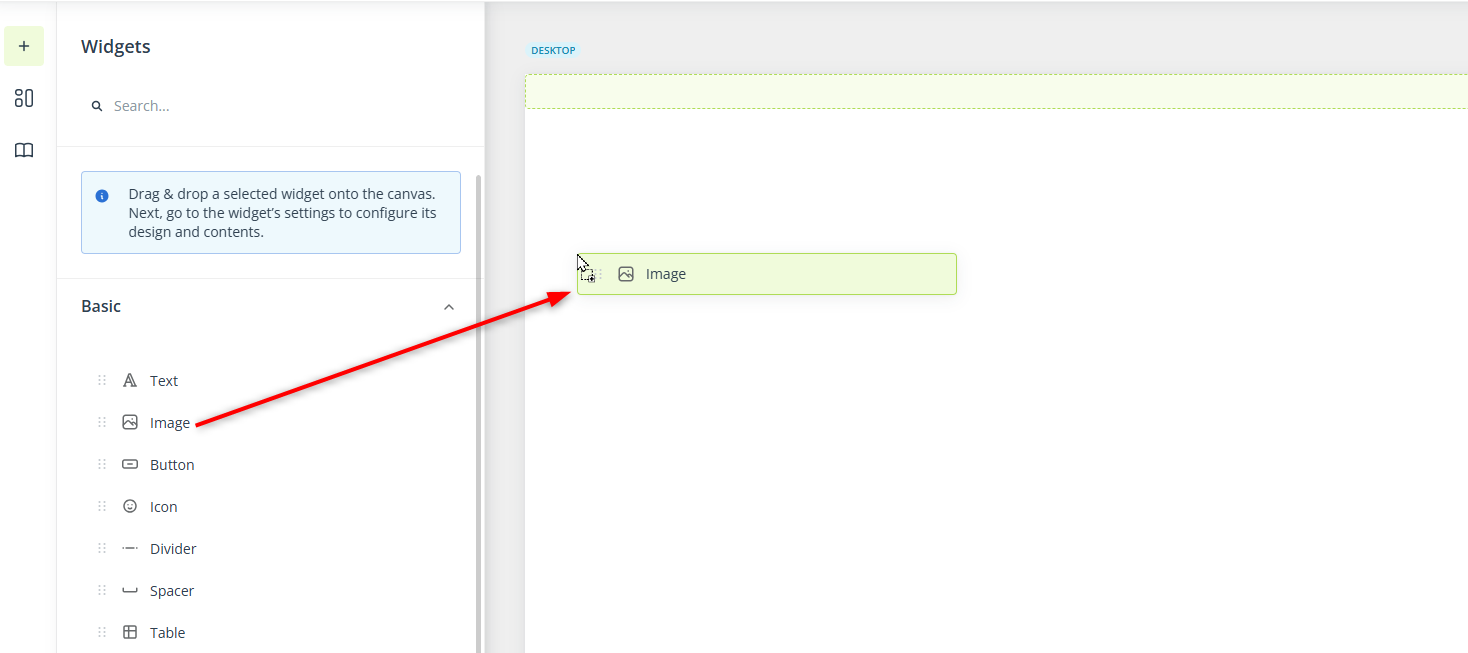
Widgets are placed within sections, which can consist of one or more columns. To include a widget in a column, simply drag it from the menu and drop it into the desired location within the design area.
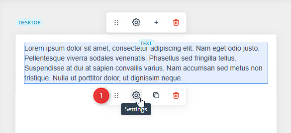
To access widget settings, click on the widget you want to modify, and a new menu will open in the left-side panel.
You can access the widget’s settings from the small bottom menu that appears when you hover your cursor over the widget [1].
The settings may vary depending on the widget. Typically, you can define parameters such as:
- Text style, including size and color.
- Positioning—Adjust the padding around the widget’s content.
- Display settings—Decide whether the widget should be displayed only on desktop devices, only on mobile devices, or on both.
- Link—Many widgets allow you to add a link.
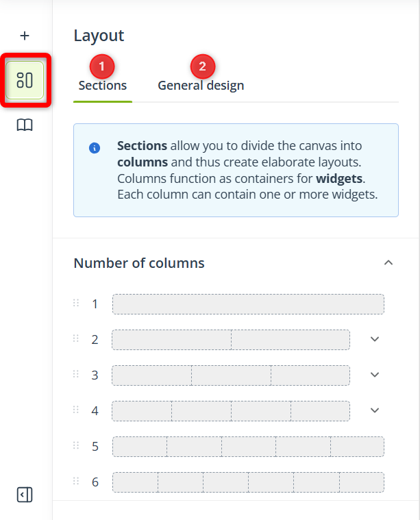
B. Layout
Here, you can add sections [1] to your Web Engagement creation and define its general design [2].
A section can contain one or more columns. Columns are frames that divide the creation body vertically, enabling you to design more complex layouts. You can insert additional sections at any point—simply drag a section from the menu and drop it into the desired position in the design area.
Columns serve as containers for widgets, which means that widgets are placed within columns.
EXAMPLE: If you drag and drop a five-column section into the design area:
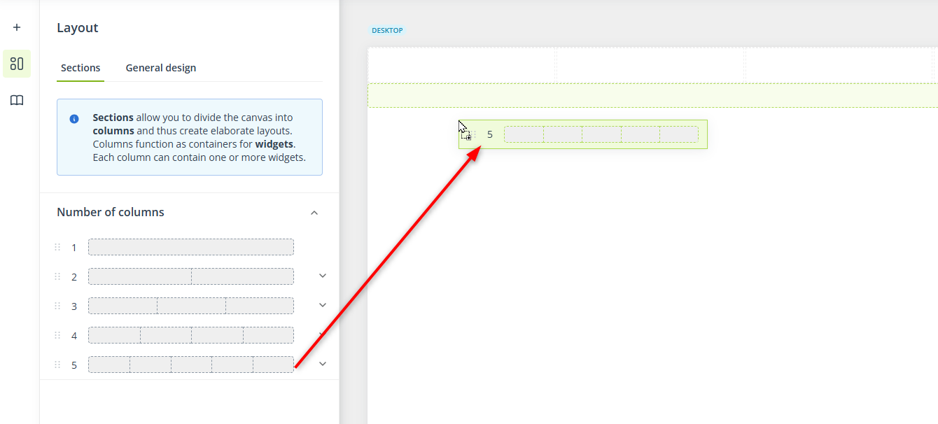
From this point downward, the body will be divided into five columns—until you add another section by dragging it from the Layout menu.
NOTE: You can insert a new section above or below an existing section, but not in between widgets.
Click a section to open its settings in the left-hand panel. In the section settings, you can adjust the relative size of individual columns and their background color or background image.
In the General design tab, you can define the general settings of your Web Engagement creation, including:
- Size—Body width and height. You can choose between two options:
- Auto—The size of your creation will automatically adjust to the size of the div container in which it is placed or, if you choose to display the creation as a page on the SALESmanago domain, to the size of the recipient’s screen.
- Fixed—Specify the maximum size of your creation, which will not be exceeded regardless of the recipient’s screen size. However, the size will still be adjusted to fit smaller mobile screens.
The width must be at least 700 px and the height must be at least 300 px.
- Style—Here, you can customize the appearance of the creation, including its background color, stroke (border), corner rounding, and padding.
Any changes you make to these settings are immediately reflected in the preview on the right side of the screen.
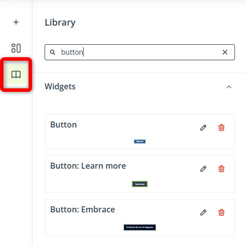
C. Library
You can store widgets and sections in the Library to save time and maintain consistency across your creations. This feature is especially useful if you plan to reuse an element across multiple creations.
You can access the Library by clicking the dedicated icon in the left-hand menu:
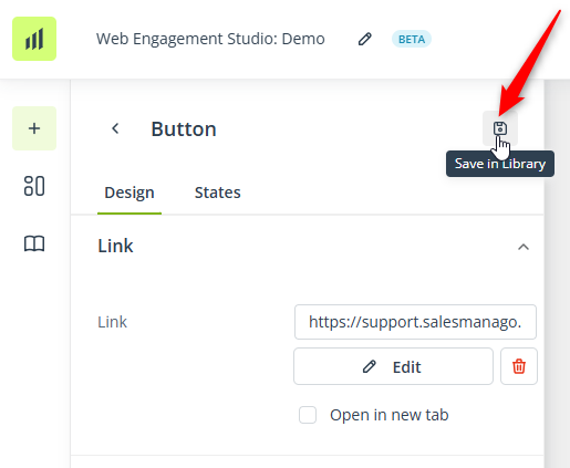
To add a section or a widget to the Library, access their settings and click the dedicated icon:
To use an element saved in the Library, simply drag and drop it in the design area:
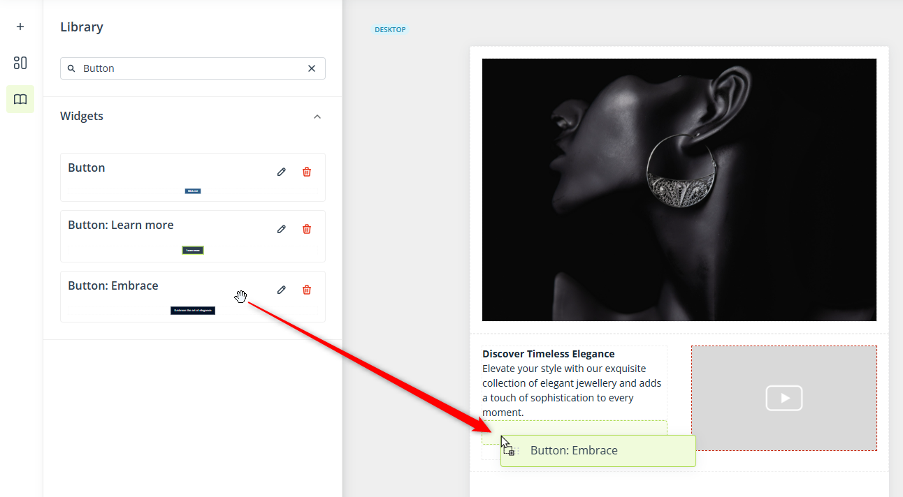
A dragged and dropped element can be freely modified afterwards. However, these changes will not be reflected in the Library unless you save the element again. Importantly, saving the element again does not overwrite it in any existing templates.
EXAMPLE: You create a button and save it to the Library. Three months later, you edit the button by changing its text. You delete the current button from the Library and save the updated version instead. Now, the old button will need to be manually replaced with the new button in each existing template.
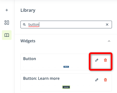
To edit an element saved in the Library or delete it from the Library, locate it on the list and click the pencil or trash can icon, respectively:
By clicking the pencil icon, you can edit the name or description of an element. To modify its content or appearance, drag and drop it into the design area, make your changes, and then save it to the Library again.
D. Desktop and mobile views
If you intend to display your creation on both desktop and mobile devices, consider adjusting its design and content to different screen sizes. In the Web Engagement Studio, you can create two versions of the same creation:
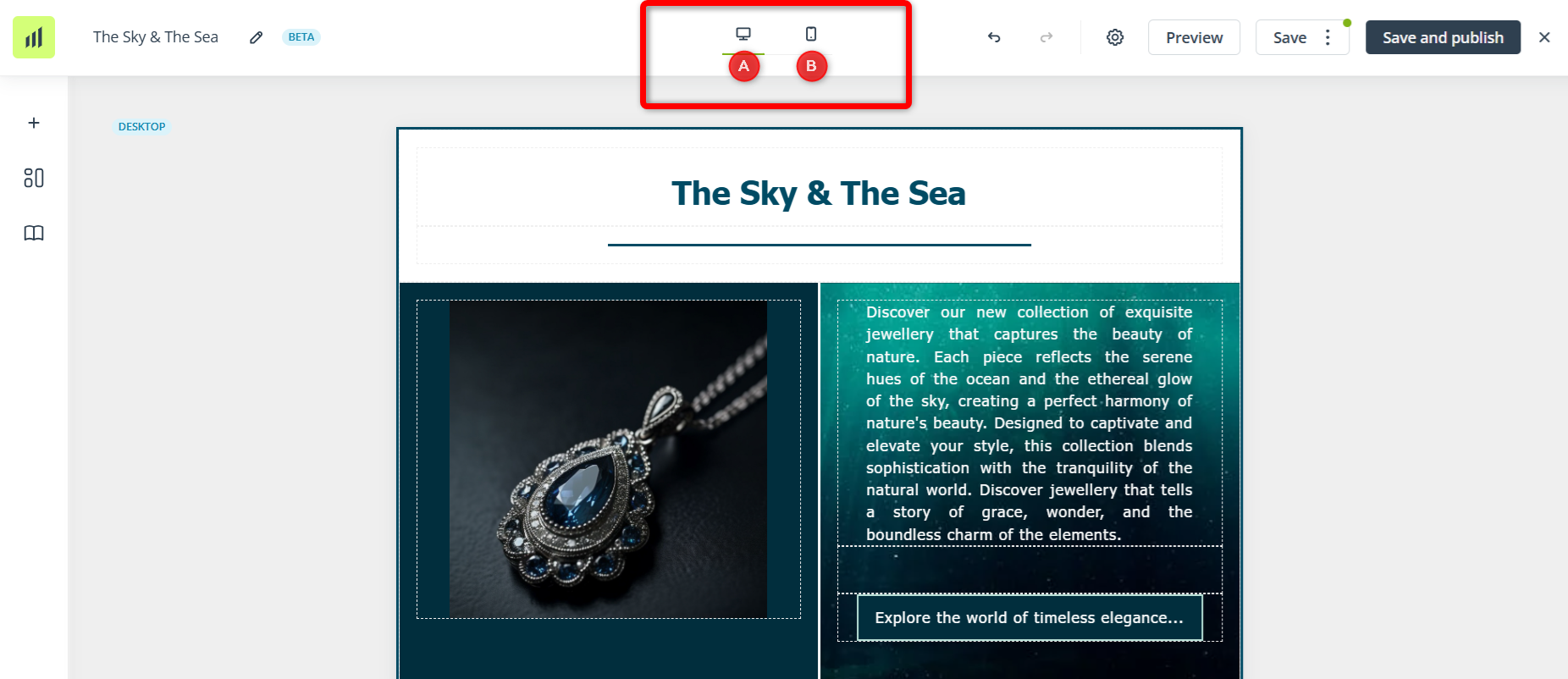
Switch between these two tabs to see how your creation will look on desktop [A] and mobile [B] devices. If you add or remove a section or widget under either of these tabs, this change will be reflected in the other version. Any widget or section configuration applied under the “desktop” tab will also be applied under the “mobile” tab. However, the moment you edit any widget or section settings under the “mobile” tab, this element will become disassociated from the “desktop” tab and any further configuration will apply only to the current tab (in other words, the widget or section will need to be configured separately under the “desktop” and “mobile” tabs).
This option can be used, for example, to add extra paddings or shorten the text for the mobile version.
Additionally, each widget has its own display settings, which allow you to decide whether a particular widget should be displayed on desktop and mobile devices. For example, with the following configuration:
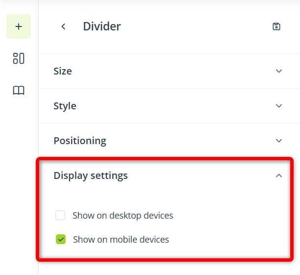
The divider will be visible on mobile devices but hidden on desktop devices.
4. Basic actions
When you click a section, a small menu appears above it. Use these icons to:
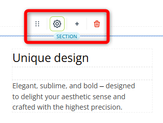
- Move the section—Click to grab the section and move it to a different location, such as to change the section order.
- Open the section settings—Click to open the side menu that allows you to adjust the column layout and style.
- Add a column—Click to add another column to the section.
- Remove the section—Click to remove the entire section from your creation, along with all widgets that it contains. You can reverse this action by using the undo button.
When you click a widget, a similar menu appears below it. Use these icons to:
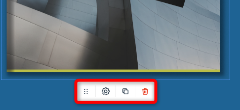
- Move the widget
- Open the widget settings
- Duplicate the widget (an identical copy will appear below the original)
- Remove the widget
5. Settings
You can access the settings of your creation by clicking the gear icon in the top bar:
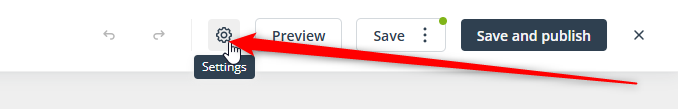
Here, you can define the following:
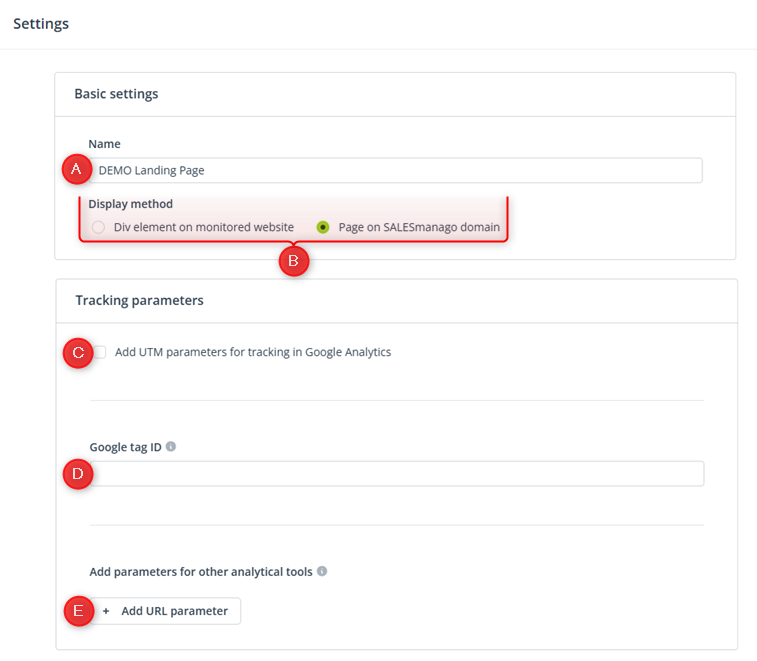
[A] Name—Provide a name that will make it easy to identify your creation on the list. This is an internal name that will not be visible to recipients.
[B] Display method—These options are described in detail in Section 5.A below.
[C] Add UTM parameters for tracking in Google Analytics—Here, you can enter the medium and campaign parameters for Google Analytics, which will be added to all links included in your creation.
[D] Google tag ID—This setting is optional. Here, you can provide your Google tag ID to track on-site behaviors (such as button clicks or page scrolling) in Google Analytics.
If you provide a Google tag ID, a Google Tag Manager (gtag.js) script will be added to the code of the page where your creation is displayed. As a result, information about user interactions will be transferred to Google Analytics and displayed in the Google Tag Manager dashboard.
The Google tag ID has the format of “G-” or “AW-” followed by a combination of letters and numbers, for example: G-PSW1MY7HB4.
To find this ID in Google Analytics 4, go to Admin and under Property Settings, select Data streams. Click the name of a selected data stream. Under Stream details, copy the “Measurement ID”.
[E] Add parameters for other analytical tools—Here, you can add up to three additional parameters for tracking results in tools other than Google Analytics. The parameters will be added to all links included in your creation.
A. Display methods
When creating a landing page or a form, you need to select one of the two available display methods:
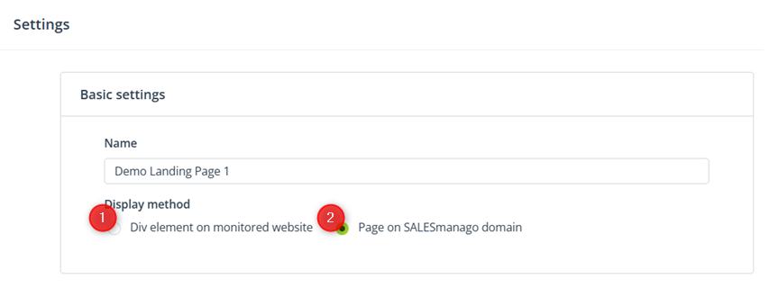
[1] Div element on monitored website
Choose this option if you want to contain the creation in a div element located on your own domain. You need to provide the ID of the element and select the monitored domain on which this element will be displayed.
IMPORTANT: Make sure that the SALESmanago Monitoring Code is implemented on the selected website.
Ensure that a div element with the specified ID actually exists on your domain. The SALESmanago system automatically generates a div ID for each creation. You can either copy and implement this ID on your website, or you can replace it with your own div ID.
This option is recommended if you prefer not to display your creation in a window on the SALESmanago domain (which may impact the recipient’s trust in your message).
If you choose this method, you do not need to specify the publication or deactivation time. The creation will become active immediately after you click Save and publish, as long as a div element with the specified ID is present on your website.
[2] Page on SALESmanago domain
This option requires no additional configuration on your part. When you click Save and publish, SALESmanago automatically generates a URL, which is immediately displayed in a new window. If you ever need this URL in the future, you can hover your mouse over the creation in the list and click the copy button:
You can include this link in your communications, for example, an email template (added to a button or image) or an iframe element on your website.
Note that the creation will be displayed in a window located on the SALESmanago domain.
If you choose this option, you can specify the publication date and time and, optionally, also the deactivation date and time. When you click Save and Publish, the following screen will appear:
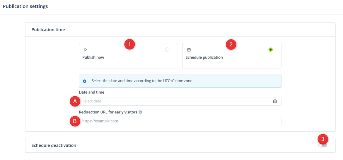
[1] Publish now—Select this option if you want your creation to become active (accessible) immediately after you click Save and Publish again.
[2] Schedule publication—Select this option if you want to schedule the activation of your creation for a later time. Specify the date and time [A] and provide a redirection URL for early visitors [B].
The URL provided in field [B] is a “fallback” address. Anyone who clicks the link to your creation before its scheduled publication time will be redirected to this fallback address. This protects your content from being accessed prematurely.
[3] Schedule—Whether you choose option [1] or [2], you can schedule the deactivation of your creation. Specify the date and time when the creation will stop being published. Then, provide a redirection URL—a “fallback” address to which anyone who clicks the creation’s link will be redirected after the creation becomes inactive.
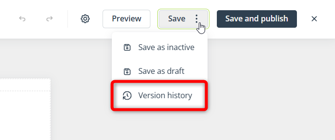
6. Saving options
When you want to finish working with the Web Engagement Studio, you have three options for saving your work (located in the top right-hand corner of the screen):
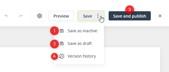
[1] Save as inactive—Choose this option if your creation is finished, but you do not want to publish it yet.
[2] Save as draft—Choose this option if your creation requires more work and still needs to be finished.
[3] Save and publish—Choose this option if your creation is finished and you want to publish it immediately or schedule its publication for a later time.
[A] Version history—Here, you can see the history of changes to this creation. If necessary, you can restore a previous version. For more information, see Section 7 below.
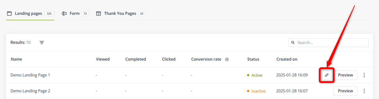
All saved creations are accessible in Menu → Web Tools → Lead Generation → Web Engagement Studio, under the appropriate tab: Landing pages, Forms, or Thank You Pages. In the Status column of the table, you can check whether they are saved as a draft, as active (published), or as inactive.
7. Version history
The version history is a record of changes made to your creation over time. It allows you to track edits and, if needed, restore a previous version. You can access the version history in the Save menu:
In the Web Engagement Studio, a new version is recorded:
- When a draft or a finished version (active or inactive) is saved for the first time.
- The creation is saved as finished (active or inactive) after a widget was added or removed, a section was added or removed, or a column was added to a section.
The version history does not retain autosaved versions. A version is only recorded when saved by a user.