Useful links
Widget Frame with product to choose allows you to select independently products to your dynamic email. Ordinary product frame works on the basis of automatic placement of products from an abandoned cart or last visit, depending on which type of recommendation you choose.
Benefits:
- selecting products to your dynamic emails all by yourself,
- the possibility of offering your customers products that they have not got a chance to see (news or customized products),
- building the atmosphere of trust.
What needs to do?
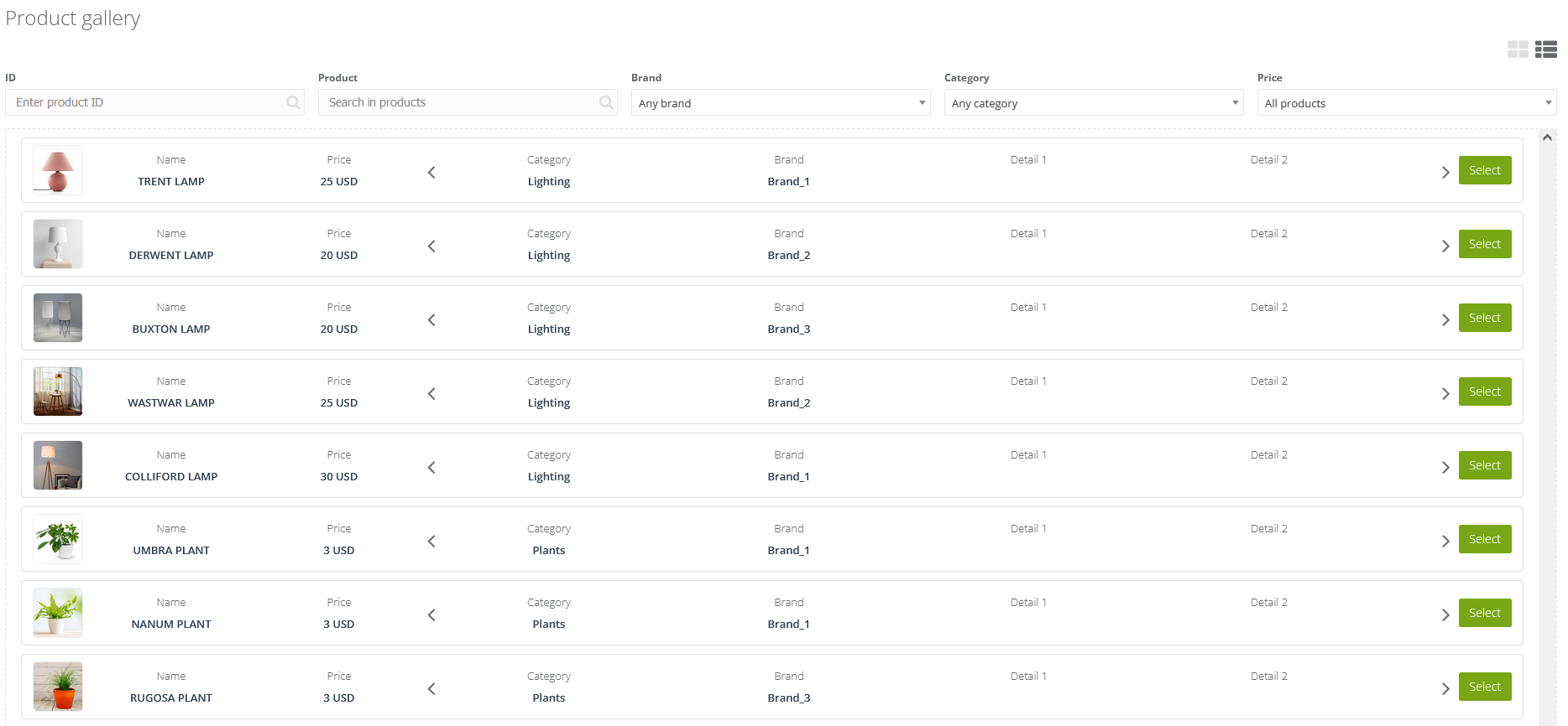
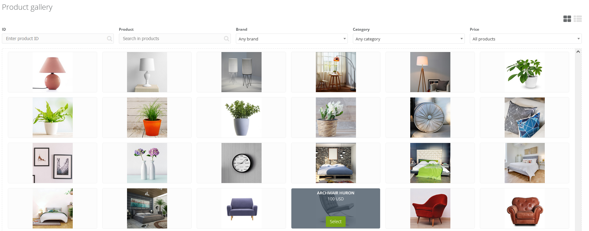
Add an XML file to the SALESmanago system. Once the file is added correctly, you will gain access to the product gallery. You can get there through the widget. You can choose products in your email.
How does it work?
After you choose products, the frame will contain images of the chosen products together with standard information about them that is included in the XML file (name, category, description, and price).
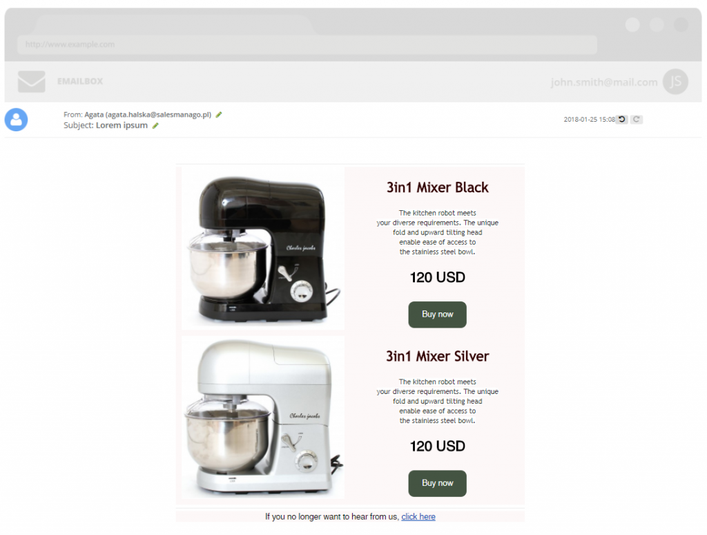
Here is the exemplary email with recommendations in the Frame with product to choose:
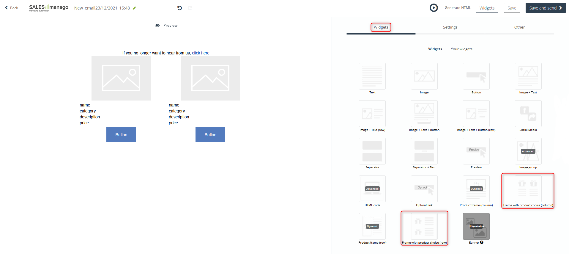
In order to use the widget Frame with product choose, go to
Channels → Email Marketing → + New email → Drag & Drop → Widgets → Frame with product choose
Contents
- General settings
- Product fields
- Button
- Select a product
1. General settings
From the Widgets tab drag Frame with product to choose. Once you hover the cursor over the widget, you will see a green panel that enables editing the widget. Click the pencil icon to do so.
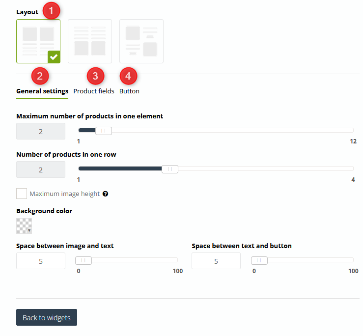
[1] Layout – choose one out of three available layouts of the products inside the frame.
[2] General settings – it applies to all products in the frame.
- Maximum number of products in one element – choose the number of products that will display in the frame. You can choose up to 12 products.
- Numeber of products in one row
- Maximum image height – when the maximum height is set, larger photos larger will be adjusted proportionally.
- Background color – choose the background color of the frame by means of the color picker.
- Space between image and text – set space between the image and the text.
- Space between text and button – set space between the text and the button.
2. Product fields
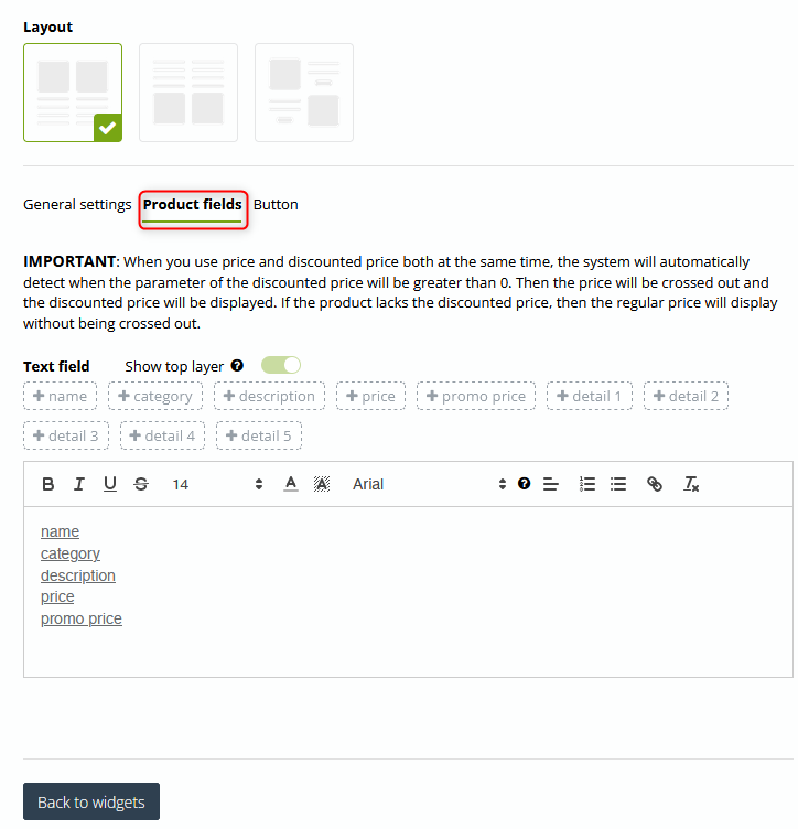
[3] Product fields – by standard, XML files include 4 basic information about a product: name, the category of the product, description, and price. If the file contains non-standardized information such as details or discount price, you can add them in the tab. To do so, you need to click [ + ] on the tag with the piece of information.
You can freely edit the font in the product frame. Mark the information which appearance you would like to edit. You can change the font type and size, make it bold or underlined. You can choose colors, add links and insert bullets.
IMPORTANT: Checking Show top layer makes the text box change its background color according to the color selected for the widget. When clicked, the option will also become active for other widgets.
3. Button
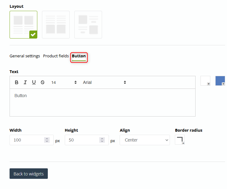
[4] Button – adjust the settings of the button according to your preferences. You do not have to insert the URL address as it is added automatically.
- Button text – type in the text that will be available on the button. You can change the font type and font size; edit freely the font: make it bold, underline it, etc. Next to the field, you can find two color pickers with which you can change the background color and the font color.
- Width – establish the width of the button in pixels.
- Height – establish the height of the button in pixels.
- Align – choose one out of three positions of the button from the dropdown list (centered, left and right).
- Border radius – determine the degree of the corner rounding of the button.
4. Select a product
Hover the cursor over the widget right in the place where a product will display. Then click Select a product. You will be redirected to the product gallery where you can choose products to your email.
