Useful links
The Web Engagement Studio is an intuitive tool that enables you to design engaging creations to be displayed on your website.
Read more about the Web Engagement Studio >>
One of the available creation types is the form, which allows you to collect zero-party data and turn anonymous visitors into leads. Data collected through forms can be used to create personalized content, enhancing the overall experience of your audience.
To create a form in the Web Engagement Studio, go to
Web Tools → Lead Generation → Web Engagement Studio → New creation → Form
Contents
1. Getting started
Forms are a useful tool for converting anonymous website visitors into leads. In the Web Engagement Studio, you can easily design visually appealing forms with complex layouts and configure all the necessary settings.
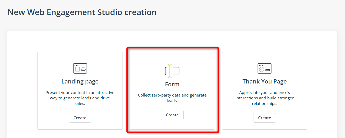
To create a form, go to Menu → Web Tools → Lead Generation → Web Engagement Studio. There, click New creation in the top right-hand corner of the screen.
Select Form as the creation type:
When you click anywhere on the form in the design zone, the following left-side menu will open:

The menu has three tabs, which are described in detail in the sections below.
NOTE: A form can be included in a landing page. In the landing page creator, go to Widgets and open the Conversion menu. Drag and drop the Form widget into the design area:
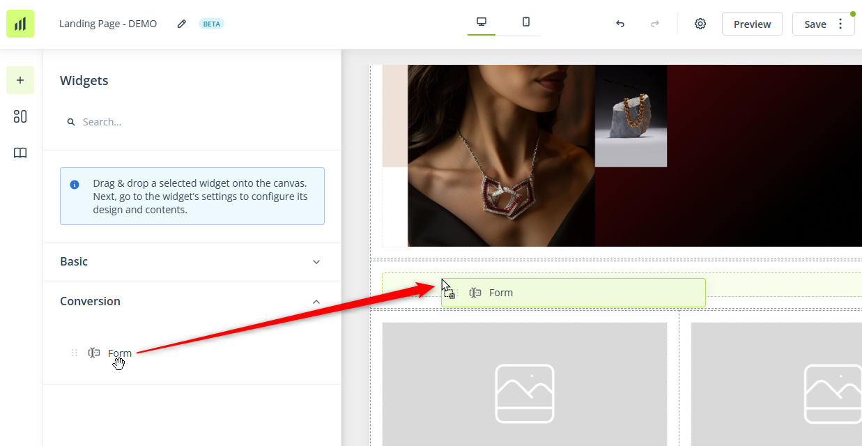
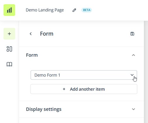
Next, select an existing form from the list.
The selected form will be inserted into the landing page.
IMPORTANT:
- A form can only be included in a landing page if it is saved and active (published). Inactive forms and drafts are not available in the list.
- To adjust the content or appearance of the form, edit the form itself (you cannot make any adjustments in the landing page creator).
2. Data fields
Forms created in the Web Engagement Studio allow you to gather a broad scope of valuable zero-party data. This data can be leveraged to execute highly personalized marketing campaigns.
Read more about collecting and using zero-party data with SALESmanago >>
Specific types of data are collected through corresponding data fields, consisting of a label, an input field, and, optionally, a placeholder. The label and placeholder text can be freely edited.
The available data fields are divided into two categories:
- Contact details—These data fields allow you to collect basic personal information, such as name and address.
- Other—This category includes some more advanced options (dropdown menu, single- and multi-choice questions), various consent types, and custom text.
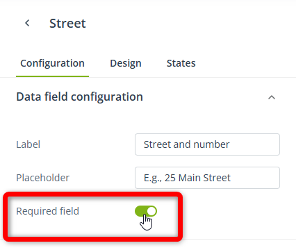
The only data field required by SALESmanago is the email address. However, you can mark any data field as required by accessing its settings and using the dedicated switch:
A. Contact details
This category includes data fields for basic personal information:
- Email address—This data field is included in the form by default and cannot be removed as the email address is required to create a Contact Card in SALESmanago.
- First and last name—This data field is included in the form by default but can be removed.
- Street
- City
- Province
- Postal code
- Country
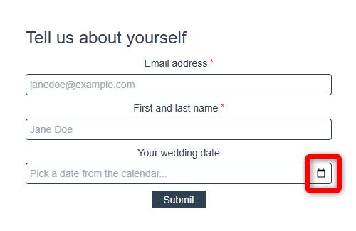
- Birthday—This option may look slightly different for individual end users depending on their browser. In the great majority of cases, they will be able to pick a date from a calendar. The picked date will be transferred to SALESmanago in the UTC timestamp format and displayed on the Contact Card in the YYYY-MM-DD format.
- Company
- Fax
The following data fields allow you to collect additional personal information, specific to your industry and individual needs:
- Standard detail
After adding this data field to your form, click it to open its settings. Under the Configuration tab, specify the name of the standard detail [A] that will store answers provided in this field.
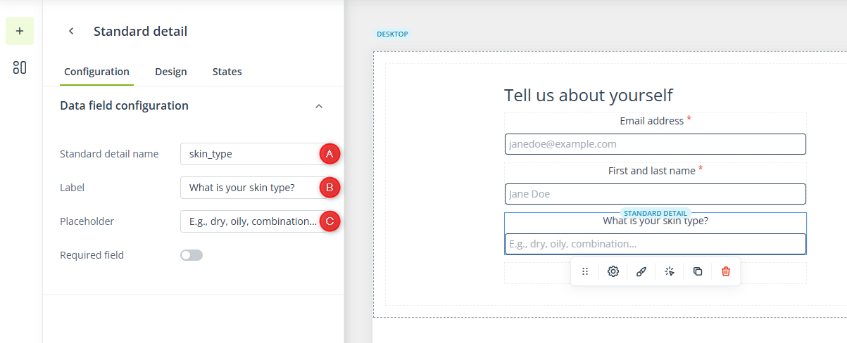
- Provide a clear label [B] and a placeholder [C] that will help your website visitors correctly fill out the field.
- Dictionary detail
Dictionary details are used to store numbers or dates. Unlike standard details, dictionary details must be created (defined) in advance. Therefore, after adding this data field to your form and clicking it, select an existing dictionary detail [A] that will store answers provided in this field or create a new dictionary detail [B].
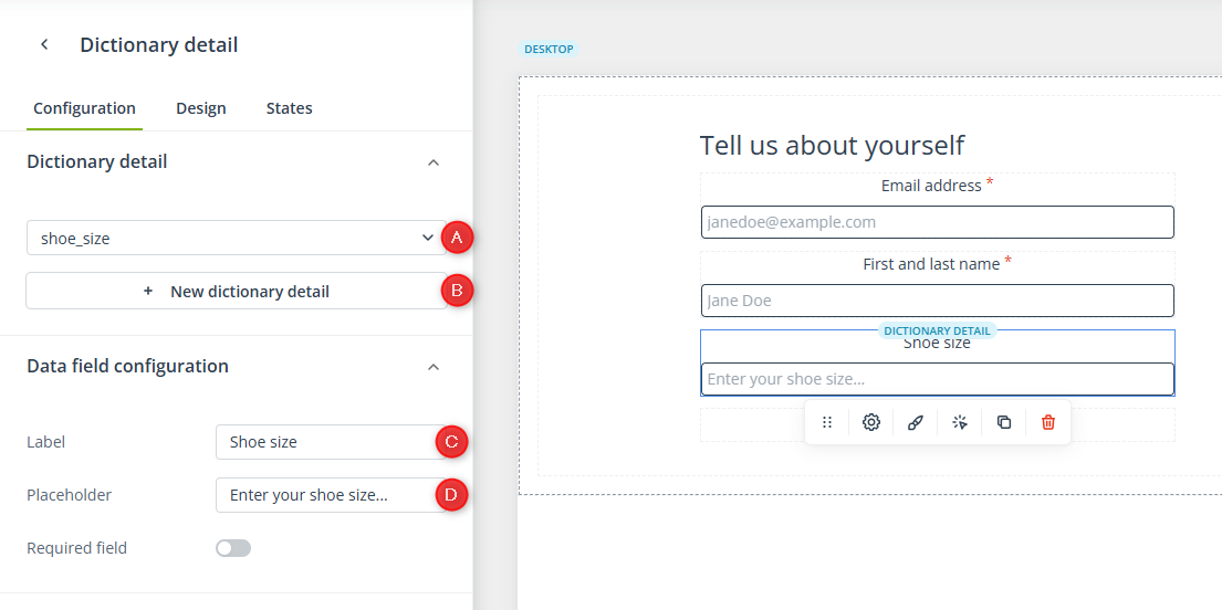
- If you click button [B], a new browser tab will open. Once you save your new dictionary detail, it will immediately appear in the list in the first tab.
Next, provide a clear label [C] and a placeholder [D] that will help your website visitors correctly fill out the field.
NOTE: The completion mode will be different depending on the type of the selected dictionary detail: - If you select a dictionary detail storing numbers, the website visitor will only be able to enter a number in this field.
- If you select a dictionary detail storing dates, the website visitor will need to pick a date from a calendar, for example:
- Key Information
Key Information items must be created (defined) in advance, along with any possible answers. Therefore, after adding this data field to your form and clicking it, select an existing Key Information item [A] that will store answers provided in this field or create new Key Information [B].
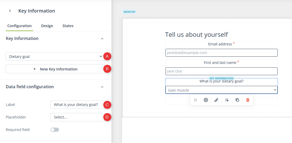
- If you click button [B], a new browser tab will open. Once you save your new Key Information, it should appear in the list in the first tab. If you cannot see it in the list, try using the search box or save your creation as a draft and edit it again.
Next, provide a clear label [C] and a placeholder [D] that will help your website visitors correctly fill out the field.
B. Other
This category includes the following data fields:
Dropdown menu
This data field allows you to display a list of options in the form of a dropdown menu. Only one of these options can be selected when completing the form.
The answers provided in this field will be stored in SALESmanago as standard details. Therefore, after adding this data field to your form, click it and provide the following details:
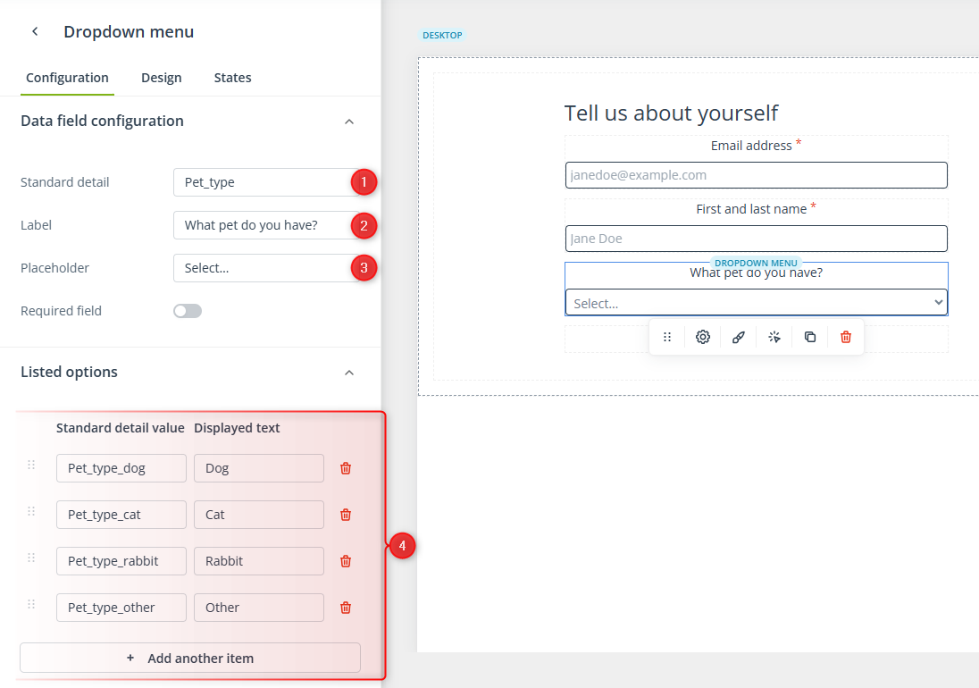
[1] Standard detail—Enter the name of the standard detail that will store answers provided in this data field.
[2] Label—Provide an easy-to-understand label that will be displayed above the input field.
[3] Placeholder—Enter a short text that will help your website visitors take the required action.
[4] Listed options—Here, define the possible answers that will be displayed in the selection list. Add as many items as you need (you can change their order using the six-dot icon on the left). Then, specify how the answers will be saved in SALESmanago (Standard detail value) and provide the text that will be displayed in the dropdown menu (Displayed text).
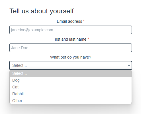
For example, if you complete this section as shown in the screenshot above, your website visitors will see the following list:
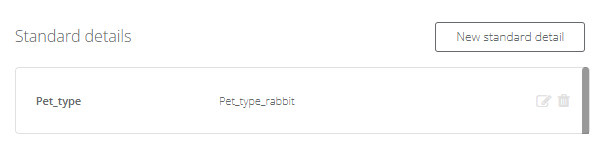
If someone selects “Rabbit” from the dropdown menu, this answer will be saved on their Contact Card in the following format:
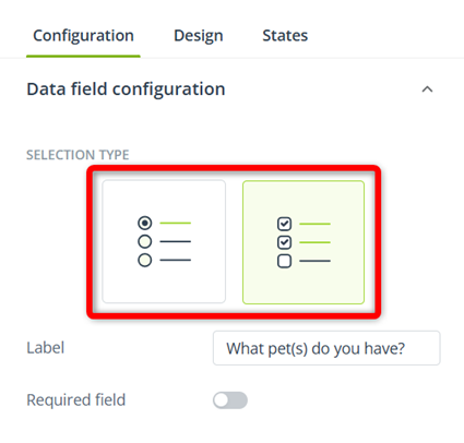
Radio buttons/Checkboxes
This data field allows you to display a list of options in the form of controls: radio buttons (single choice) or checkboxes (multiple choice).
After adding this data field to your form, click it to access its settings. First, decide whether you want to list the available options as radio buttons or checkboxes:
Irrespective of your choice, the answers provided by your website visitors will be stored in SALESmanago as standard details. However, the configuration looks different for these two types of controls. This stems from the fact that a standard detail can have only one value per Contact.
If you choose radio buttons, you need to specify the name of the standard detail [1] that will store answers provided in this field. In the Listed options section, add as many items (options) as you need. For each item, specify the standard detail value [2] (the value that will be saved in SALESmanago and displayed on the Contact Card) and the displayed text [3] that will be actually visible in the form.
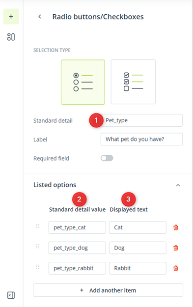
Items in the list can be rearranged using the six-dot icon or deleted using the trash can icon.
If you choose checkboxes, you need to provide as many standard detail names as there are items in the list. This is because a single standard detail cannot store more than one value per Contact (while it is possible to select more than one checkbox). Therefore, each selected answer needs to be saved as a separate standard detail.
Start by adding the required number of items (options) in the Listed options section. For each item, specify the name of the standard detail [1] that will store the answer provided through this checkbox. Next to the name, define the detail value and displayed text [2]—for ease of configuration, in the case of checkboxes, the value saved in SALESmanago and the text displayed in the form must be the same.
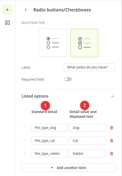
Items in the list can be rearranged using the six-dot icon or deleted using the trash can icon.
Loyalty Program
This data field allows you to invite your website visitors to join a selected Loyalty Program.
After adding this data field to your form, click it to access its settings. First, select an existing Loyalty Program [1] or create a new Loyalty Program [2].

Next, provide the text [3] that will be displayed next to the checkbox that enables your website visitors to join your Loyalty Program.
Custom consent
This data field allows you to include a request for a custom consent created in Menu → Audiences → Contacts → Custom consents.
Read more about custom consents >>
After adding this data field to your form, click it to access its settings. First, select an existing custom consent [1] or create a new custom consent [2].
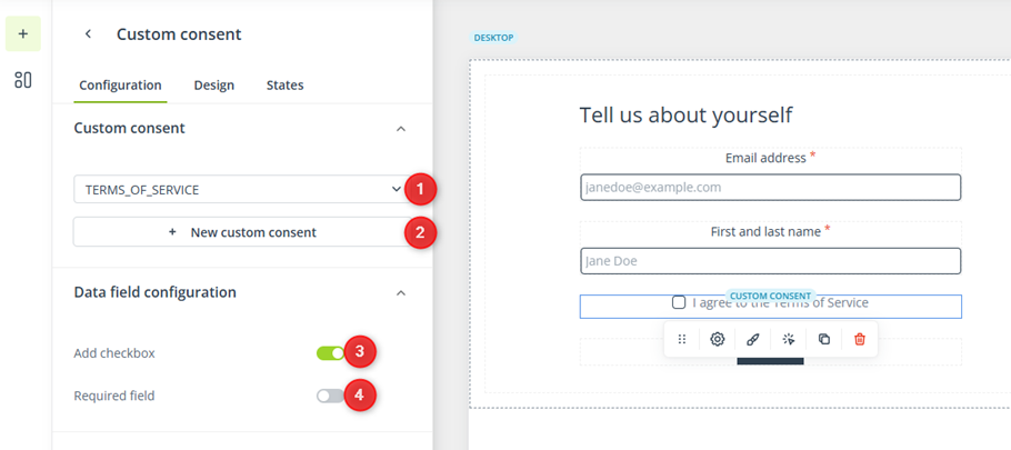
Then, decide whether the text of the consent should be accompanied by a checkbox [3]. By not including a checkbox, you imply that the consent is given by submitting the form.
If you add a checkbox, you can make its selection required [4] for the form to be submitted.
Consent
This data field is an alternative to the custom consent data field described above. You can use it to ask for any type of consent. The responses (acceptance/decline) will be stored in SALESmanago as tags.
After adding this data field to your form, click it to access its settings. First, provide the consent text [1].
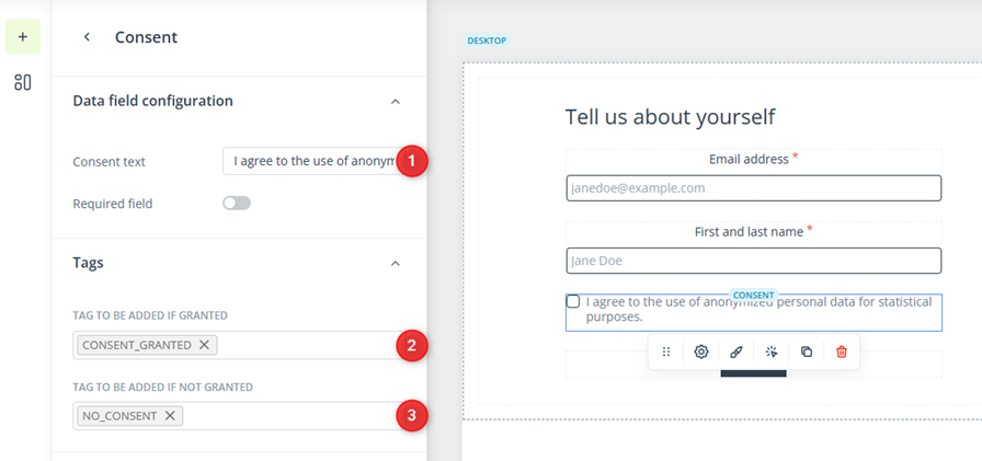
Next, specify the tag that will be added to the Contact if they check this box and grant the consent [2] and the tag for the opposite situation [3].
TIP: The consent and custom consent data fields can be used to ask for marketing consents. For example, you can configure the consent data field as follows:
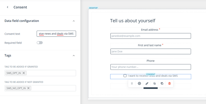
Then, you can create a Workflow process in which the Event: Tag assigned to Contact will be connected to the Action: Change Mobile Marketing consent status to opt-in. This way, the consent granted through the form will be reflected as opt-in status on the Contact Card.
Custom text
“Custom text” is not an actual data field, but rather a simple text field that allows you to include additional text content within the form, for example:
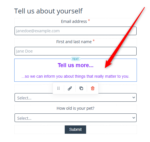
You can place the custom text data field above or below another data field.
3. Design
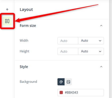
To access the general design settings of your form, click anywhere on the form and select the Design tab in the panel that will appear on the left side of the screen.
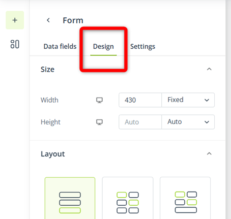
Here, you can define settings such as the size of your form and its background color. Note that these settings are different from the layout (design) settings of the entire creation (see Section 5 below), which can be accessed through the dedicated icon in the main menu:
The options available under the Design tab allow you to define settings that will be applied across the entire form, including all data fields, such as the default input field design, the default text formatting for labels, placeholders, and input text, and the display settings—whether you want the form to be displayed only on desktop devices, only on mobile devices, or on both.
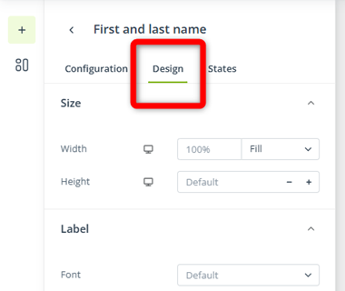
All settings defined under the Design tab can be overwritten in the settings of individual data fields. To access these individual settings, click a data field and switch to the Design tab:
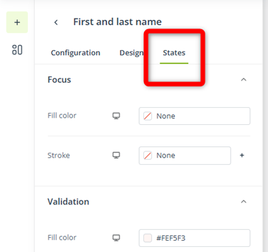
In the third tab, States, you can define the appearance of the input field in different states (Focus and Selected) and the formatting of any validations that may appear to help in filling out the form, such as:
- This field is required
- Please enter no more than {0} characters
- Enter a valid phone number
- Please enter a valid email address
- Enter a valid date
4. Settings
To access the form settings, click anywhere on the form and select the Settings tab in the panel that will appear on the left side of the screen.
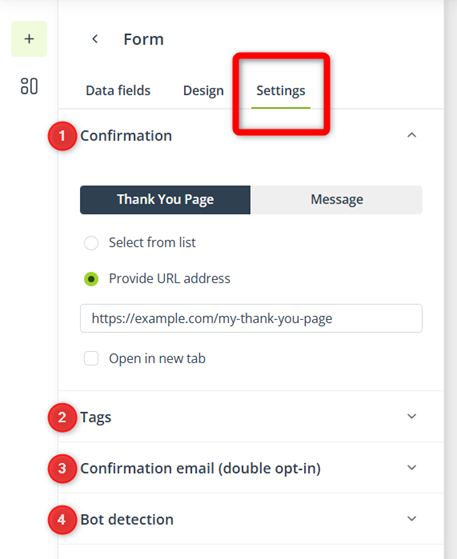
Here, you can define the following settings:
[1] Confirmation mode—Configure the message that will be displayed to a website visitor when they successfully fill out and submit the form. You have the following options:
- Thank You Page—Select an existing TYP (for example, one created in the Web Engagement Studio) or provide a URL address. You can configure the TYP to open in a new tab using the checkbox below.
- Message—Select the image that will be displayed at the top of the message. Then, turn on the switch below to see a preview [A] of the message:
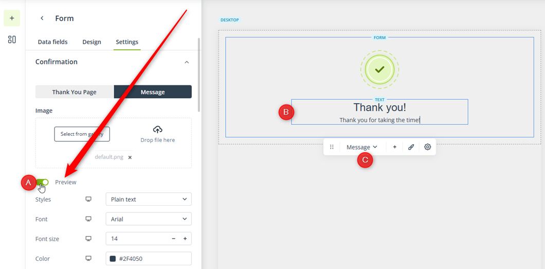
- When this switch is on, you can click the text field [B] in the confirmation message and edit its content (the text formatting options will appear in the left-hand panel).
You can switch between the previews of the form and the confirmation message using menu [C].
[2] Tag(s)—In this section, you can enter one or more tags that will be assigned to Contacts who have filled out this specific form.
[3] Confirmation email—Select the email template that will be sent as the subscription confirmation to Contacts who have filled out this form.
The double opt-in mechanism is obligatory for all forms created in the Web Engagement Studio (note that the email address is a required data field). By default, the selected subscription confirmation email will be sent to existing opt-out Contacts and new Contacts who have completed this form.
If you enable the option: Do not send to existing Contacts, the email will be sent only to new Contacts, i.e., Contacts that did not exist in your database prior to completing the form.
[4] Bot detection—Decide whether you want to implement reCAPTCHA v3 for this form.
reCAPTCHA v3 is a Google security service that detects and prevents bots without user interaction, which means that the person filling out the form will not be required to take any action to prove they are human.
Read more about reCAPTCHA v3 in Google’s guide >>
5. Creation settings
When creating a form, you need to define a range of settings, just like for any other creation.
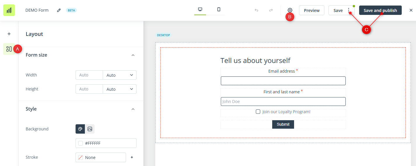
Detailed instructions concerning the layout configuration [A], the general settings [B], and the saving options [C] are provided in the main article: Web Engagement Studio | First steps >>