Useful links
The contact form is an effective way to generate leads within your own website. In the new Express form designer, you can easily create eye-catching and effective pop-up contact forms.
Each anonymous contact who submit a contact form is saved in your CRM database as a monitored contact, letting you track their behaviour – subsequent visits, interests, time spent on the website, and so on. Over time, each monitored contact’s behaviour profile becomes more complete, which allows you to create more effective automation processes.
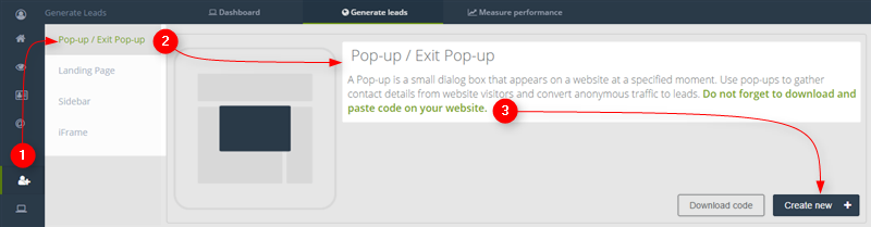
In order to create a pop-up or exit pop-up in Express wizard, you need to go to
Web Tools → Lead Generation → Lead Generation forms → Pop-ups → + Create new
Contents
- Starting
- Choosing a form type
- The form
- Thank you page
- Confirmation mail
- Display settings
1. Starting
To begin creating a new contact form, go to Menu → Web Tools → Lead Generation → Lead Generation forms → Pop-ups → + Create new
You can choose from 4 ready-to-use content templates.
.
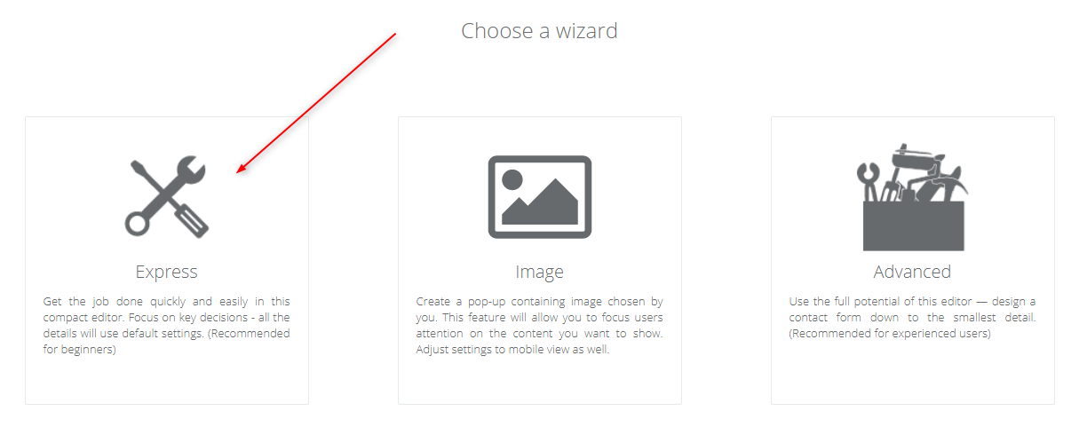
At this point, you can choose which form building tool to use. Click the Express builder.
If you want to create Advanced Pop-up/Exit pop-up click here.
If you want to create Pop-up with image click here.
A pop-up contact form in SALESmanago consists of 3 elements:
- the form itself, with fields to be populated with details of people visiting your website,
- a thank you page to appreciate contacts who submit the form,
- an email with a link that confirms subscription (+ optionally, a short confirmation message informing contacts that they successfully subscribed).
TIP: You will get the best results if you use a consistent style in each element of the contact form.
.2. Choosing a form type

[1] Tour – switch on the tour that will guide you through the process of creating a pop-up and adding it to your website.
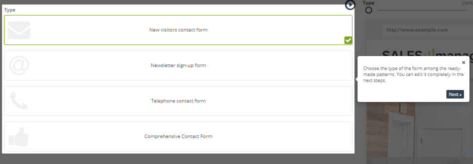
[2] Type – select one of four ready-to-use content templates. Each template is built around a certain goal, but you can adjust all aspects of the template once it is loaded.
[3] Progress bar – shows how far along you are in the process of making a contact form.
[4] Dynamic preview – any changes you make to the template will be instantly shown in the preview.
[5] Display mode – you can switch the preview between different kinds of devices and see how the element would be displayed on different screens – PC, tablet, and phone.
[6] Displayed element – click tabs to switch between the constituent parts of the contact form in the preview (by default, the displayed element will be the one you’re editing at the moment, but you can always switch back and forth between them).
Click Next to start working on the first element.
3. The form
The form is where users can enter their details, but it’s also the place where you greet them and make a first impression. When someone submits a form, the entered details go to the contact database in your CRM and are formed into the contact card.
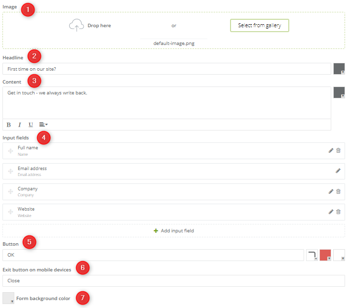
[1] Image – the graphic on the form. You can use the default provided in the template, or add your own image from the gallery. How to use the image gallery
[2] Headline – the first line of text on the form, a title or an opening sentence.
[3] Content – the main body of text in the form. Putting crisp, witty copy here will work wonders for your lead gen process.
[4] Input fields – here you can add, edit and remove the input fields of your contact form.
Available input fields:
- Full name
- Email address
- Phone number
- Date of birth
- Street address
- Company
- City
- Region
- Postal code
- Country
- Position
- Website
- Any text
- Agreement
- Custom detail – fields to type the contact data in
- Agreement – checkbox to agree for receiving emails
- Consent from consents list – checkbox to agree for created by you consent:
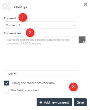
[1] Consent – choose a consent name from the list
[2] Consent text – in this place you can change the consent text and font size.
[3] You can display a consent as a checkbox – the user can check a consent, but don’t have to do it to go further, or you can display checkbox as a required field.
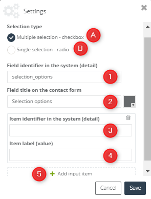
- Selection options – allows adding radio buttons (single selection) or checkboxes (multiple selections):
[A] checkbox
Adding the checkboxes to the form allows the contact to have multiple selections of answers on the specific field. Typing the chosen data in the checkbox settings you have to consider both the value and the detail of elements.
IMPORTANT: chosen by the user option will be saved on the contact card as a detail.
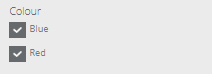
The view of exemplary check buttons on the form:
[1] Item identifier in the system (detail) – type the name of the detail, which will be saved on the contact form including answer chosen by the user (saved as a detail value).
[2] Field title on the contact form – type the name of question, which will be displayed on the pop-up.
[3] Item identifier in the system (detail) – type the name of the detail, which one will be saved on the contact card with chosen by a user option (saved as a detail value from 4th point).
[4] Item label (value) – possible options (answers) to choose between assigned to the given question. The option chosen by the user will be saved on the contact card. (the detail name should be typed in the 3rd point)
[5] Add input item – add another option.
THE TIP: The view attached above shows an exemplary scheme, which should be followed while filling the relevant fields to add checkboxes to the form. The first field defines field title on the contact form – in this case: colour, the detail will be the phrase indicating the choice – possible among the available options (it should contain the field title to correctly identify the answer to the given question) ex. colour_1→ represents choosing blue colour; similarly: colour_2→ here: choosing a yellow colour. Thanks to this, the information including all the answers assigned to the given question will be placed in the details of the specific contact (in this case about colour).
[B] radio button

Adding the radio buttons to the form allows respondents to choose one of any given by you options available to choose between
IMPORTANT: chosen by the user option will be saved on the contact card as a detail.
The view of exemplary radio buttons on the form:

[1] Field identifier in the system (detail) – type the name of the detail, which will be saved on the contact form including chosen by the user answer (saved as detail value)
[2] Field title on the contact form – type the name of question, which will be displayed on the pop-up.
[3] Selection items – possible options (answers) to choose between assigned to the given question. The option chosen by the user will be saved on the contact card. (the detail name should be typed in the 1st point)
[5] Add input item – add another option.
- Dictionary detail – after filling a form, on the contact card will be created a detail with defined name and following detail value:
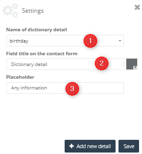
[1] Name of dictionary detail – choose the name of the dictionary detail from the list.
[2] Field title on the contact form – choose the name of the field what will be displayed on the pop-up.
[3] Placeholder – type the prompt what will be displayed in the form.
After complete all the data in the first window, the second one will show you. In this one we have to set information about adding a new detail:
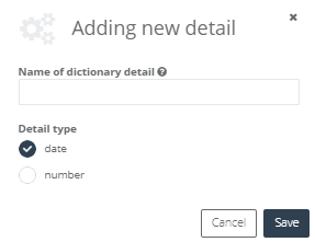
W tym miejscu wpisujemy naszą nazwę szczegółu ze słownika, która musi posiadać przynajmniej 3 znaki, oraz ustalamy, czy nasz szczegół ma mieć formę daty, czy liczby.
In this place, you have to type the name of dictionary detail (remember – the name of dictionary detail must have at least 3 characters) and choose what form have our detail – a date or a number.
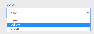
- Selection list – allows creating a drop-down list with the options displayed in the form of the selection list.
Adding the field “selection list” just as in the case of radio buttons, there is a possibility of selecting only one option, with this difference that the given options will be displayed in the form of the drop list, not radio buttons.
IMPORTANT: chosen by the user option will be saved on the contact card as a detail.
The view of the exemplary drop list on the form:
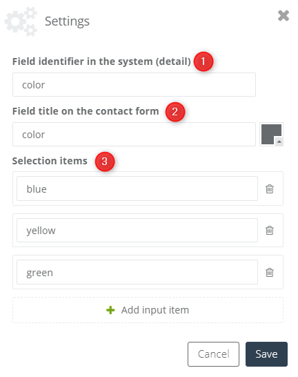
[1] Field identifier in the system (detail) – type the name of the detail, which will be saved on the contact form including answer chosen by the user (saved as detail value)
[2] Field title on the contact form – type the name of question, which will be displayed in the pop-up.
[3] Selection items – possible options (answers) to choose between assigned to the given question. Chosen by the user option will be saved on the contact card. (the detail name should be typed in the 1st point)
[5] Button – here you can specify the text, colour, and shape of the Submit button.
[6] Exit button on mobile devices – allows you to change the button text.
[7] Form background colour – use this colour picker to change the colour of the contact form’s window (the background layer).
When you’re done, click Next to start working on the Thank you page.
4. Thank you page
It takes time, effort and trust on a part of a customer to provide their contact details via a contact form. A Thank You page is a short message that expresses gratitude to people who go out of their way and give you their personal information. You can also inform your soon-to-be subscribers when and how you will be contacting them next.
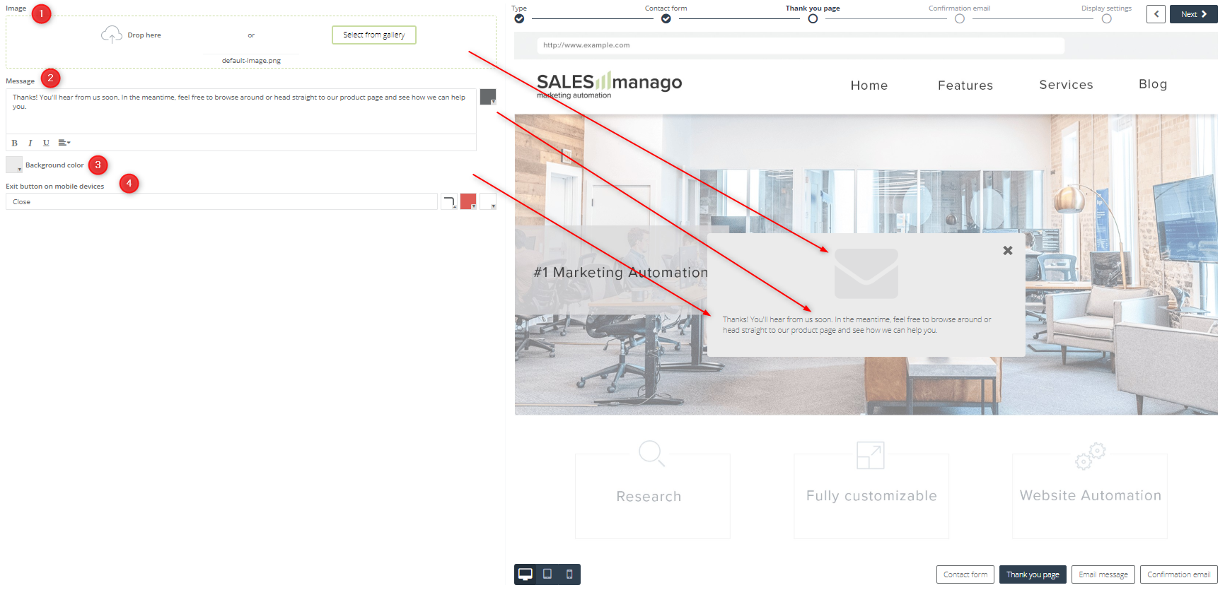
[1] Image – the graphic on the Thank You page. You can use the default provided in the template, or add your own image from the gallery. How to use the image gallery
[2] Message – here you can enter a short message to go with the Thank You page.
[3] Background colour – use this colour picker to change the colour of the Thank You page (the background layer).
[4] Exit button on mobile devices – allows you to change the button text.
Click Next to start working on the Confirmation email.
5. Confirmation email
To make sure email addresses of contacts are valid and all contacts who enter your CRM database do so willingly, a double opt-in system is in place. When someone subscribes on your website, the system sends that person a confirmation email to the address provided in the contact form.
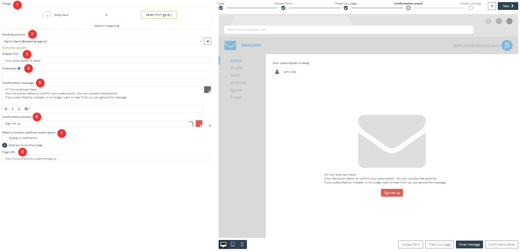
[1] Image – the graphic on the Confirmation Email. You can use the default provided in the template, or add your own image from the gallery. How to use the image gallery
[2] Sending an account – this is the email account from which the confirmation email will be sent.
TIP: If you don’t want to use any of the accounts from the list, you can make a new sending account by clicking the [ + ] icon.
[3] Subject line – enter the subject of the confirmation email here.
[4] Preheader – every email on the list in an inbox has a Subject and a short line right after the subject – a preheader.
[5] Confirmation message – enter the body of your message here. Explain to the recipients why they get this message and what you need them to do.
[6] Confirmation button – this button goes into the email, below the message itself. When a recipient clicks this button in their inbox, they are assigned an opt-in status in your contact database (this means they are a willing subscriber).
[7] When a contact confirms the subscription – decide what should happen after the recipient of this email clicks the confirmation button [5].
- Display a notification – the contact gets a short notification informing them of the successful subscription.
- Redirect to another page – the contact is redirected to the specified URL address.
[8] Page URL – if you chose Redirect to another page in the previous step, enter the URL to which you want to redirect contacts who click the Confirmation button [5/6b].
When you’re done, click Next to go to the last step – Display settings.
6. Display settings
Specify where, when and to whom you want this contact form displayed.
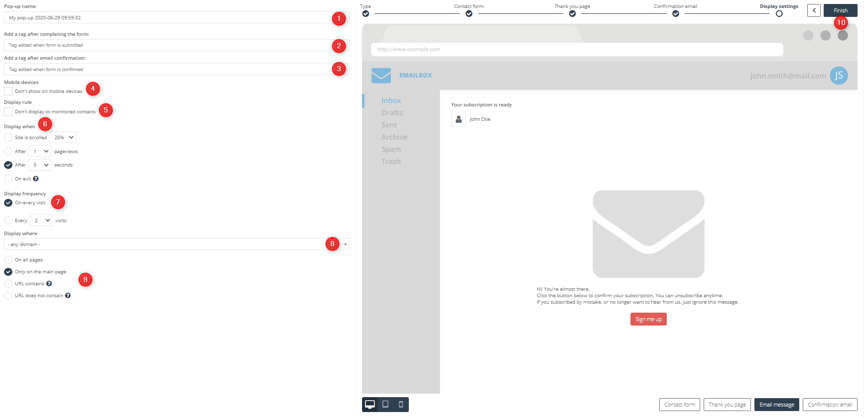
[1] Pop-up name – enter the name under which you want to save this form in SALESmanago.
[2] Add a tag after completing the form to contacts – enter tags you want to be automatically assigned to contacts after saving this form.
[3] Add a tag after email confirmation to contacts – enter tags you want to be automatically assigned to contacts after their confirmed the form via email.
[4] Mobile devices – select this checkbox if you want to exclude smaller devices (such as smartphones) from displaying this contact form.
[5] Display rule – select this checkbox if you want to show this contact form only to anonymous (unidentified) visitors.
[6] Display when – specify when during a visit should this contact form be displayed.
- site is scrolled xx% – the form appears after a person visiting your page scrolls the specified % of the site’s length, for example after reading xx% of an article.
- after x pageviews – the form appears after a person visiting your page enters or reloads a page on your website x times.
- after x seconds – the form appears x seconds after a visitor entered the website.
- on exit – remember that exit pop-ups don’t work on mobile devices.
[7] Display frequency – specify how often the pop-up will display:
- on every visit – display a pop-up every time a user visits the website.
- every x visits – display a pop-up after a specific number of visits.
[8] Display where – enter the URL of the website on which you want this contact form to be active.
[9] Display where (cont.) – specify on which pages within the website you want this contact form to be active.
- On all pages – the default setting, the contact form will be active on all pages within the website.
- Only on the main page – the contact form will be active only on the homepage of the website.
- URL contains – the contact form will be active only on those pages within the website, whose URL contains the specified phrase. Up to 255 characters.
- URL does not contain – the contact form will be active only on those pages within the website, whose URL does not contain the specified phrase. Up to 255 characters.
[10] When you’re done, click Finish. The contact form is ready and you can activate it right away.
.
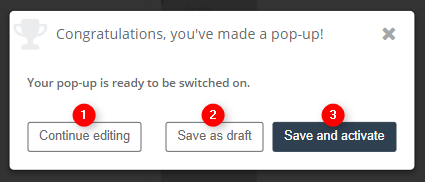
[1] Continue editing – click this button to return to the contact form builder and continue working on the form (the form is NOT saved).
[2] Save as draft – save the contact form as a draft, ready to be activated.
[3] Save and activate – save the contact form and activate it on your website. The form will start functioning right away.