Useful links
Drag & Drop Designer allows you to create beautiful, responsive, personalized email messages without having to understand HTML. You can use over 100 ready-made templates, or create your own layout using dynamic widgets, thanks to which you can add new message elements to the creation (text, graphics, buttons, products, etc.). Use the data of your contacts to personalize the content of the message and create different content variants, depending on who the message is sent to.
In order to start working with the designer, you need to go to
Channels → Email Marketing → Dashboard → + New email → Drag & Drop
Contents
- Introduction
- Choosing a layout and template
- Message settings – details
- Adding widgets to the templates
- Image + Text Widget
- Widget – Image group
1. Introduction
In the Email Drag & Drop Designer, you can create your own template with any layout using available widgets, or use a library of prepared patterns. By adding dynamic product frames and using placeholders, you can increase the personalization of your mailing.
IMPORTANT: The versions supported by SALESmanago are for Outlook 2017 and above.
For beginners, we have prepared a tour that will walk you through the process of creating a new email. To turn it on, after entering the designer, click the button in the upper right corner:

2. Choosing a layout and template
First, choose a general message format. In the next step, you will learn how to add graphical elements (the widgets) to the template.

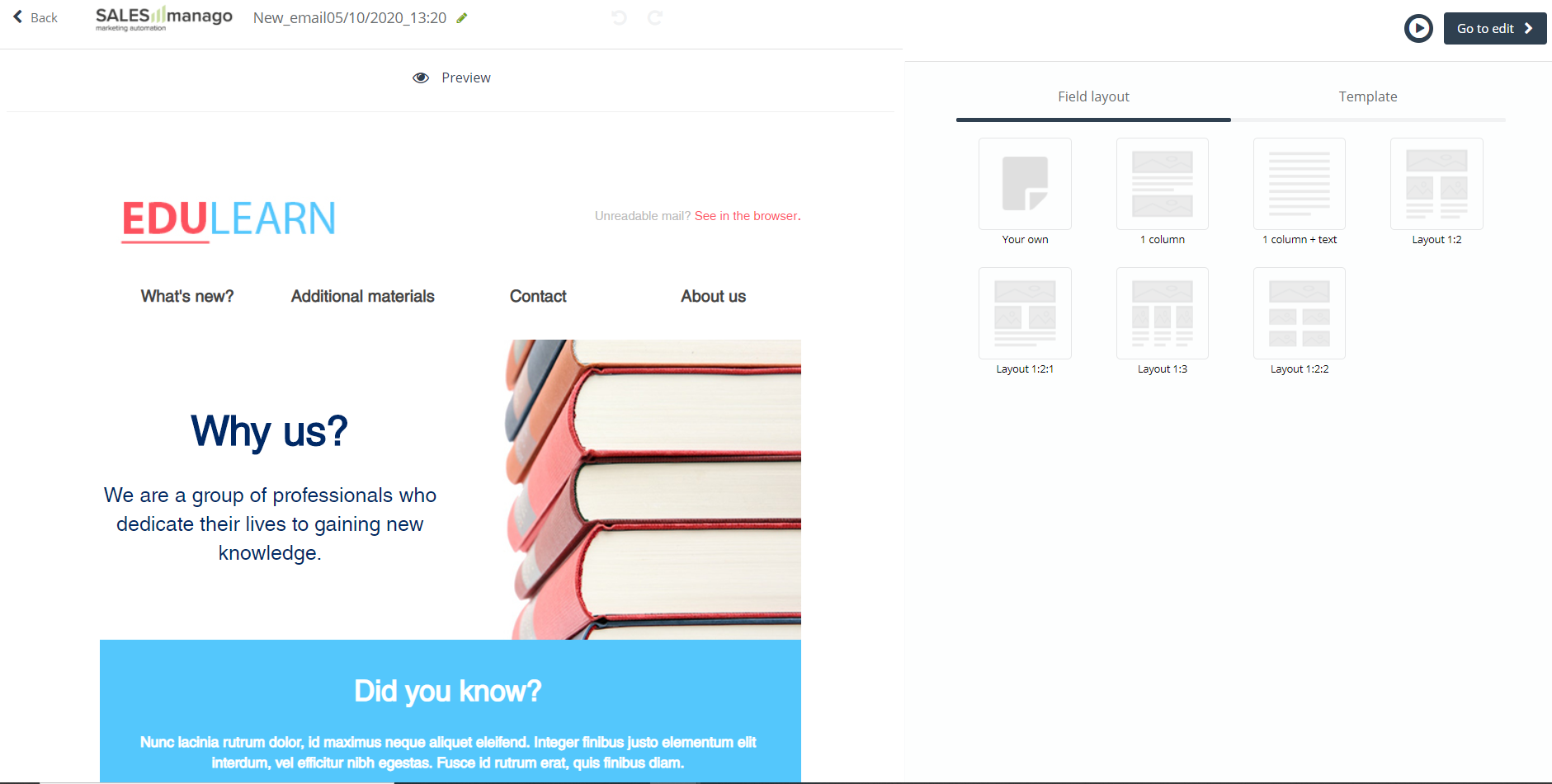
[1] Message settings – click the pencil icon to change the settings related to how the message is displayed in the recipient’s inbox – name, subject, account, preheader, and template width (for more information see 2.1 Message settings – details). You can change these settings now or later when setting up widgets.
[2] Widget settings – each widget can be freely moved, for example, by clicking the icon on the left, and edited by clicking the pencil icon.
[3] Duplicate – each widget with its settings can be duplicated by clicking this icon.
[4] Delete – click the trash can button to delete the selected widget.
[5] Preview – you can go to the preview at any time to see how your message is displayed to other users on the selected device. From here you can also go to editing additional information – the same as in point [1].
[6] Undo changes – you can undo or restore changes at any time.
[7] Field layout – choose the general format of the template. The layout affects how the template elements are aligned with each other.
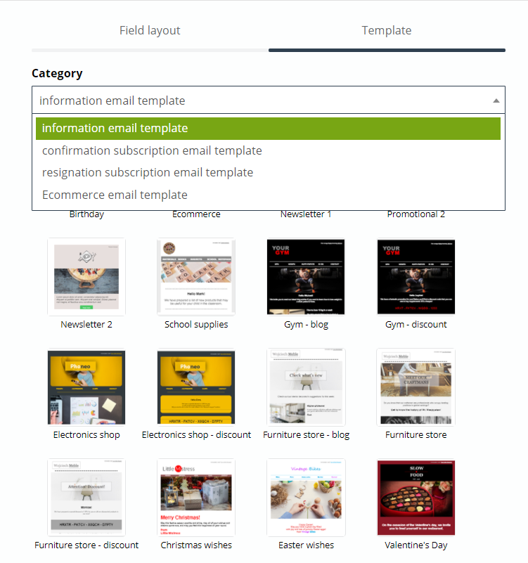
[8] Template – if you do not want to design your messages from scratch, you can choose one of the ready-made templates. Select one of the categories prepared by us to shorten the list to the searched ones:
[9] Tour – turn on the hints which will guide you step by step through all the stages of creating an email.

3. Message settings – details
You can access the message settings from several points in the Drag & Drop Designer. After going to editing, the settings panel is also visible, where it’s possible to change:
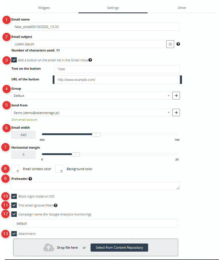
[1] Email name – the message will be saved in the system under this name.
[2] Email subject – the subject of the message may consist of 3-164 characters, you can add simple icons to the subject (button on the right).
[3] Add a button on the email list in the Gmail inbox – you can add Gmail markup to the subject of an email, set the content of the button, and its link. More information >>
[4] Group – in order to speed up the sending process, you can select a group of addresses from the drop-down list, or create a new one by clicking “+”.
[5] Send from – select the account from which this message will be sent. Click [+] to create a new account specifically for this sending. Information about the type of email account is displayed in green. More information >>
[6] Email width – move the slider to adjust the width of the message template. This is an important setting for the Image Group widget. You can set the maximum width of the message to 700 pixels.
Example: If you set the message width to 700 pixels, in this case, in order for the message template to scale, the total width of the images cannot exceed 700 pixels in width.
[7] Horizontal margin – move the slider to adjust the horizontal margin. You can choose its width on a scale of 0-20 pixels.
[8] Email window and background color – click the checkbox to change the color of a given item. The message window is the area where all the template elements are located – text, pictures, etc. The background is the area at the very back, behind the message window.
[9] Preheader – each message on the email list in the inbox has a visible subject of the message and a line of text right after the subject – the preheader. This is the first thing the recipient will see after reading the message subject:
IMPORTANT: If you leave this field blank, the preheader will be replaced by the first line of text in the message template. For this reason, it’s best to set up and control your own preheader.
[10] Block night mode on iOS – the option works only for the built-in box for iOS and ignores background color changes.
[11] This email ignores filters – uncheck if you want the message to be sent even if it is inconsistent with the filters set in Menu → Channels → Email Marketing → Settings → Sending settings.
Example: You have specified in the Email and SMS sending filters that you do not want recipients to receive more than 1 message per week, or receive a message on the weekend. However, you still may want your customers to receive, for example, a birthday message, and by selecting this option, even if the message is sent on the weekend, or it would be the second message in the week, it will be delivered.
[12] Campaign name (for Google Analytics monitoring) – uncheck it if you want this mailing to be included in your Google Analytics.
[13] Attachment – add an attachment by dropping it in a given place or selecting it from the repository.
TIP: The subject line and preheader share space on the inbox bar. For example, if you write a shorter topic, the longer preheader will fit in the bar.
4. Adding widgets to the templates
You can add widgets to the template in any order. After adding a widget, hover over it to open the context menu, move the item, or duplicate it.
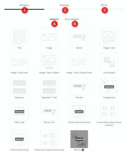
The menu is divided into three tabs [1] Widgets, [2] Settings, and [3] Other:
[A] Widgets – to add an item to the template, click on the desired widget and drag it to the edit field on the left.
- Text – a block of text,
- Image – any file you drop from your computer, or an image from the gallery,
- Button – an interactive button that you can link to,
- Image + Text – combination of 2 elements in one block,
- Image + Text (row) – combination of 2 elements in one horizontal line,
- Image + Text + Button – combination of 3 elements in one block,
- Image + Text + Button (row) – combination of 3 elements in one horizontal row,
- Social Media – buttons for direct subscription to company profiles on social media with icons and the possibility of personalizing their shape,
- Separator – a horizontal line separating elements,
- Separator + Text – the horizontal line separating elements with text,
- Preview – a link that allows the recipient to view this message in a separate browser window (for example, if the recipient uses an inbox that does not support images),
- Image group – a widget designed to create responsive mosaics from previously cut graphics,
- HTML code – a widget that allows you to insert an element written in HTML code,
- Opt-out link – a link that allows the recipient to unsubscribe from receiving subsequent messages from this sender (mandatory element),
- Product frame (column or a row) – a widget that allows you to easily include products from your store in your message. Thanks to the possibility of choosing the type of recommendation, you can add products from the abandoned cart, or the recently viewed products by the user. The widget allows you to contain selected information about the product (the name, category, price, or description are displayed as standard). If you have any non-standard information in the XML file, in the Product fields tab, drag those elements with the information that you want to additionally include next to the product. You can also set the number of products in an element and in a row yourself, as well as adjust the appearance of the frame according to your preferences – products in this frame may be displayed in a column or a row depending on your choice,
- Frame with product choice (Column or a row) – after uploading the XML file to the system, you have the option to place products that you choose yourself in the frame. To do this, just enter the widget editing panel, where you can enter the product gallery and select products for your message. The information contained in the XML file will be downloaded to the frame (by default: name, category, description, and price). Products in this frame, depending on the choice, may be displayed in a column or a row,
- Banner – personalized banners allow you to adjust the content in the newsletter or on the website to the interests of a specific user. This content can be adjusted on the basis of segmentation relating to the stage of the sales campaign, assigned tags, set scoring (the option to add a widget with a dynamic banner will be available after its creation in the system).
[B] Your widgets – in this tab you can create and save your own combinations of widgets. If you always use e.g. the same footer, you can save it in this tab and add it quickly to other structures that you will create in the designer.
[2] Settings – message display settings (detailed description above).
[3] Other – here you can create conditional segments of a given email. This functionality allows you to personalize the content of the message depending on the conditions that a given contact meets without the need to create multiple email creations.
If you want to know more about Conditional Content, click here >>
5. Image + Text Widget
After adding a new “Image + Text” widget you can freely edit it by clicking the pencil icon, duplicate it, or click the trash can icon to delete it.
Image + Text is an advanced widget that will allow you to add two basic elements in one.
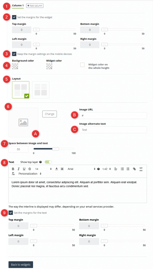
[1] Column – set the number of columns you want the widget to have. The maximum number is 6. You can set personalized appearance settings for each of them.
[2] Set the margins for the widget – by default, the elements are pressed against the edge of the field in which they are located. Move the slider to select the width of the margins that will separate the text from the sides of the widget. You can set it on a scale of 1-50
[3] Keep the margin settings on the mobile devices – if you want the selected settings for margins to be displayed on mobile devices, uncheck this checkbox.
[4] Color – choose the color scheme for your widget. The background color is the color for the previously selected margins, the widget color is the color of the field that the widget covers. You can also set the color of the widget to cover the full height.
[5] Layout – choose one of the possible field layouts in the widget.
[6] Image – here you adjust the settings for one of the basic elements of the widget:
[A] Image – load any image from the gallery or add a file to it to use a new picture.
[B] Image URL – add the address of the website, where the selected image will be redirected to.
[C] Image alternate text – otherwise known as the alt attribute, this is the alternate text for the image that will appear in its place if the image does not display correctly for the recipient.
[7] Space between image and text – on a scale of 0-100 you can set the distance that is supposed to divide the image inserted by you from the entered text.
[8] Text – you can enter any amount of text in the text field. You can follow the changes you make in real-time on the left side of the screen in the widget preview. Specify the font type and size, and change its colors, background color, bold, italic, underline, or strikeout. Also, set alignment and bullets. Optionally, you can embed links in the text, including the unsubscribe link. Additionally, you can include formulas in the text that will allow you to personalize the email content. Just expand the Personalization list and select elements from it, which, when clicked, will automatically appear in the selected place in the text field.
IMPORTANT: Checking Show top layer makes the text box change its background color according to the color selected for the widget. When clicked, the option will also become active for other widgets.
[9] Set the margins for the text – apart from the margins for the widget, you can also set the text margins on the same scale.
6. Widget – Image group
This advanced widget allows you to combine images of different sizes into a coherent whole. Graphical content on the website will be responsive, or change scale, depending on your preferences. Arrange them into complex patterns, and link each element to the website of your choice. Duplicate them, move them to the desired place on the screen, and manually adjust their size (width and height).
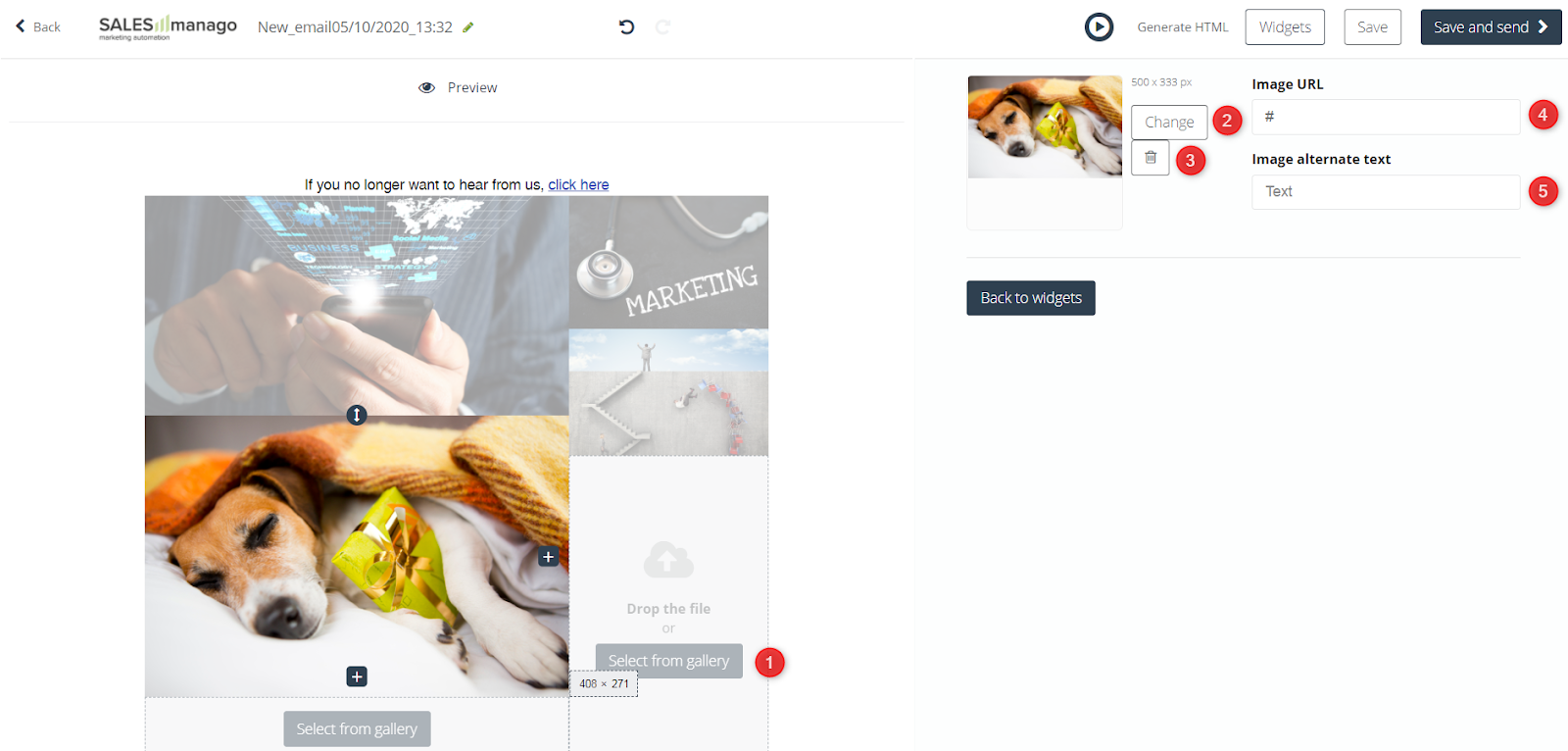
[1] Select from gallery – choose an image from the default gallery or upload your own.
[2] Change – by clicking this button you will be redirected to the default gallery where you can select an image.
[3] Recycle bin – by clicking this button you will delete the image.
[4] Image URL – an image can be linked to any URL, for example, a product photo can contain a link to that product’s page.
[5] Image alternate text – or attribute, that is an alternate text for the image that will appear in its place if the image does not display correctly for the recipient.
If you want to go to the general settings of the widget, click the pencil icon:
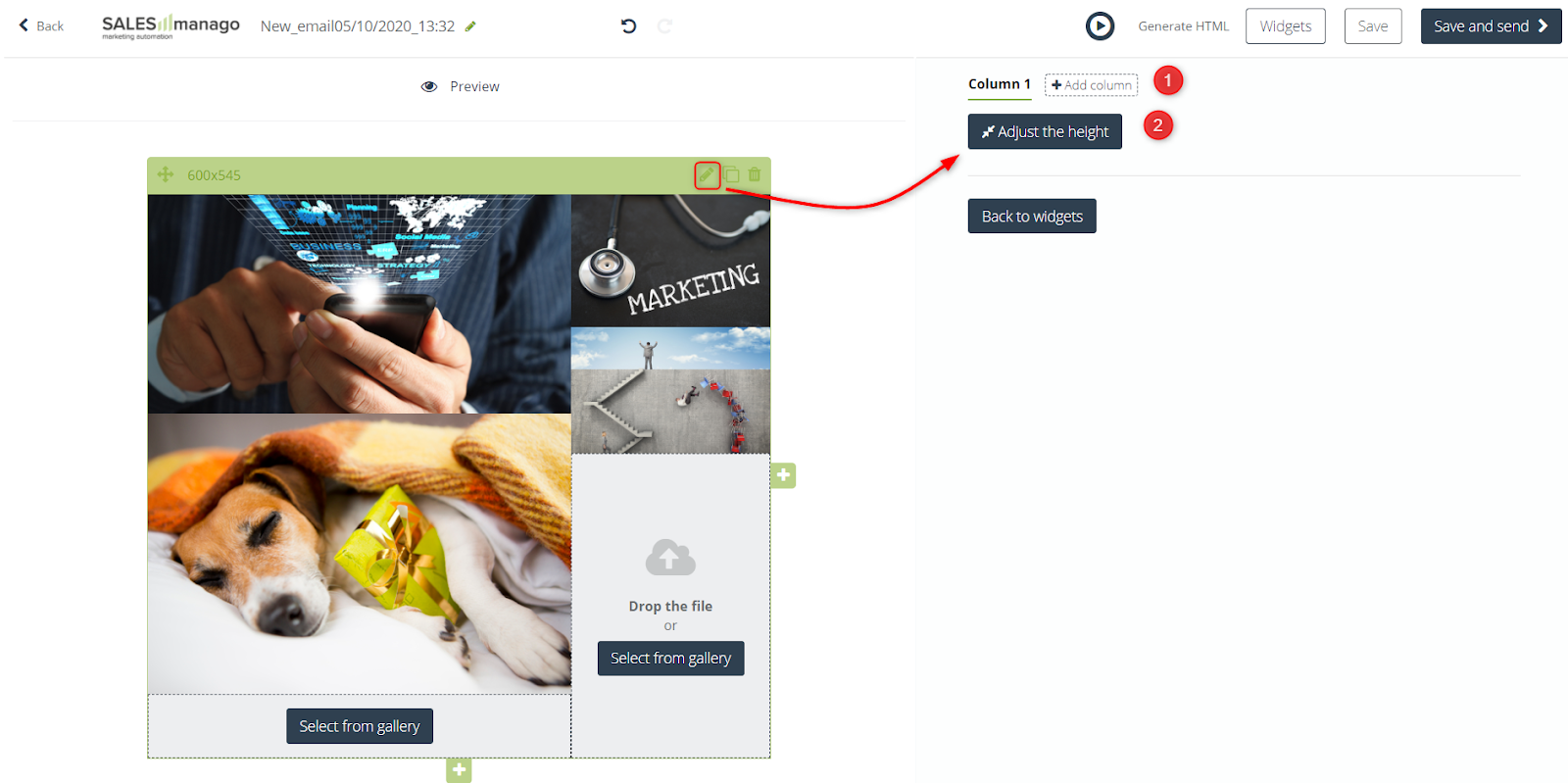
[1] Add column – this button will allow you to add an additional column that will fit the size of the tallest image in the column, in case the images in the message will be scaled. However, if the images behave responsively on the page, then the image adapts to the column.
[2] Adjust the height – click if you want to adjust the message template height to the image group height.
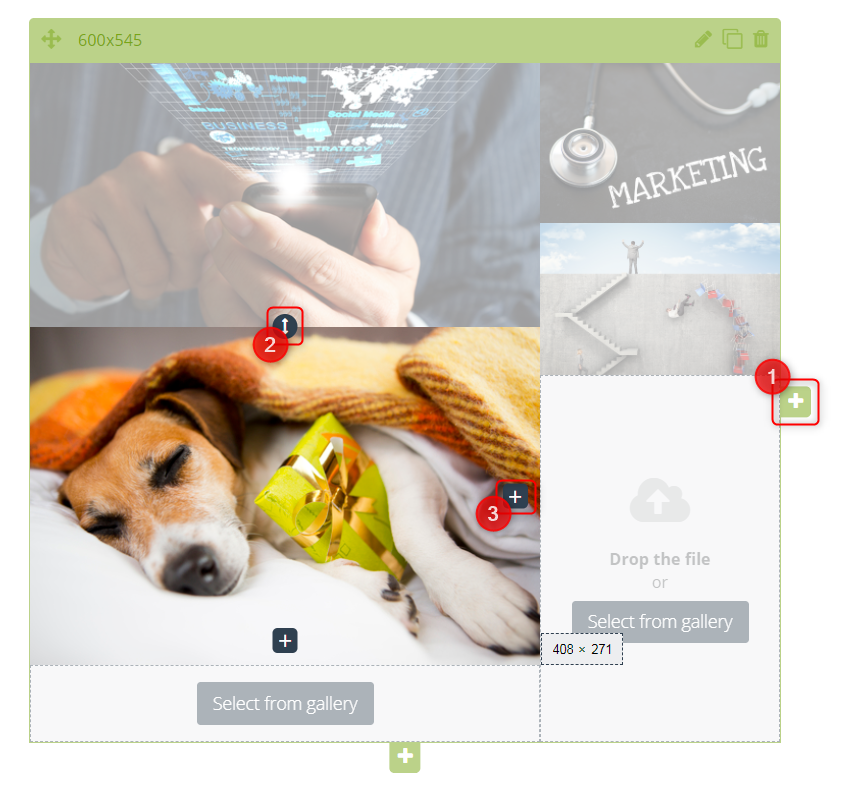
Each edit icon in the message view has its own function:
[1] Add a new main field where you can upload a picture. Thanks to this button, images added in this field will be scaled, i.e. they will not move downwards when the display field is limited (e.g. when the user displays a message on a smartphone).
[2] Adjust the width or height of the picture.
[3] Add a new, smaller picture box inside the picture box.
